Travelling is surely one of the things many of us miss greatly due to the pandemic. Consequently, my travel wish-list keeps getting longer. Yours probably too. Anyway, as of lately, I have included Portugal among many other countries. So when a press release of a sophisticated open space apartment in Porto, Portugal landed in my mailbox, I got instantly hooked. Firstly, because I don’t know anything about Porto, and it got me curious. Secondly, because I really liked the images of this apartment with its chic industrial aura. But, since it’s best to decide for yourselves, I’m going to share them with y’all today.
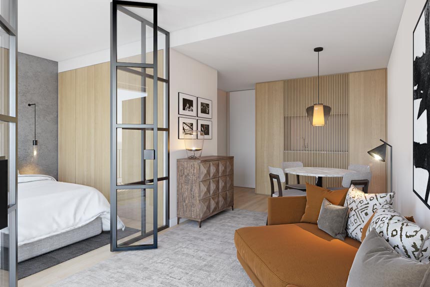
Good design is a universal language. If it’s good, then it will speak to you no matter what your cultural background is. It will grab your attention and draw you in to take a closer look and linger for longer than you probably ever planned. And that’s how I felt when I first saw the images. I was drawn in by the clarity and simplicity of this open space flooded by natural light from the window doors.
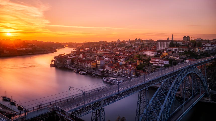
This apartment is located at the ”Antas” area in Porto. It was designed by the Empatias Studio Isabel Santos Helena Rodriguez. It is surrounded by the historic train station Campanhã. As such, its nearby railways became a strong inspiration with a big influence on the creation of this apartment. I love that about its design for it draws ever so slight, subtle references to the railways. Thus, it is within context and that means that this project has roots – it has a story to tell. And that is how it should be done.
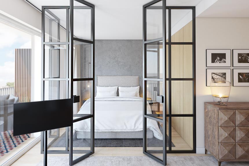
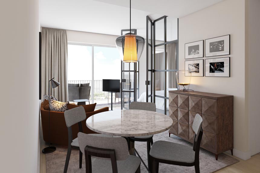
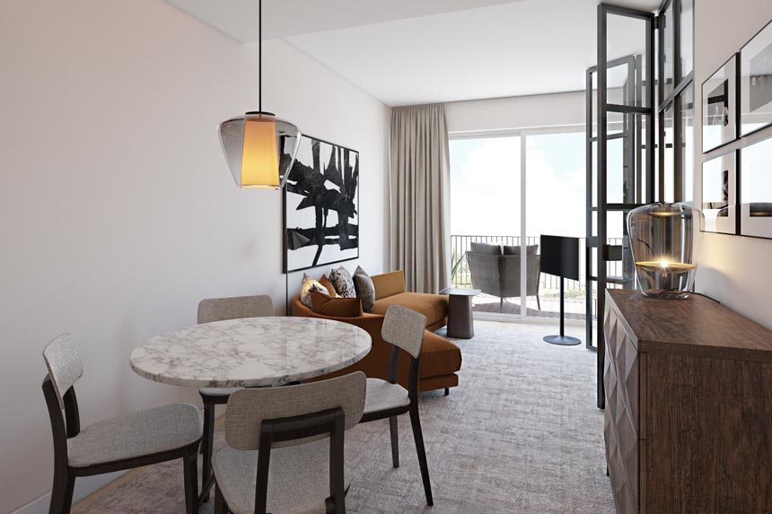
Obviously, creating an industrial open space has its perks but also some limitations. However, it seems that comfort has not been compromised in any way. Nothing feels out of place. The apartment has a well lived in feel to it, partly because the home decor embraces an earthly color palette. Hence it remains neutral, grounded and inviting. As for the inky details, they add definition and a punctuated sophisticated wow factor.
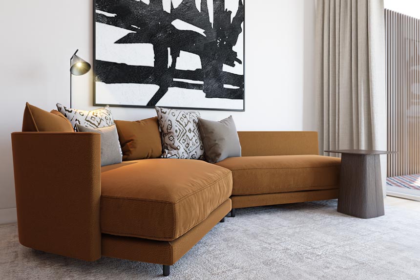
All the while, distinct functions (i.e. sleeping, dining e.t.c.) have all been zoned without breaking the space flow. A false ceiling zones the kitchen behind the light wood slats. The critall doors lend privacy and intimacy to the bedroom. And the curvy terracotta sofa form gently separates the sitting area from the dining space.
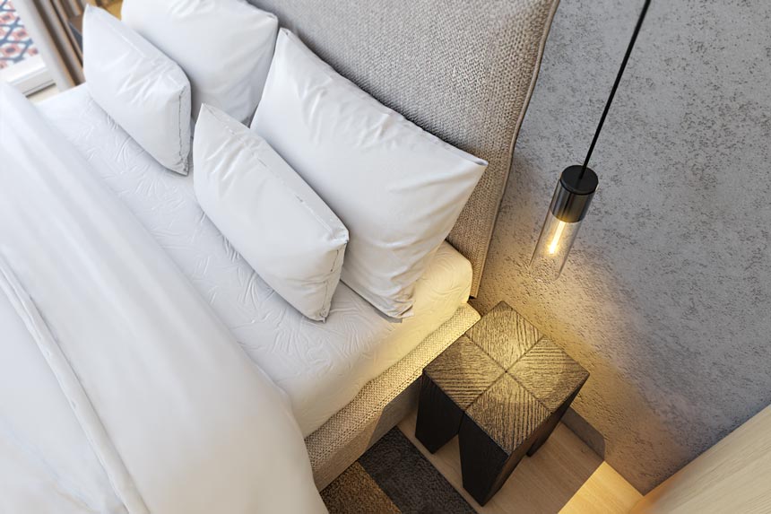
Also, one of the details to note is that in the bedroom, the bedside tables are made by half-burned logs – one of the main materials used at train stations and railways. Similarly, the artwork on the walls brings everything together by connecting the design inspiration of this project to photos of the Antas industrial zone before modernization.
The uptake
An earthly color palette, inky details, original artwork, abundance of natural light and an inspiring heritage to draw elements from, are the main ingredients for this delightful space. It has a somewhat hybrid aesthetic: Mediterranean meets Scandi. Yet, it is honest and livable. And although, I have no clue if the outdoor views are any good, I truly believe that this cozy apartment would serve as a fine living experience when I visit Porto…
Suggested read: How to Upgrade your Airbnb Home Listing
Cheers y’all!


