The Studio McGee signature look is a fresh iteration of the “Modern Farmhouse” style, that embraces comfort and a relaxed feel with elevated modern details. Some of you may be following Studio McGee on Instagram, or watched Shea and Syd McGee, in the Netflix ‘Dream Home Makeover’ series generate a lot of hype over this approachable, airy, and collected style that packs nature-inspired textures and tones. But, is it possible to recreate it on a budget? Is it possible to adopt it in smaller scale footprints? Is it really worth the hype? I will delve into all these issues, starting with yes, it is possible to recreate the Studio McGee signature look on a budget if you follow my tips, just read on.
Breakdown of the Studio McGee Signature Style
The Modern Farmhouse style falls under the bigger style category known as ‘transitional’. Predominantly, transitional styles rely on a single focal point, a neutral color palette, natural materials, and subtle accents of natural-inspired hues. The McGee signature look is no exception. It is easy on the eye and while it manifests a reverence to nature it does put you at ease. It looks and feels refined, elevated, and put together. So let’s breakdown this style to its elements and nail their signature spin.
The Color Palette
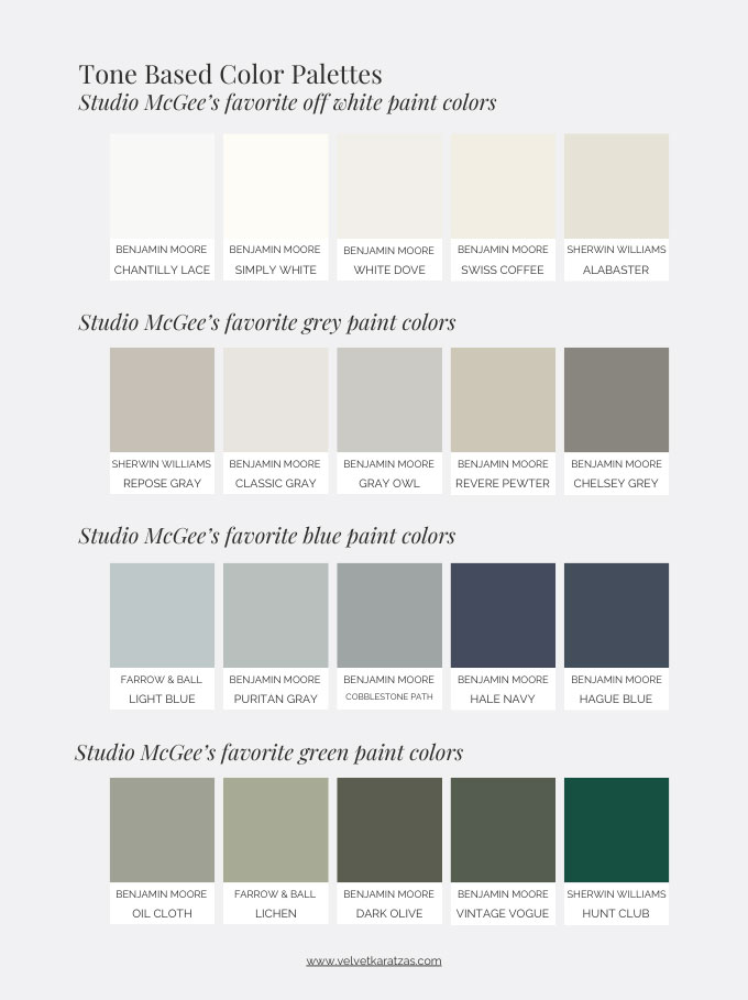
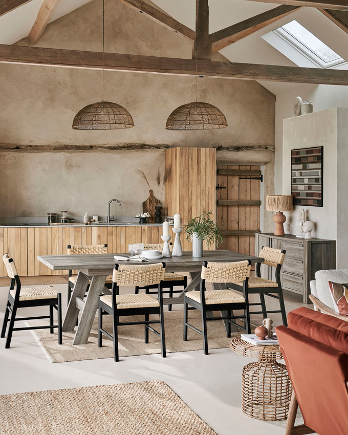
The foundation of Studio McGee signature style is a neutral color palette, inspired by the Nordic-sphere, that acts as a common thread in their design briefs. The color palette includes several off-whites, i.e. Benjamin Moore Chantilly Lace, Simply White and White Dove, some grays like BM’s Classic Gray or Revere Pewter, tan/camel hues for leather, mid-tone browns for wood, grey-based greens, pale and muted inky blues.
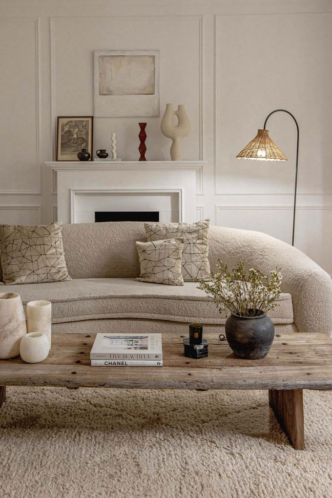
Shea McGee’s love for a white room is unquestionable. She seizes every opportunity to apply a crisp white or an off-white to ensure that bright and airy look. If she chooses to go dark and moody, then it’s almost always a muted shade. The only time she will go for a fairly saturated color is when she aims to pair it with a color pulled out of a wallpaper.
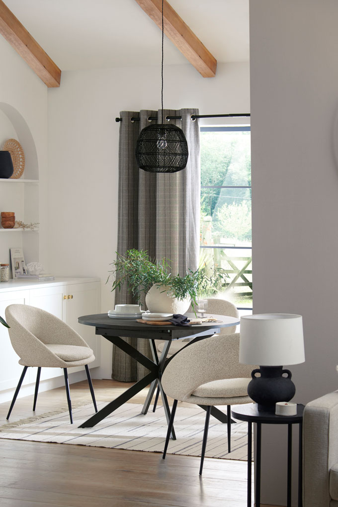
The key to the color palette which exudes an effortlessness is contrast, i.e. a light colored sofa against a darker area rug or the other way around. Shea doesn’t go for monochromatic (or tone-on-tone) schemes. Moreover, in order to elevate this palette further, hints of black are also skillfully added in the mix. The reason being is that they give definition and a high-end polished look Shea McGee always strives for.
It follows that, color blocking will not get you the Studio McGee signature style look. In fact, she lets the color run across the entire space without breaking it up, unless there’s paneling on the walls. That way, any space looks bigger and allows the infusion of other style elements to shine through. So, it’s very important to treat your walls as a uniform entity with a single neutral shade of your choosing – no accent walls. If in doubt, then know that any of the following whites should work for you (My Top 5 Benjamin Moore White Paints).
Natural Materials
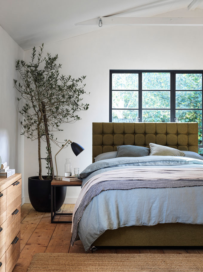
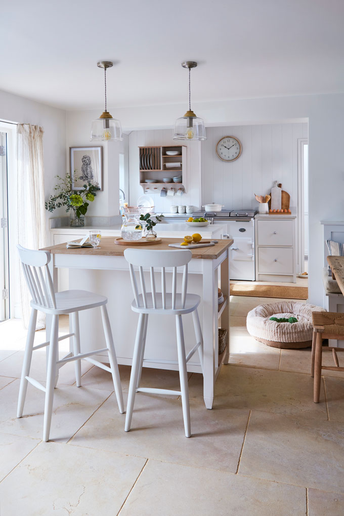
The next element that is very important to this style is the use of natural materials. Wooden finishes, i.e. white oak hardwood floors (sometimes with a white bleached stain) or exposed timber beams as accents, marble, linen, tanned leather, some velvet, wallpaper, ceramics, and rattan are just some of the materials Shea uses on repeat. Stone or handmade tiles and unlacquered brass fittings are also some of her go-to finishes when she wants to add some soul, especially in newly builds, however she’s not keen to use crown moldings that can make a space look dated.
More often than not, spaces with no architectural features tend to look flat. Hence, she often opts for wall panelling to add depth and a rustic chic appeal. Shiplap cladding or board and batten accents that draw the eye up, because of their vertical lines, are quite common features in her projects. Similarly, in a space with low ceilings she will try to draw the eye up by introducing exposed beams. The choice of stain or paint next determines the final style effect. For instance, a few coats of white paint on a wooden ceiling shiplap cladding may exude a coastal vibe. A medium stain on the other hand will a sense of warmth that is more appropriate for i.e. a cabin.
Again, Shea thrives on creating contrasts everywhere. So mixing different wood stains runs fine by Shea. In fact, many times she will deliberately mix the stains, i.e. a rustic oak dining table with black stain cane chairs for a modern twist. Hence, don’t worry about mixing wood tones as long as the undertones are aligned.
Having said all that, it’s very important to point out that your setting context is crucial. Think of your surroundings and what you are trying to accomplish. Then think through the incorporation of each and every material finish, in terms of your aesthetic goals and whether it’s on the same wavelength. For example, if you live in a small flat in an apartment building somewhere like say Tottenham, London, then it doesn’t make sense to introduce exposed beams on your ceiling, now does it. Obviously, you shouldn’t beat yourself about it. Instead, a DIY board and battens project may compensate for the beams quite nicely. Like I said, context is everything. If your design solution isn’t within context, then no matter how you decorate next, it will never be a solution.
Single Focal Point
Sometimes the single focal point is a fireplace, a piano or a wall with built-ins. In every case though, there is a focal point – true characteristic of a transitional type of interior style. Shea always tries to make the focal point the attracting feature that all else gravitates to in a space, i.e. a U-shaped conversation pit in front of a fireplace. Or it could be a statement headboard for the bed in the primary room. This grasp of this concept is especially handy when dealing with open plan spaces.
Obviously, symmetry is definitely a sought-after quality, but not always possible. So that’s where you’ll need to create some sense of balance in your space and eliminate the element that may be responsible for the lack of symmetry. Taking lots of pictures of your space from different angles may help you identify the troubleshooting element, or lack of. Once identified, then it’s easier to decide how to tackle it, i.e. replacing a mantel or reconfiguring the fireplace.
Texture and Patterns
Go heavy on texture or don’t bother – that’s their motto. The Studio McGee signature style thrives on layers of texture – textiles, cushions, rugs, greenery and textured finishes. Therefore, even if you have a carpet from wall to wall (as long as it’s neutral), then layering another atop will work wonders. According to Shea McGee, it is the texture and patterns on the textiles that set the tone in a space and she’s right about that. In fact, she deliberately uses various throw pillows on her sofas that do not match each other, yet coordinate really well based on the color palette discussed earlier.
When it comes to tile placement, her favorite patterns are brick lay, stacked and/or herringbone depending upon the house’s context. Brick lay and herringbone have a traditional vibe, a stacked placement patterns looks more modern, ideal for mid-century settings. For print patterns on textiles she usually turns to subtle classic stripes and flower prints, or traditional plaids and gingham. I have never seen her use an animal inspired print, like leopard or zebra yet, or polka dots and damask patterns for that matter.
Blend Styles
Shea McGee claims to blend styles, however she won’t blend just any style. What she’s really doing very ingeniously is to create a neutral backdrop that runs like a thread throughout and then seamlessly introduces a few elements from contrasting styles, i.e. bohemian, rustic farmhouse, Old World, coastal, mid-century inspired; that’s the McGee spin – keeping it very subtle. The aim to her signature style is to achieve a soft upscale look.
Simply put, she mixes traditional elements and counter-balances them with modern ones. Old World elements are matched against mid-century, rustic against contemporary and so on. That’s how she invents the Studio McGee signature look.
For instance, if the design brief calls for a traditional rustic vibe, then she will incorporate more wooden accents i.e. shiplap paneling, rustic decor pieces and vintage finds, usually against an off-white backdrop and a single contemporary focal point. If on the other hand, the brief specifies boho-chic, then she’ll add on a few boho decor pieces and less wooden accents against modern elements.
Also, she never incorporates furniture sets. The main couch is usually more boxy, i.e. a sectional, but the accent chairs are often very airy with thin legs, i.e. mid-century inspired. This gives her signature style room to evolve.
Having said all that, Shea McGee never goes overboard with any one style. It’s all about keeping the balance and a cohesive composition, based on her signature foundation. Also, she cautiously stirs clear of blending these two interior styles: shabby-chic and industrial. That’s because those two particular styles can ram that elevated vibe of the Studio McGee signature look and feel closer to Joanna Gaines’ Modern Farmhouse look.
Statement Lighting
The concluding puzzle piece in the Studio McGee signature style is statement lighting. Sconces, oversized pendant lights, and table lamps must stand out and create juxtaposing moments. Honestly, some of the pendants she’s used could be contemporary Spanish or Italian designer ones. Kudos to her for that! Hence, when it comes to lighting, you should really splurge out – cheap looking lighting fixtures, i.e. flush mount aka boob lights, don’t make the cut for this style. Lastly, I would also avoid industrial style lights. They are not a good fit.
Recap on How to Create the Studio McGee Signature Style : The Do’s and Dont’s
This style must feel clean, airy, bright, and elevated – quite the opposite of a builder’s grade look. So in a glance, these are the key components.
- A neutral color palette (inspired by nature, especially the Nordic-sphere, lots of white with accents of muted greens and blues) and hints of black for definition, i.e. black window frames;
- natural materials;
- contrast, contrast and more contrast;
- a single focal point; a sense of balance and symmetry when possible;
- loads of texture on texture, soft florals, stripes, and plaids for textile patterns; brick-lay, stacked or herringbone patterns for the finishes;
- no matching furniture sets;
- a kitchen island as opposed to a peninsula;
- blending of elements of different styles (except shabby-chic and industrial);
- statement lighting that creates a juxtaposition with the other appointment pieces.
Obviously, the Studio McGee look works really nicely in spaces with a large footprint. In Europe, spaces are far smaller. So is it possible to create this look? Yes, even on a tight budget and without exposed reclaimed timber beams! But here’s what to do and not do.
First, declutter you space. Commit to keep only the things you really love. It is important for your space to look roomy and not congested, yet not bare. The decor pieces must be on the large scale in terms of proportion. Forget about small knick-knacks here and there. Next, adopt Shea’s color palette and use it as your common thread. Opt for an off-white color for your walls and ceilings to allow the light to bounce; no color blocking or accent walls. Reconsider your crown moldings and if possible rid them. If it comes to choosing crown moldings or statement lighting, then go for the statement lighting.
A farmhouse sink in your kitchen will score you points. Similarly, an odd vintage piece of artwork somewhere in the kitchen or a bookshelf will elevate your space. You should however, avoid generic art prints that tend to look inexpensive. And you don’t need double kitchen islands, or built-ins. Wall paneling is most welcome, but not absolutely a necessity. In any case, don’t overload your spaces with pieces from any one style; blend them and color coordinate them, based on your color palette. When in doubt, mid-century inspired pieces have the potential to save the day.
Keep things simple, no frills, no glitter, no tray ceilings with LED lights. Say yes to headboards, floating open shelves, pot racks, wooden accents, ottomans, lots of baskets, and vintage vessels and/or vintage art. Opt for rugs that are neutral, i.e. jute or vintage looking. And last but not least, incorporate a branch in a ceramic vessel and/or a tree in planter pot (preferably an olive tree). And it’s a wrap!
Is it worth the hype?
In a country that’s as big as the States, the Studio McGee signature style can work really well. Large footprints and homes in the vicinity of beautiful outdoor landscapes make this style feel like a natural fit. So, under the light of this context, it’s a yes – it’s worth the hype. However, there are a couple of drawbacks that make me skeptical. For example, I don’t like the fact that it’s not very versatile or personal for that matter.
In other words, if you’ve seen a few home makeovers done by the Studio McGee, you’ve seen it all – exposed beams, wooden accents, white walls, a kitchen island, built-ins, ceramics here and there; hopefully you get the picture. However, this style leaves no room for “out-of-box” solutions. The same elements are used on repeat and it almost feels like each makeover is another Studio McGee showroom. It looks fresh, yet somewhat ‘young-ish’ if I may say so. Surely it has evolved since Shea’s first home design. And as with many designers, they too established a signature style that serves them well. Why should Studio McGee be any different. After all, they’re in the business of promoting their style and its product lines.
Truth be told though, interior design is not a one size fits all kind of trade. It’s about the actual people and people are different. There lies the beauty. Therefore, drawing inspiration from any particular style is great; that’s the purpose of this article too. But when people sign up in a craze to have their homes done after the Studio McGee signature style, as opposed to their own, as seen on the Netflix series, then that is up for a debate. Bottom line: If you really love this style, go for it, but own it. Make it personal, make it about you. Adopt and adapt sort of speaking!