Hi everyone! The weekend is over and it’s time to get to work. Since I get asked quite often for decorating tips with impact that make a home look great, I think that I should share some of those with you before I go on with my home improvement post thread. There are always many little tricks and hacks that we can employ to make our homes look GOOD! And goodness me, there are so many posts out there about this very same thing. Therefore, I have narrowed down the list to six good, old, fail-proof interior decorating tips that we can easily have a go at without breaking a bank, even if we live in a rental home. That means that we assume that the super major stuff like the layout, the lighting, the interiors materials and the flooring are a given. But it’s not all hopeless. We can employ these tips to make our homes look fantastic.
1. Edit and layer
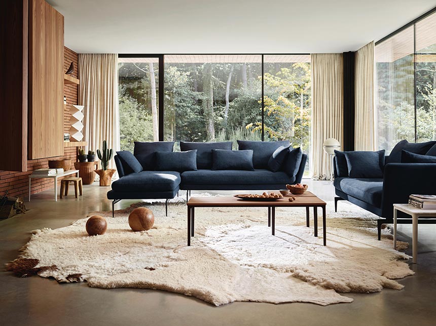
My first tip is probably the most important one of all. I can’t emphasize it enough. We all must edit our possessions and collectibles from time to time. We accumulate things that clutter our space. Some of those have sentimental value, others are aesthetically pleasing, while others are functional. If we all take some time to classify them, then we should be able to get rid of the unnecessary ones. Undoing the clutter is essential. Only then we can re-edit them in order to add new visual interests i.e. in a bookcase or a gallery wall.
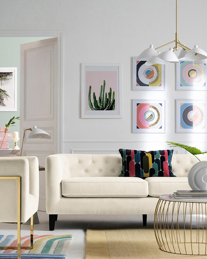
How? Try re-arranging things and layer them anew. For example: form new stacks of books and lay some on the dining table instead of the coffee table. Create (new) clusters of vases and boxes in different corners. Move things around your vignettes. Pay attention to the little details that make all the difference. Sometimes hanging artwork at a different spot might do the trick. It’s a trial and error process with a cost next to nothing! (Here’s my guide for hanging artwork).
2. Take a risk
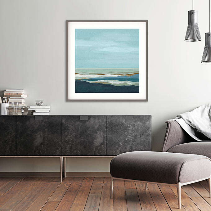
I love this tip, because it calls for an out-of-the-ordinary-action! We must step out of our comfort zones every now and then to think out-of-the-box. Believe me it’s not as difficult as it sounds. We pick a small wall in a powder room, a small ceiling, or an old furniture piece like a bedside table and go wild with it.
How? Change its color from something neutral to something really unexpected or vibrant. Or add a really fancy pattern wallpaper. If the coverage area is small enough then, it can’t go really wrong can it? Besides, we get to live only once and an interior design adventure is a must! Cost: 1-3 lts of paint, 1 brush and 2 hours of our time.
3. Invest in a rich color paint
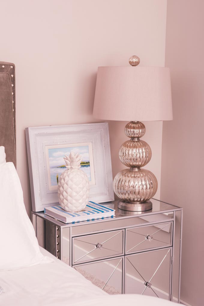
This tip differs from the above one because it is about the overall color scheme. It’s fun to be adventurous with color, but let’s face it. Most of us have a hard time with it. If we want to stay on the safe side then we can always choose neutral shades with rich undertones. Think of bold off-whites kind of speaking. (Remember that when we paint a wall with an off-white then its undertone is the one that reflects).
However, I’m sure that if we spice up our color choices (up to the degree that we are still comfortable with) then we can achieve some great backgrounds for our furnishings and decor to pop up and stand out! In other words, a good color scheme works by enhancing everything in an indirect way. Our signature color shouldn’t stand out alone. Instead, it should compliment the rest of the ensemble just like in a good cake mix where we can’t tell the ingredients. (Read more about successful color combinations).
Suggested read for inspiration: 50 Swoon-worthy living rooms you have to see.
4. Mix styles
This is very straightforward, yet my clients have the hardest time with this ever. So, I tell them of this silly little example to unblock their imagination. Let’s think of a cake. First we get the ingredients. Then we mix them one by one, before we bake the mix. The bottom line is that we can’t have a cake without the mix. The decor, the architectural features and the various materials are all the required elements. Sort of like the ingredients mentioned earlier.
Now, let’s think in bigger terms. If we go for an industrial style, then we can always throw in a couple of contrasting elements that belong to another i.e. baroque style. The key to a successful mix is to create a new balance by mixing styles i.e. modern with traditional. This adds more drama and accents with a high dosage of personality that evens out the feel of a just another copycat interior.
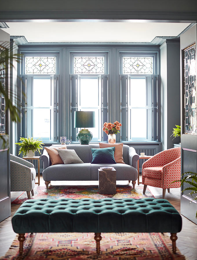
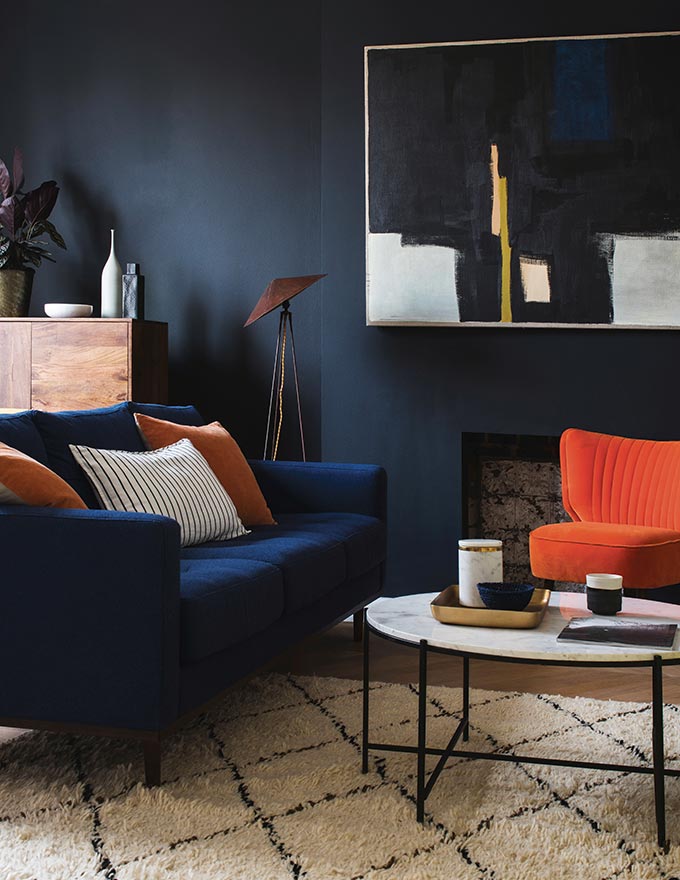
Sometimes this mix is really subtle just like in the picture below. Other times, it is a mix with an “in-your-face” attitude. After all, we all like stuff from different styles. Therefore, if we put aside our “fear-factor” of a mismatch, I’m certain that things will eventually fall in the right place.
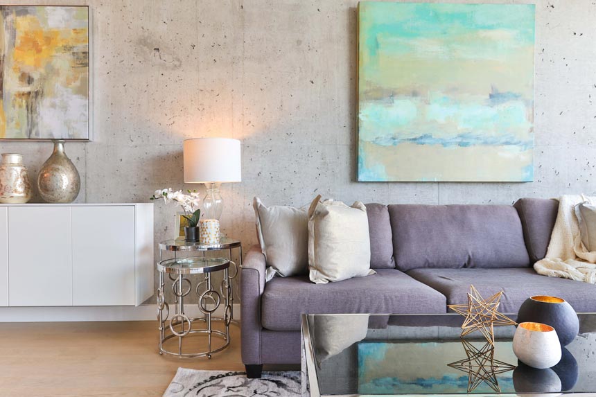
5. Add a mirror
Mirrors are great for adding instant glamour. They make everything look more posh while creating a sense of a bigger space. That’s because they add a new dimension in a space. Therefore, the best way to use a mirror is like a backdrop above or behind furniture.
One of the secrets to a stunning mirror, is its frame. A vintage gilt frame for instance can create a wonderful focal point, especially in a minimal space where visual contrasts have the greatest impact. (Since mirrors are such a special design feature, I urge you to read more about them in this post: how to choose the perfect mirror).
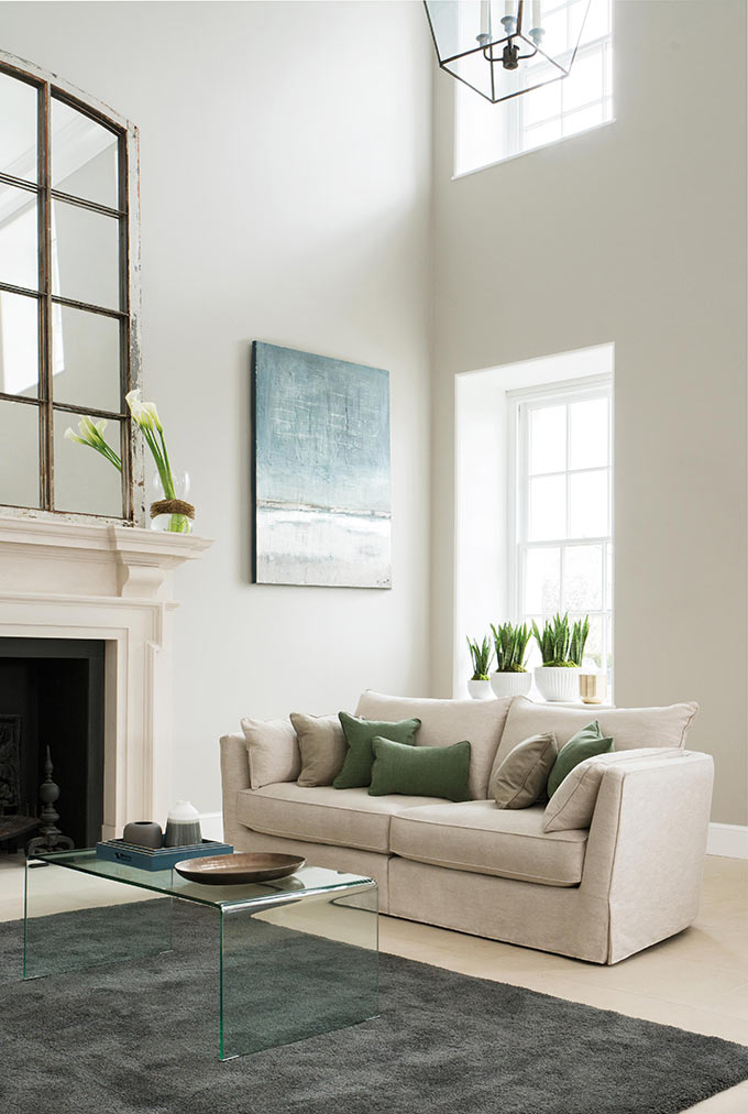
Moreover, by adding a large mirror (more coverage area) leaning against a wall we create a stunning accent in a similar manner just as big artwork does. Again, we must think out of the box and be creative. Mirrors can be placed anywhere from entryways to powder rooms, bedrooms, living rooms and even in kitchens. If we don’t have a window over our kitchen sink then, a mirror will do just fine.
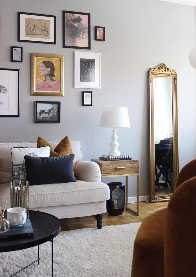

Floor mirrors are stunning decor pieces. But, what if we don’t own any or too expensive to buy? Then, invest in a gallery wall made of small sized mirrors with various frames. Their impact is just as stylish and super strong. Trust me on this! (Read more about gallery walls). Another option to consider is using antique mirrors instead. Their effect is sublime.
6. The rule of 3’s
When we layer our collectibles for extra style, as a rule of thumb we use the rule of 3’s. This rule covers basically any clusters formed in odd numbers (3, 5, 7 and so on). It’s amazing how this rule can be applied in styling just about anything.
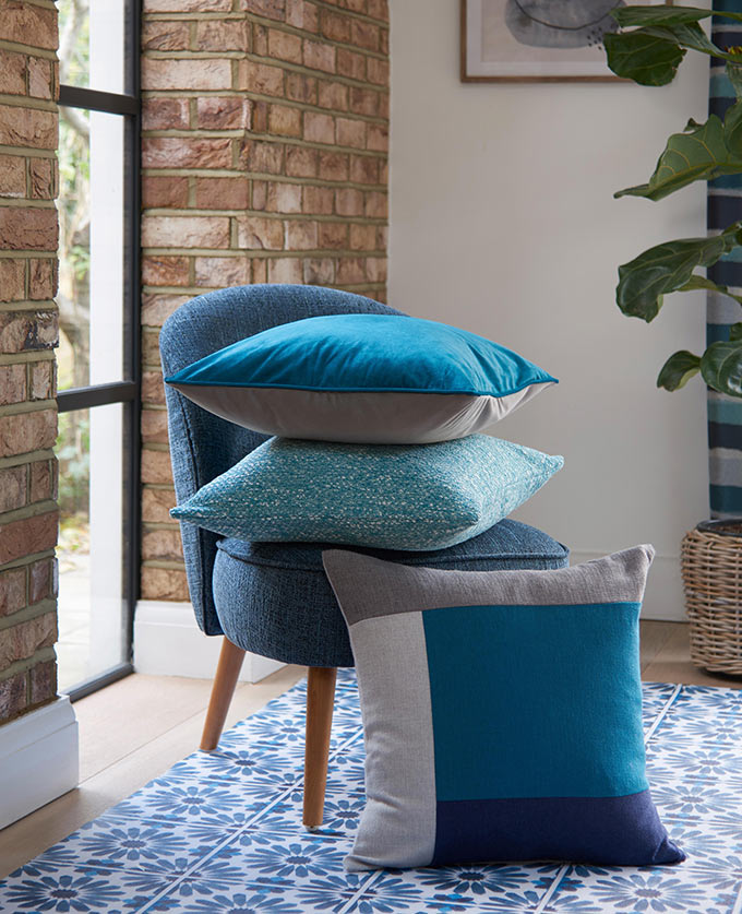
The best example of this concept is a “tired” looking sofa. First we puff up the sitting pillows. Next we add on pillows ideally in three different fabric materials i.e. chenille, wool, cotton and to top it up we use three different colors (two shades of the same hue and a third pop color for contrast). This works like a charm.
Never under-estimate the power of groups. Their impact is far greater than sole objects. Furthermore, by adding pieces that have different textures and/or colors, the visual impact of the cluster also increases. Fantastic, really!

Takeaway Thoughts
Noticed how these tips follow up each other? If we want great impact, these tips serve their purpose. Furthermore, they are affordable and almost maintenance free. So, I’m certain that these will never fail no matter what the trends dictate. Remember that we are the curators of our homes and therefore, anything we say goes…
Fashions fade, style is eternal!
Yves Saint Laurent
And if you’re reading this, it means that you love style and you love your home! If you have any favorite tips, please share. I’m more than interested to see what stylish ideas you have…
Till next time,


Thanx for the tips! Personally I want to try to add some color on a wall of mine that has some shelves in order to create a strong impact but have been postponing it for a very long time. Think I am going to go for it after reading this post! Just not sure about what color to go for?! Any suggestions?