Well hello there! I have a little fix for you today that might come handy to you; a little unsolicited advice to help you shape up your homes… There are definitely two “design mistakes” designers notice when walking inside a house for the first time, even if it’s just a social call. (Let’s be honest, if you’re in this line of business you can’t help being aware – without passing judgement though – of something that doesn’t feel quite right). Hanging artwork too high and having a rug too small.
And yes, they’re still very common mistakes. Which one is worst?
Personally, I think it depends, but I’m sure that artwork being hung too high gets the most popular vote! In fact, I read a post the other day called Decor Faux Pas to Fix Before Holiday Guests Arrive that mentioned artwork be hung way too high; as expected, it sparked a lot of comments from people (including myself).
Apparently, a lot of people are continuing to have trouble with this controversial issue. Therefore, I decided to write these guidelines to simplify things, while taking into account all the possible factors, to help you avoid one of the most common “design mistakes” so that you can hang your artwork like a pro!
Hanging artwork like a pro
Our selection of artwork is a showcase of our personality. The way we showcase it though, also has a great deal to do with our personality. That’s a factor that most of us aren’t aware of.
From my experience as a professional, I have deduced that outgoing people instinctively tend to prefer artwork being hang at eye level or a bit higher. People who are more introvert, instinctively choose to place their favorite images away from eye level to avoid direct eye contact (that usually means way too high and in fewer cases too low).
People who are perfectionists have the hardest time ever, especially if they want to create an effortlessly looking “unfinished” result. And there are also people who are generally indecisive who tend to move around their artwork one time too many and therefore, they either have too many holes on their walls or have given up at some point and left most of it on the ground against a wall, till they’re ready to “deal” with it. But, don’t worry though, I got this… Here we go!

Guide to Hanging Artwork
Ideal Hanging Height
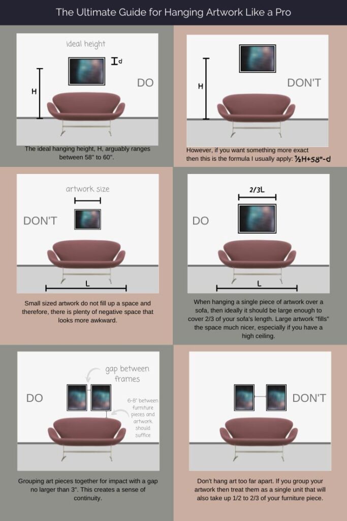
The first thing anyone will tell you is to hang art at eye level. What does that mean? The ideal height for an art exhibition is 58″ (1.47 meters) from the ground to the center of the image. The aim is to engage the viewer’s eye solely on the artwork. As such, the height of the ceiling is usually indifferent.
Two notes to remember: a small size framed art piece draws you nearer as opposed to a large sized one. Moreover, the higher the hanging height, the furthest away someone has to stand to be able to view it in relation to the size of the piece, unless one cranes their neck. So, in order to calculate the height: determine half of the piece’s total height (h) then add it on to 58″ and next, subtract the distance (d) from the top of the artwork to the hook or wire from which it will hung or ½h+58″-d.
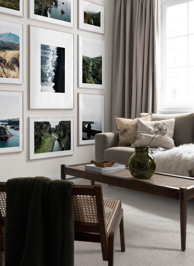
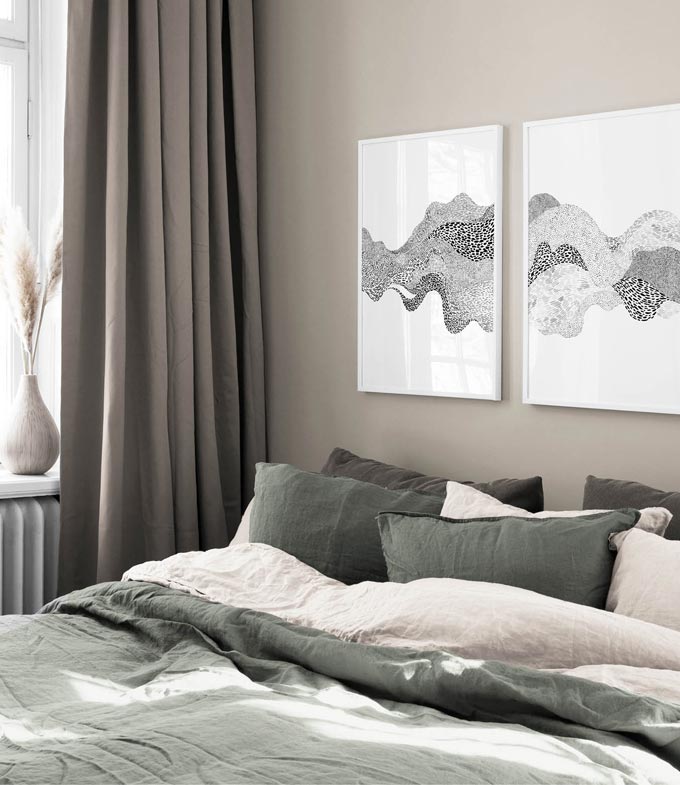
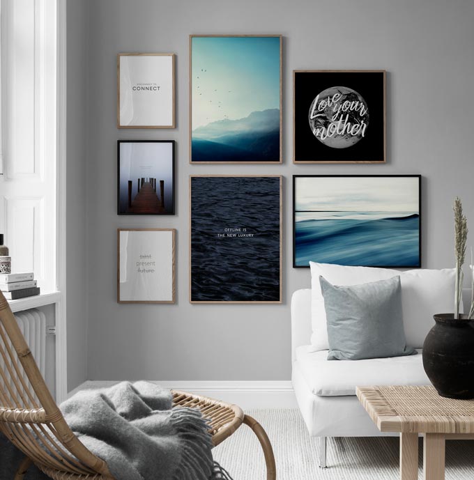
TIP: A good way to figure out if you’re hanging your artwork at the right height is to make sure that the artwork is below the top of the entry door, just like in the image above from Desenio.
When it comes to a home interior though, most will argue that 60″ (1.52 meters) from the ground to the center of the image is ideal. The principal argument behind this is that artwork must not discontinue itself from the surrounding interior. However, other factors come in play like your height, your lifestyle, the ceiling’s height, floor plan distances, architectural features and furnishings. All of these dictate the actual hanging height.
My stand on this controversial issue is to serve comfort first. For example, my height is 1,75 meters; thus, my eye level (vision line) is approximately at 1.67 meters from the ground as opposed to 1.47 meters. That’s quite a difference for it means that I have to lower my neck somewhat in order to view our artwork. So, since my husband is a tad bit taller, we both agreed to hang everything at around 65″ (1.65 meters) from the ground to the center of the image. Coincidentally, most of our friends are also about our size and therefore, this height worked quite well for most of our artwork.

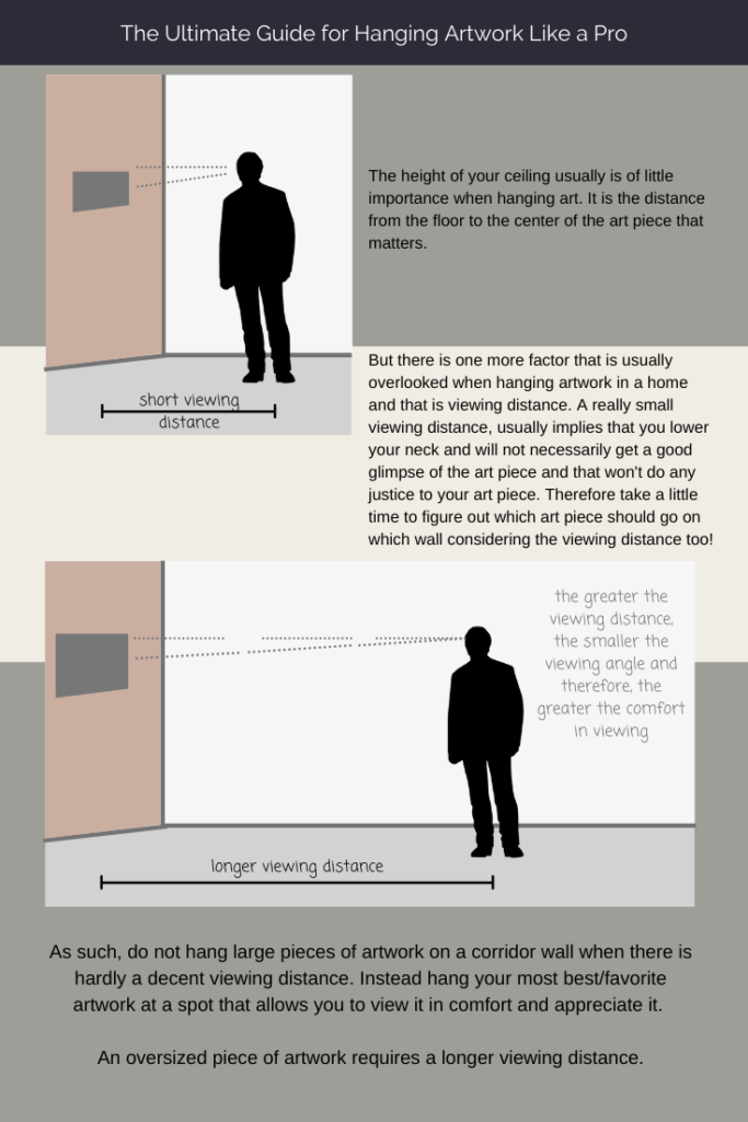
Viewing distance
Our decision to hang everything at 65″ (1.65 meters) was also based upon a factor I call the viewing distance. This is the distance between the piece of art on a wall and the usual standing distance away from it. It is all about the angle of the vision line. Please bear with me on this one, because it’s a crucial factor that much too often is overlooked. Let’s take me for example: if the artwork is somewhat small and my vision line is at 1.65 meters (65″) then if I stand fairly close to it i.e. less than a meter away, then I will end up looking down at it, creating an angle. If however, I stand a couple meters further back then, this angle becomes smaller and therefore, more comfortable.
So why does viewing distance matter?
It matters when it comes to pieces that are either too large, or too small compared to the rest (assuming that a consistent hanging height has been followed). It also matters when sofas are arranged in conversation islands rather than resting against a wall. This is the very reason why in museums and art galleries you find yourself stepping back in order to view and appreciate the artwork you admire! 😉
Therefore, once the wall onto which the art piece will be hung has been determined, then trace the frame on a piece of paper, stick it with paint tape on the wall and check to see if it causes neck craning or lowering to an uncomfortable point from the usual viewing distance. Adjust height until it’s comfortable. Thus, the viewing distance is quite relevant and just as important as the actual hanging height.
Best Ceiling Height When Hanging Artwork
Generally, the lower the artwork is hung, the higher the ceiling appears to be. The lower the artwork, the more negative space is created between the living zone (from ground up to a 2.2 meters or 7 ft 3″) to the ceiling. So far so good. If the ceiling is really high though (say over 9 ft 8″ or 3.0 meters), then what is one supposed to do about all that “extra” negative space? Do we have to fill it? No! The reason is that we simply don’t walk around the rooms with a craned neck.
Since, we’re only interested in “filling” up the living zone up to a comfortable height, having a high ceiling is not a disadvantage. It just begs and calls for oversized artwork or a gallery wall. (I have exaggerated the size of the art piece on purpose in the images below, to illustrate my point more clear).
On the other hand, ceilings may be lower than usual. That shouldn’t put anyone off from hanging large artwork. It certainly hasn’t done so in my case, and my ceiling is at 2.55 meters (8ft 4″)! However, I have taken care to leave as much negative space, left and right, to compensate for the low ceiling. And I also made sure to add more lighting sources.
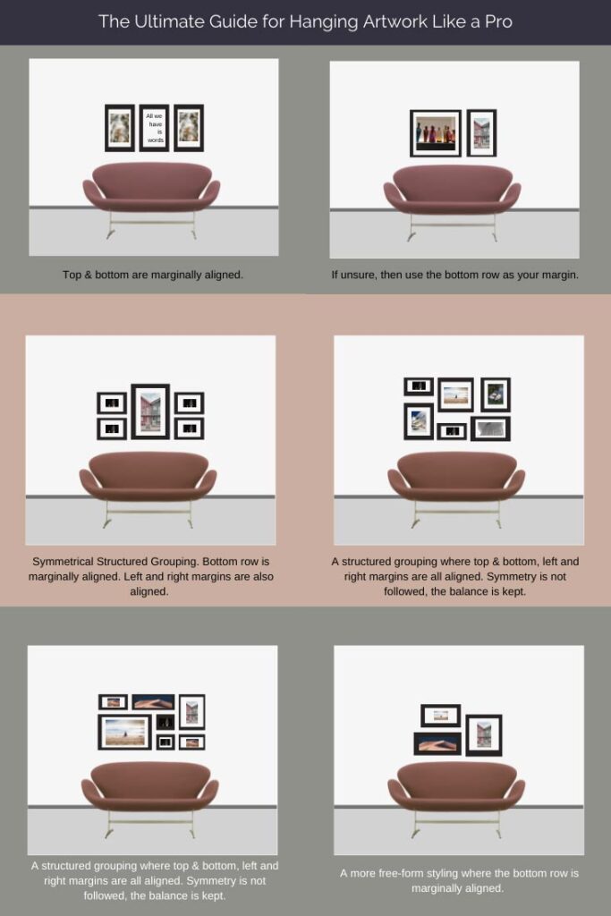
How to Hang Artwork Like a Pro Cheatnote
Next, I prepared a cheat note with all the basic information you will need for hanging artwork. So don’t forget to pin it for future reference! I then discuss in more detail each of the three sections of this cheat note.
Artwork Size
What is the ideal length of an art piece that goes over a sofa? I agree with most experts on this. At least half of your sofa’s length up to 2/3 of it. It is best to go for a bigger artwork rather than a smaller one, especially against a large empty wall with a whole lot of negative space. It’s almost impossible to go wrong with a large piece as opposed to a small one. A small piece of artwork can easily create a feeling of “not enough.” Besides, large artwork or mirrors have that fab factor that interiors need!
Grouping and Spacing
Creating groupings or art gallery walls is a wonderful way to display things that are dear to us. Ideally, artwork groupings should be treated as one entity. The position and spacing between the art pieces defines the grouping as one. Too far apart means too much negative space and discontinuity. Balance and proportion in terms of the space must always be kept in mind.
When placing artwork over a sofa or any other furniture piece i.e. credenza, then most call out for 4″ to 6″ clearance above the piece (10 – 15 cm). Believe me I get that placing artwork too low over a sofa is not very convenient. As a matter of fact, it can kill any mood for relaxation should anyone bang their head on a bulky frame. So, I prefer a minimum of 6″ to 8″ or 15 to 20 cm clearance instead.
If the sofa has a low back, then I won’t hesitate the increase that clearance distance further. Moreover, I need a little more negative space to rest my eyes without feeling overwhelmed by a clutter zone! Similarly, for medium and large size art pieces grouped together, the spacing between them should ideally be 2″ to 3″ apart (5 to 7 cm); for smaller pieces 1.5″ to 2.5″. (If you need some inspiration on groupings then pin the cheat note below).
Again, I tend to be a little more flexible on these distances, depending upon the frame. (This is another factor that is so often overlooked). These distances work beautifully for a minimal framing approach. You may have to increase by an inch or two clearance distances in the case of a vintage golden frame. That is to compensate for the elaborate ornamental nature of those frame designs.
Just a note for parents: toddlers, much too often find it amusing to swing frames. A good way to avoid any accidents is to fasten secure the framed pieces. Consider the use of command strips that work like velcro at the back of them. They are easy to re-attach and will ensure some piece of mind. 🙂
Overview of all tips
The bottom line is to create a sense of balance by keeping the proportions. So do hang artwork at a pleasing height that is comfortable and soothing. Placing art on the floor against the wall creates a “heavy” feel to it. It also makes it very difficult for your guest to actually look at the art and much less appreciate it.
If you hang your artwork too high, then chances are that it won’t be very comfortable to admire. It’s a trial and error process. However, if the viewing distance and angle are determined, then it’s a lot easier to adjust the hanging height. Likewise, you can adjust the spacing distances (and gaps) to fit your lifestyle in a harmonious way.
I hope I got you thinking. After all design is meant to make the living experience much more pleasurable rather than burdensome. Therefore, now would be a great time to shape up your home by re-examining the height of your artwork… Drop me a line and let me know your thoughts on this.
Stay tuned for some holiday inspiration! XO