The thrill of decorating a home should never be ruled by the square footage or budget. That is why this post is all about interior tips for celebrating ‘living big in a small space.’ Think of it like a small space interior design guide that will stir you away from many common design mistakes with regards to small homes.
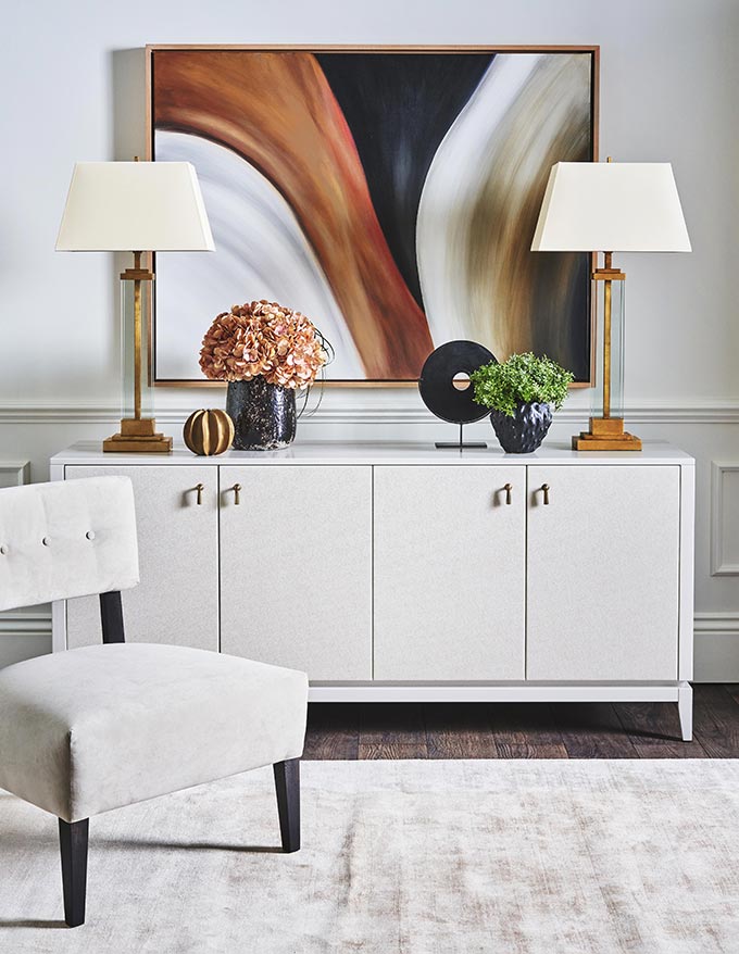
Color Palette for a Small Space: Light vs Dark
More often than not, small spaces are under-designed. As such, part of their real potential is never “discovered,” let alone highlighted. So it’s about time that I set the record straight starting with a controversial issue. White paint. Surely, you have heard that white paint will make everything look bigger, brighter and more clean.
But let me tell you this: there are two approaches to painting a small interior. You should either go all light, as in white-ish (all off whites included), or all dark. And when I say all, I mean all, including the ceiling, the trims, skirting boards, moldings etc. That’s because, this approach treats each room as a single volume, with a single color running through it, creating a strong sense of cohesion.
In the event you choose to paint the various design elements i.e. ceiling, and/or trims different colors, then you are basically “dissecting” your room into surfaces. In other words, you are no longer treating each space as one volume. Hence, the eye will read the room much differently. Now, that’s not wrong, but it works best if your space is large. However, if your space is small, then the best approach is to stick to paint colors of the same tonality throughout, amplifying the impact of your chosen color palette.
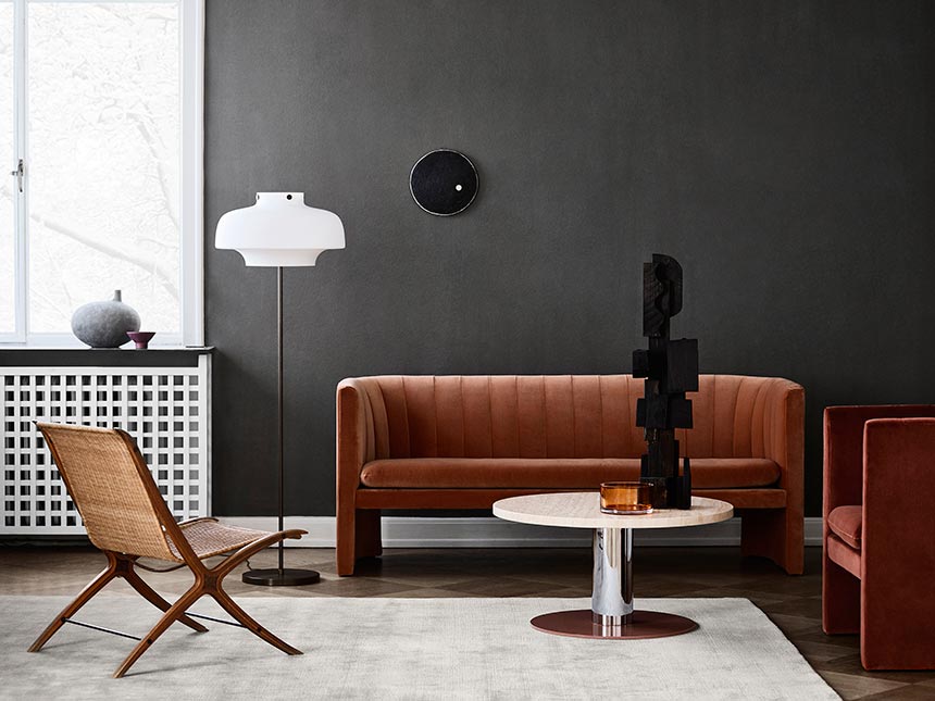
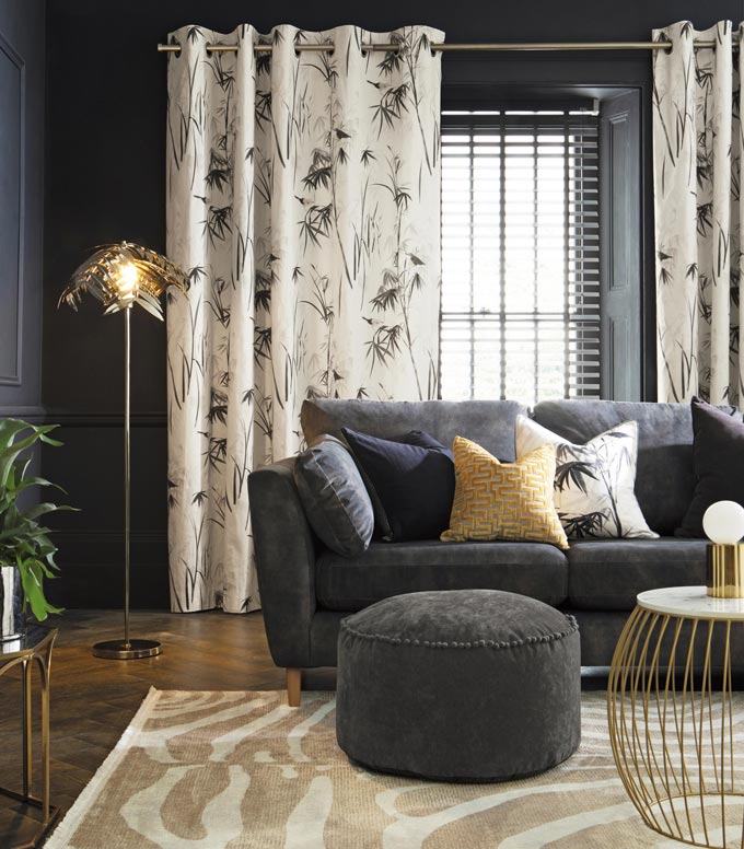
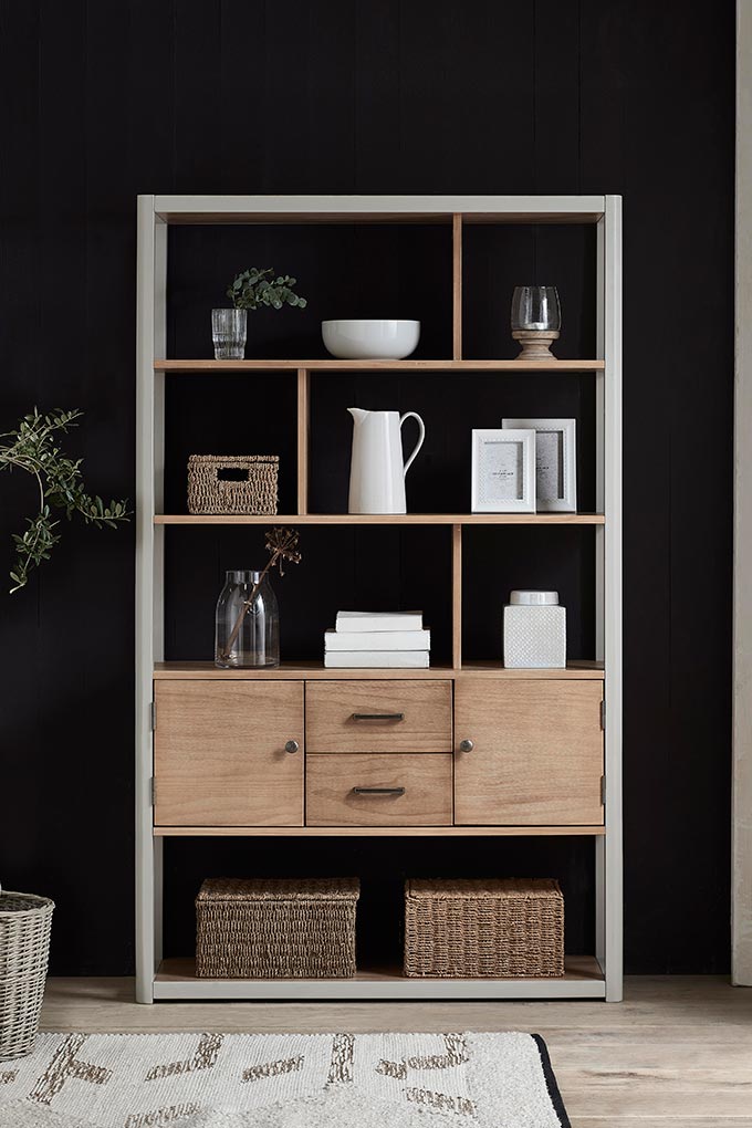
Obviously, white is a bright and light color that reflects light back into the room (up to 90% for those of you who like figures). Thus, it makes sense to go for any off-white color. Yet, going all dark (emphasis again on “all”) is another way to create a strong sense of cohesion, but with a much more alluring feel to it. Still, it is not for the faint-hearted that have commitment issues. So, if you’re not into moody interiors, then stick with a light color palette. (Suggested read on moody interiors: The Eye-Catching Decorating Trend to Love Next).
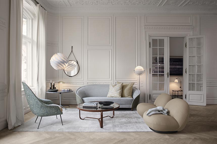
Having said all that, a light color palette for a small space works best when styled with light toned finishes and furnishings too. Strictly speaking of small spaces, keep your contrasts to a minimum, especially when it comes to big furniture pieces. For instance, don’t go for a Chantilly Lace white wall paint and add an almost black, bulky sectional, because all you ever going to notice is that black sectional. Instead, go for an ivory colored sofa or a soft gray one. It will be gentler on the eye, as the sectional will blend better in your otherwise all-white interior. (Suggested read: My Top 5 Benjamin Moor White Paints that work for any room).
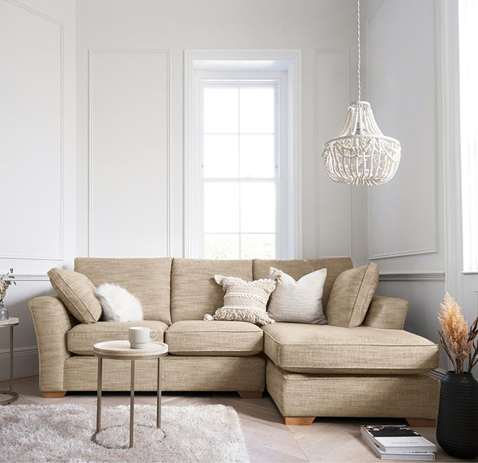
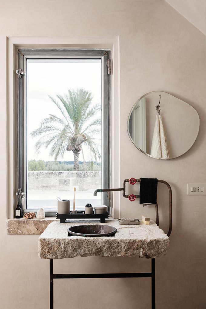
Strong and bold contrasts in a small space interior design result in a harsh effect, drawing the eye upon that one single element thus, “losing” sight of the remaining context it is in. And that’s one thing you don’t want to do. Therefore, aim for soft transitions from piece to piece, endorsing the eye to travel and scan across the whole of the room. Think of tone-on-tone interiors. (Suggested read: How to do the all white interior design).
Reflective Materials
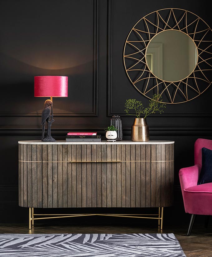
A touch of metal here and there, tables with glass or marble tops and of course mirrors are only but a few reflective surfaces, that will bounce more light into your interior. And more light means a sense of a bigger space. As such, consider your wall/ceiling paints with a high gloss finish, instead of a flat or eggshell emulsion only. You won’t believe the difference that will make. Zellige tiles, brassy or silvery hardware, a crystal chandelier are a few more elements to consider. (Just saying)! 🙂
Small Space Furnishings
When it comes to furnishing a small space, always opt for the most airy kind. Furniture like armchairs, sofas and dining chairs that are not bulky, with exposed legs are the best choices for small spaces. That’s because they appear more light. And naturally, if they come in neutral tones, then you are totally nailing it. (Bonus tips: Also, aim to combine different upholstery textures for that extra punch).
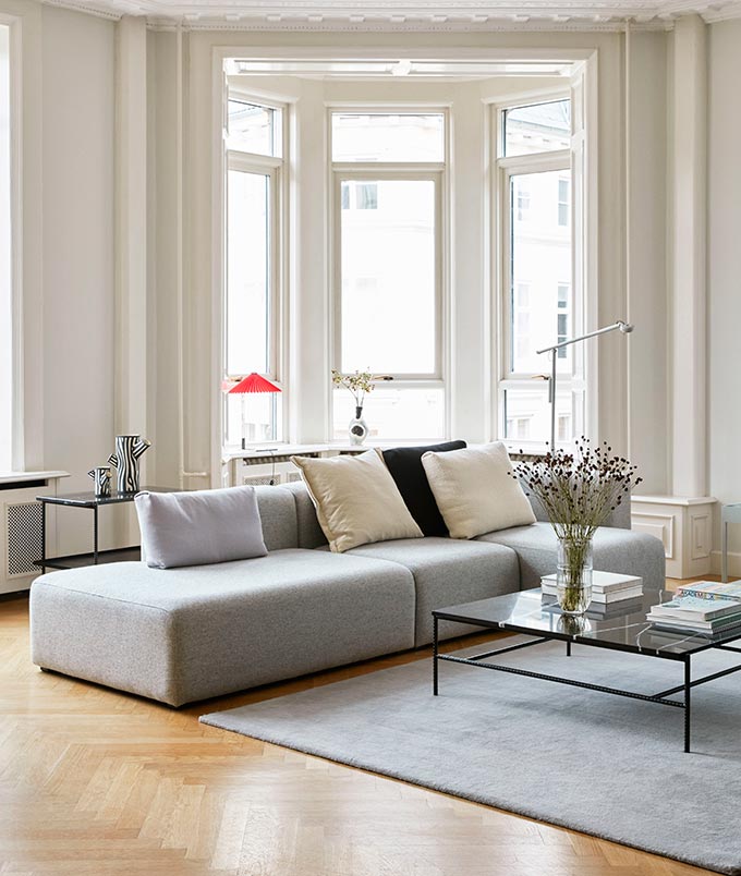
But what about a dining table, you ask. Well, a round dining table, with its organic shape, may very well create a better sense of flow in your small space, take up less space, while adding points to your style. Hence, ditch the idea of that large dining table you have been eyeing. Organic shapes is the game changing factor that you should go after.
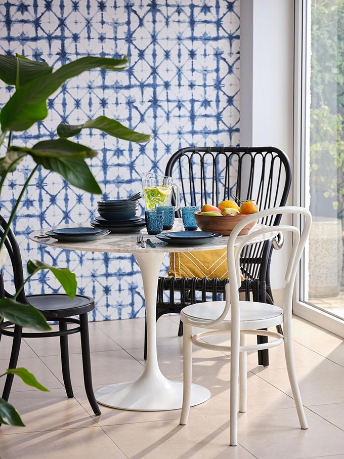
Furthermore, choose double duty pieces that are versatile, flexible and serve more than one purpose. A wooden kitchen table for example may double as an extra piece of worktop when you don’t have a kitchen island. Obviously, any furniture with hidden storage will also come in handy. Also, go for any built-ins that use up vertical space to cover best your storage needs. Thus, it all boils down to making sure you prepare a list of all your needs, do your market research, check their scale and THEN buy.
Invest in Lighting
Now, this next design trick works miracles in any space and is true for any style: invest in good lighting from different sources. And when I say different sources, I mean at least three. These different sources (other than natural light) usually includes overhead and ambient lighting fixtures that create a well lit, comfy living space. Add table and/or floor lamps in every vignette you create.
Additionally, one of best decorating tricks is to backlight if possible any big furniture and/or TV in order to create a sense of a bigger space. To get this right, make sure your light source is hidden! Suggested read: Lights :: The Basics.
Visual Clutter and Scale
If there’s one thing that can hinder the interior design and style of any space (big or small) that’s visual clutter. Hence, it is vital to edit the space and curate each and every piece that goes into its making. Get rid of any/all eyesores – things that no longer please you. Every little thing counts, so keep only the things you love and are proud to showcase. That way, you’ll have the opportunity to expose the best of your furnishing/decor pieces that reflect YOU, while they bring a smile to your face.
Moreover, avoid adding too many voluminous things when your square footage is on the small scale. Of course, adding too many tiny pieces may have an adverse effect too; that may create too much visual clutter and definitely not a clear message. As such, I would advise you to reconsider any of your plans for a wall to wall art gallery. Art gallery walls have a ton of visual weight with a very personal touch too, but they can be quite overwhelming in a small space. Therefore, it may be best to opt for a couple of large pieces of artwork as opposed to several smaller scale art pieces that may end up creating visual clutter.
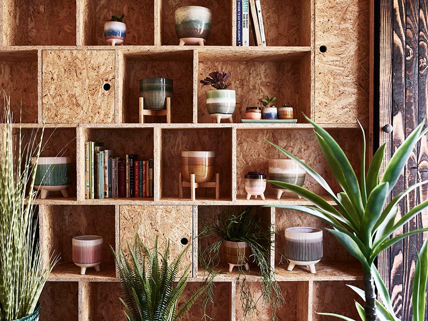
On this note, too many plants or too many decorative patterns (i.e. on sofa cushions) for that matter, can also create visual clutter! I know that many of you may object to this, believing that there’s no such a thing as too many plants…But, sadly when it comes to visual clutter, there is. As much as I love plants, rooms with way too many indoor plants placed in no particular sense of style or thought, can add considerably to visual clutter.
The same applies to too many patterns across a sofa or simply having too many knick knacks. Obviously, I prefer, on any day, clutter from plants over knick knacks. Still, the placement of plants around a room needs some thought into it as to avoid that cluttered-look. Thence, if you are not sure how to go about it then, style them preferably in small groupings (of odd numbers) at vignettes with height variations for visual interest.
Open Views
Sometimes though, simple decorating tricks aren’t enough. Hence, you may have to get bolder and tear down a wall or two. By connecting adjacent spaces and opening up the views, you may in fact make a space feel less flat and visually more interesting. Obviously, the eye will travel across the space for longer and the resulting light flood may save your design intent. As such, glass walls and pocket doors with glazed windows may be a great solution in tight spaces. Something to consider!
Your Takeaways
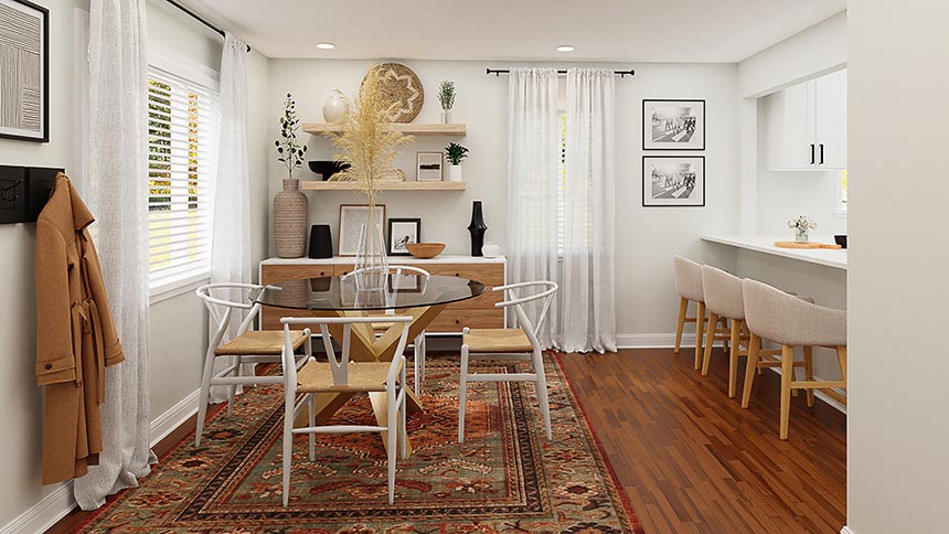
Decorating a house with small square footage can be a challenge. However, with some careful planning ahead, wise choice of materials and good scale furnishings, bespoke built-ins for storage and plenty of light sources you can make a dreamy home, despite its smallness.
- Go for an all-white or an all-dark interior. Treat each room as a single volume.
- Avoid accent walls, but invest in accent (oversized) artwork.
- Go for big, but fewer furniture pieces.
- Avoid bulky pieces.
- Add lights.
- Do away with clutter, especially small knick knacks.
- Use reflective materials, i.e. mirrors.


painting with light color will make any smaller space look good