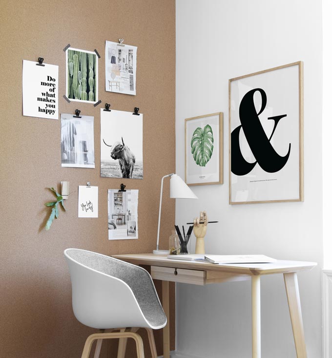
Typography in home decorating is one of many designer’s tools. Typography is a very special art. Whatever the message may be, subtle or bold, a proverb or a motto, typography stands out. That is why almost every interior is embracing consciously more highlights with typography. It is a decorating trend that has a growing loyal fan club and will continue so. Therefore, I’ll dare say it is a macro trend.
Typography makes an impression by definition. The typeface, size, spacing, the mix of colors, intensity, fonts, the fluidity or austerity, the orientation and placement all convey a message, create a mood, make a statement. The aim: to convey a message in an appealing way! As such, it can easily add a sense of style when used in an eclectic way as decorative means. More importantly, typography in home decorating can add a very personal touch in any interior, especially when it is a message or a quote that is of meaning to you.
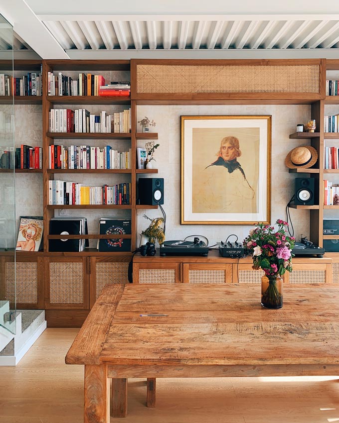
The living space below is a wonderful example of how typography in home decorating is used on the spines of the books creates a more whimsical vibe in this bookcase and combines with the grave looking portrait in the middle. It all creates a cohesive ensemble with a cozy feel to it yet, interesting and casual.
Typography as a decorating element
Typography highlights may be small and subtle, i.e. a cookie jar with a label or big and bold as a furniture piece, i.e. a coffee table or a chair. You may even use a stencil kit to add your very own typography touch to your old coffee table or your bed’s wooden headboard. I haven’t actually used such a kit myself yet, but I’m seriously considering it. (If you have used one, please share the details below in the comment section).
The main thing to keep in mind is that typography may emphasize and complement a space in a most appealing way, as long as you keep a balance. Too much of it and it can go seriously wrong, resulting in dressing-down your space. That’s definitely not something you want. And you can easily go overboard with it. Therefore, balance it out with some negative space and a lot of artwork to keep it looking more edgy. An analogy to keep in mind as a rule of thumb is three to one (3:1) or higher.
Placement
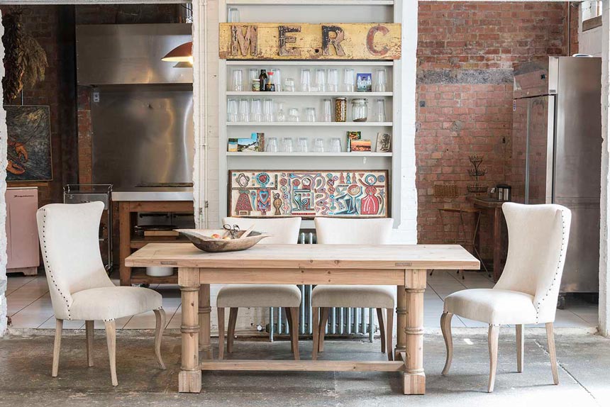
Moreover, I think that its placement is of great significance for it may add on or take away from the design scheme. For instance, typography can look exceptional in a bookcase (you could read my tips on how to style a bookcase here). But, it can also look flashy or cheesy and so it has to be used with caution.
Design Weight
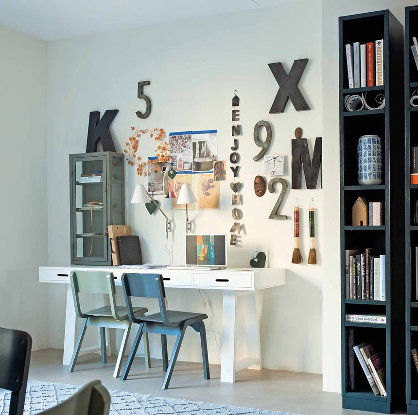
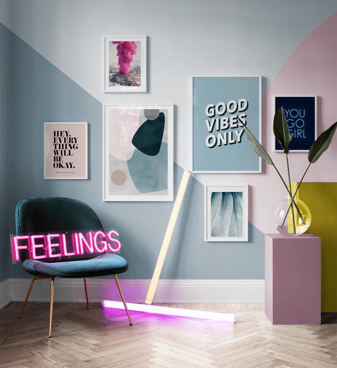
A quote or a decorative letter sign don’t have the same design weight. A quote tends to have less design weight and therefore, I would restrict it in i.e. bedroom. A sign letter with lights though, usually carries more design weight and hence, I would consider using it in a contemporary living room.
The “copy-paste” approach
As a matter of fact, there are many examples judging from numerous Pinterest images with quote imagery for instance, used to style a space that look a bit dull and boring (putting it politely).
The worst part of it though, is that it looks like a “copy-paste” approach, and that strips of any magic found in the uniqueness of typography! And I blame greatly the same type of framing seen everywhere for this wrong vibe that these quote imagery prints give out. So please think it through again…
Since all it takes is to frame your favorite motto in a large print to add that personal touch, please do consider carefully your framing! IKEA type of black frames i.e. RIBA, may look great in a bathroom or a bedroom, but not necessarily in your living room – for they lack depth. And depth is one of the design elements that adds dimension and aids in a good design flow.
Yours,

Last update: 12/30/2019