Hello everyone! Fall is officially here; and the sunsets lately in my part of the world have been nothing less than glorious, with stunning gradient hues of blush pink, peach, and rose quartz layered along the blue ones. Those neutral shades of pink are priceless filled with a strong sense of hope ‘that everything will get better, for tomorrow is a new day!’ So, it’s no wonder that I’m in a pink mood and chances are, that you’ll be as well after reading this post. I have to warn you that it’s a contagious condition. I made a pink moodboard that draws inspiration from nature, every day life, interiors, foods and anything that deserves to be pink. Because, pink is never just a color – ‘it’s a revolution!’

I don’t know about you, but blush pink with its dusty pink hue first crept in my vanity make-up case, flushing my cheekbones. Then it crept into my wardrobe with several tees and sweats to account for. Next, it crept into my interior despite my husband’s contrary stance, but to his delight, it looked modern and fresh.
So, I think it’s pretty safe to say that pink permeated into our lives, brightening it effortlessly. It certainly won me over, despite the fact that I was never into it. But here are five reasons why we should all love pink:
- it’s flirty,
- it makes us smile,
- it’s around us even if we don’t take the time to notice it (including the sunrises and sunsets of our days),
- it’s neutral,
- and despite popular belief it’s not a ‘girly’ color. It’s an earth color with an understated appeal, no seasonal borders, highly sophisticated with a modern personality and a timeless quality to it.
It’s no wonder that Pantone announced Rose Quartz (13-1520) as the color of the year 2016 along with Serenity (15-3919) and to be honest, I don’t think that we’re done with it. As a matter of fact, we’ve just began to appreciate its beauty and integrate it into our decor. Enough said though: time for my blush pink moodboard inspiration as promised!

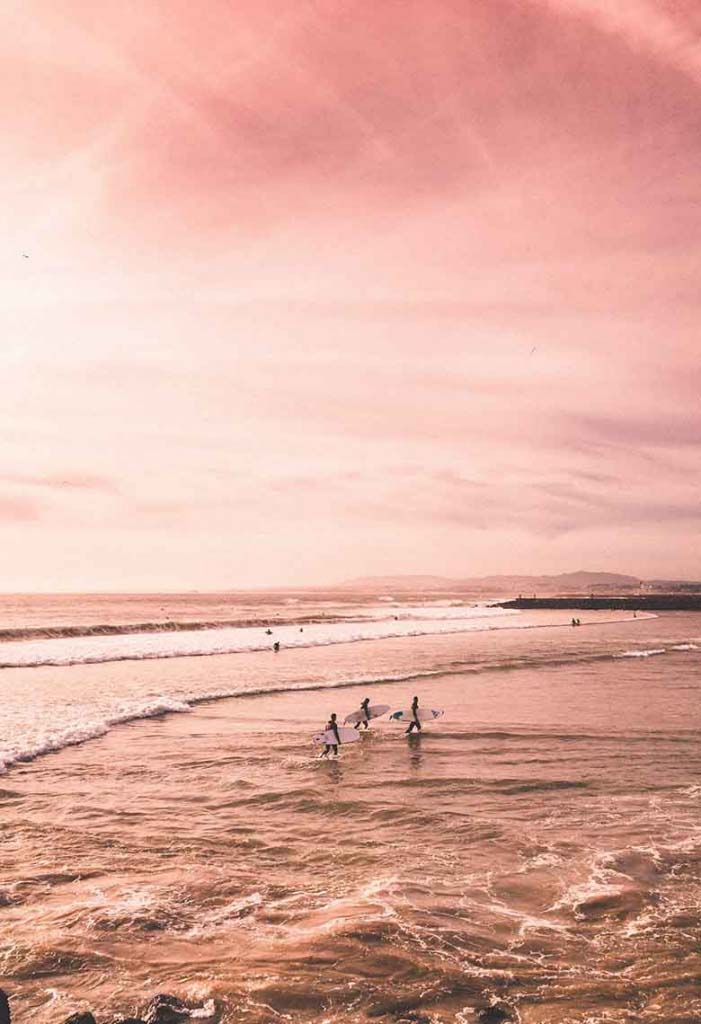

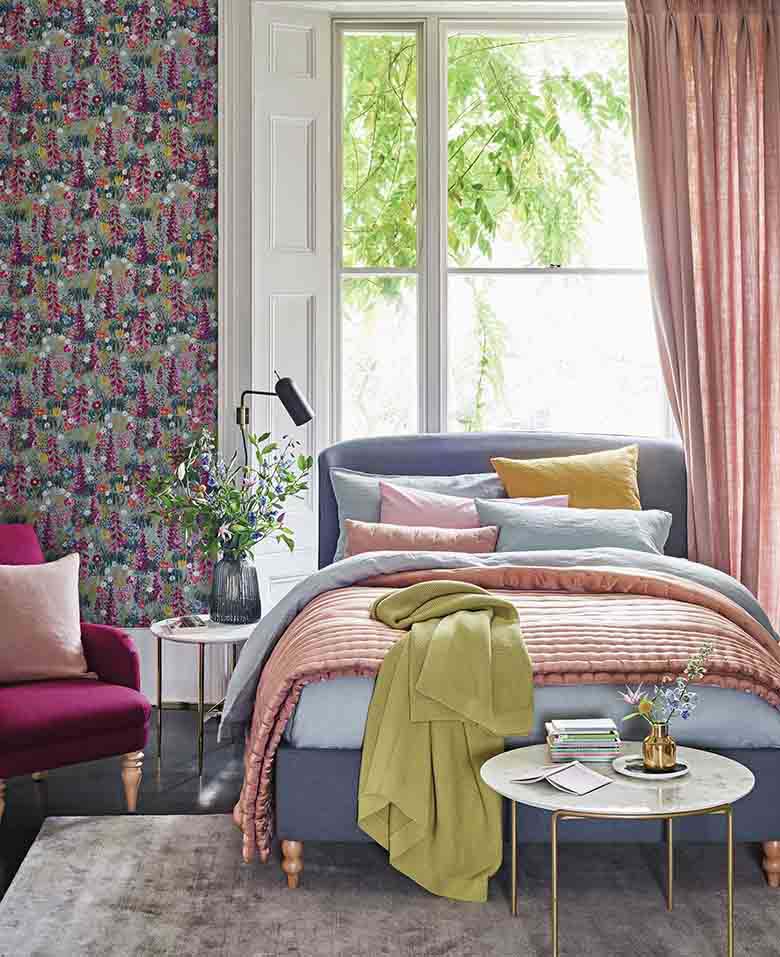
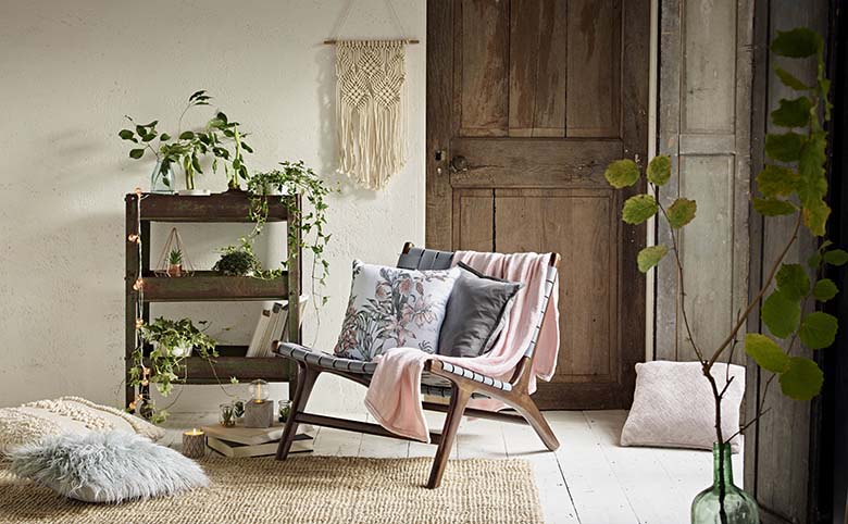
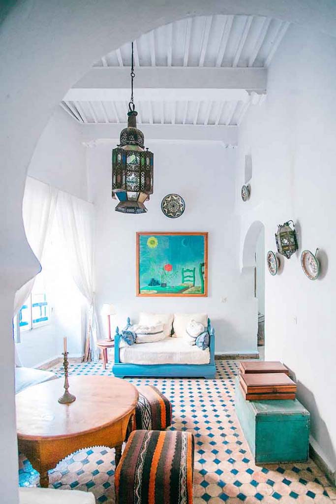
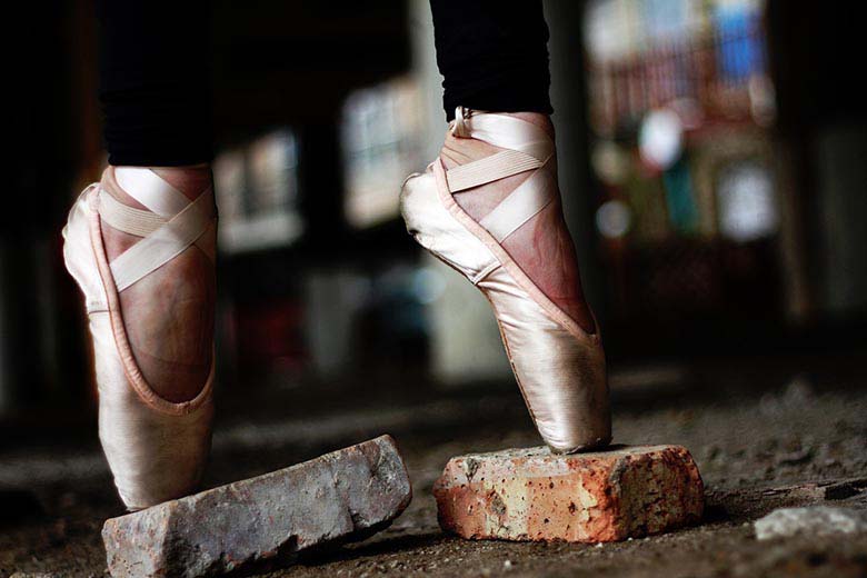
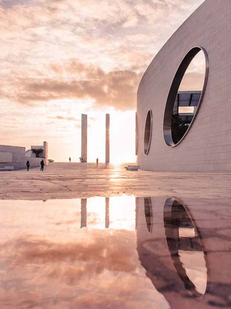

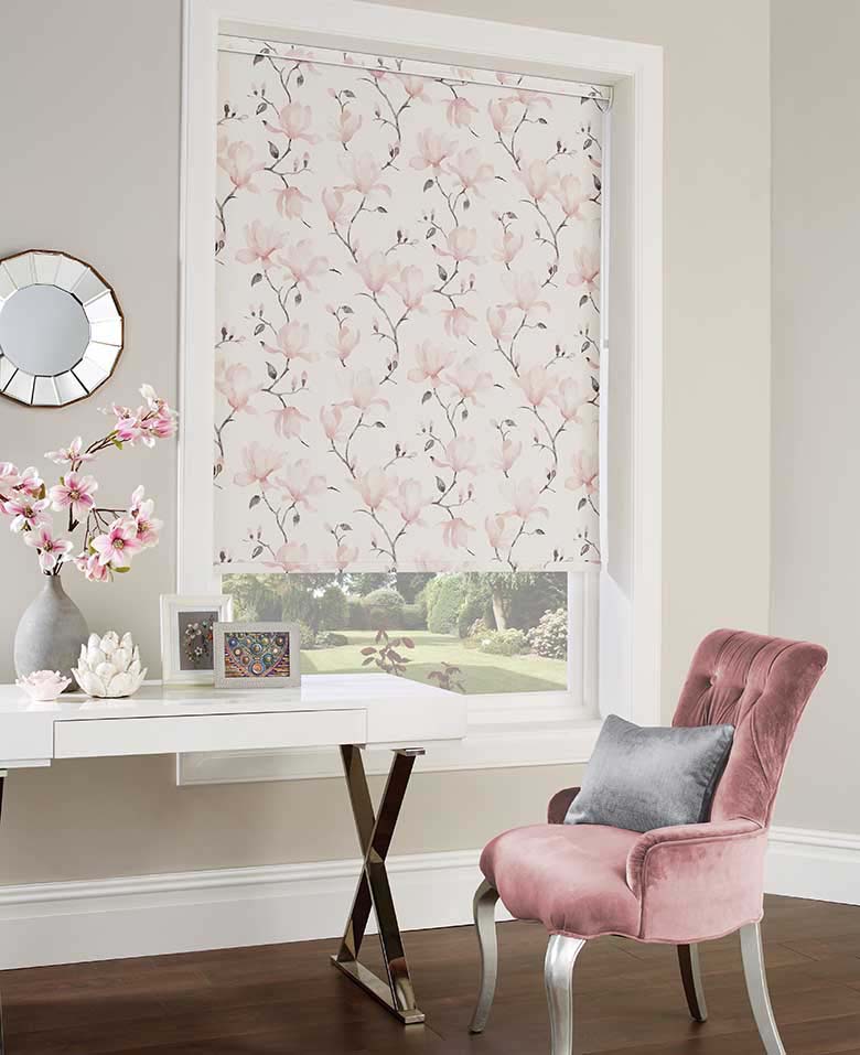
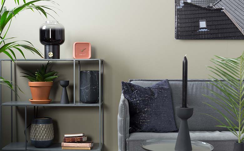
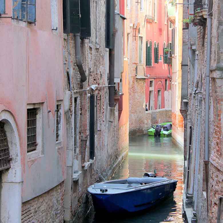
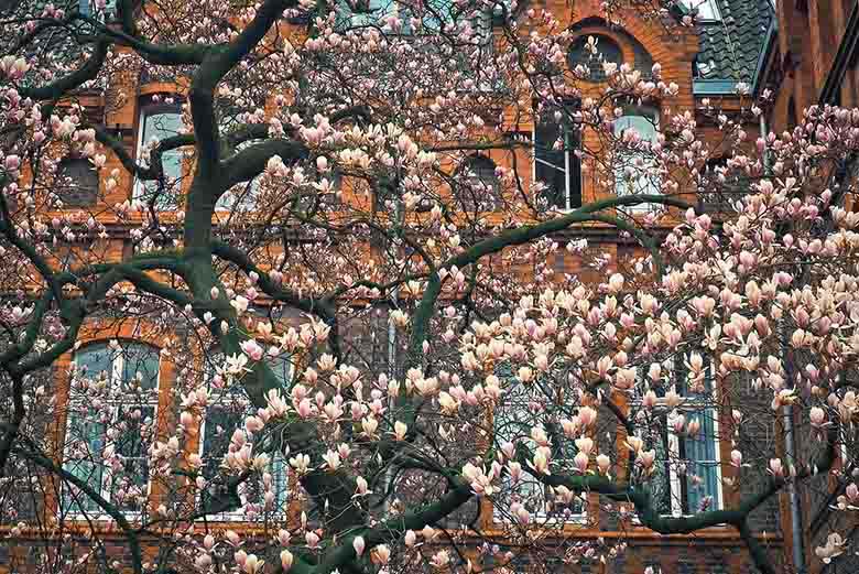
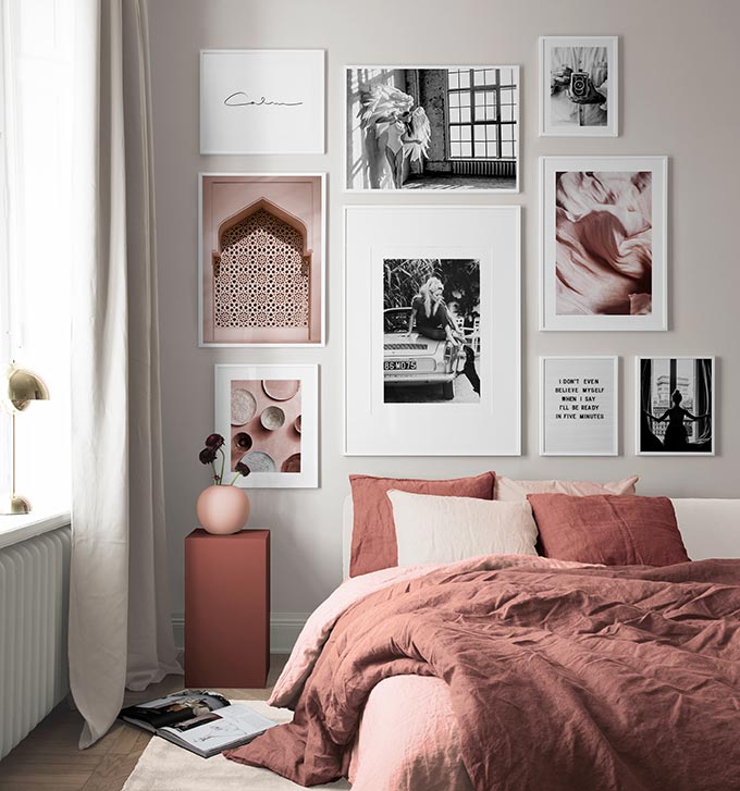
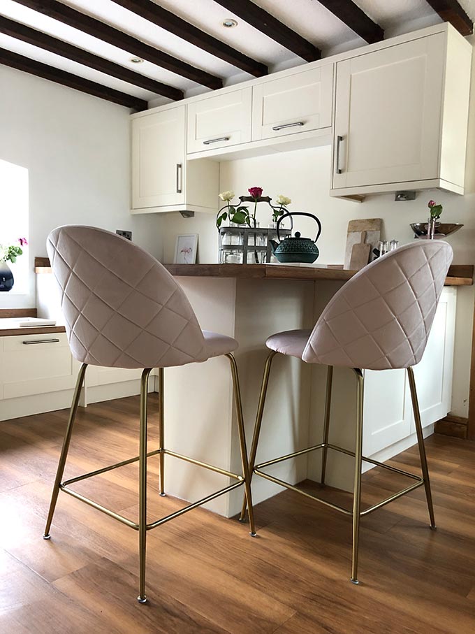
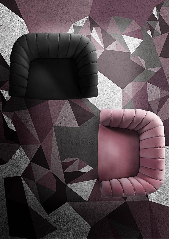
Wasn’t this pink moodboard fascinating? Did you notice the subtle impact of pink in the interiors? Or the abundance of pink in nature? I’m sure that there are probably a million more reasons to embrace pink in our lives. I’ve only managed to show you but a few. Personally, I love combining it with other neutrals to make a more elegant ensemble. However, it can certainly vamp up a space in a pop kind of way if you combine it with a cheery color like bright yellow or orange.
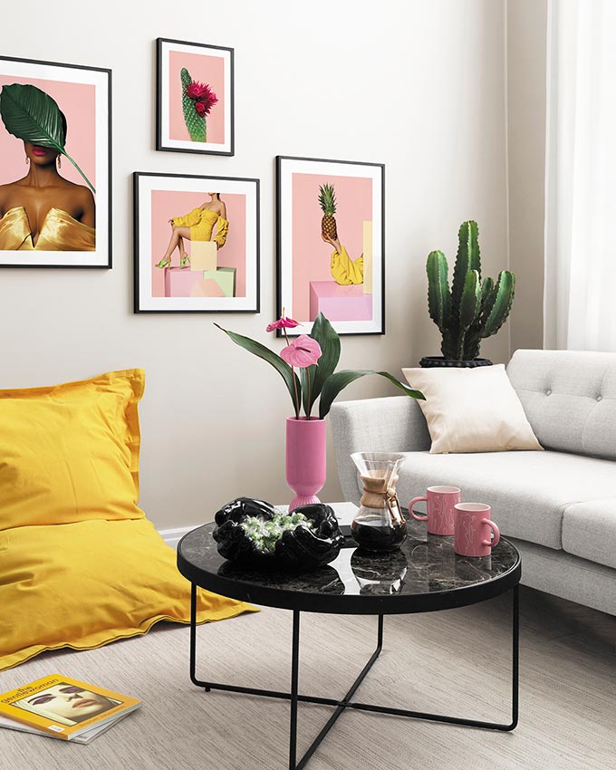
There was a time when pastel colors, including pink, were cast aside. People opted something more vivid and intense or moody. But, since everything goes around in circles, pastels have resurfaced and have gained their popularity once again these last few years, trending in both the fashion and design industry. Besides who said that pink can’t be moody?!
Is it a ‘romantic’ color? Sure it is! But positive thinking and being hopeful are also ‘romantic’ acts and I don’t see anything wrong in that… So I think a little more pink is a good idea! Let me know your thoughts on this…
Stay inspired, xo

Last update: 06/30/21
Beautiful pictures and once again great article!!!its definitely changed my mind and view of Pink, thank you