Just the other day, I stumbled upon a hardcover book by Carlos Mota: Beige Is Not a Color. The title alone of this coffee table book is super catchy AND admittedly, it is backed-up with some great imagery of colorful interiors. Yet, I could not disagree more with it. And that’s because I’m fairly certain that beige is one of the top three most popular wall paint colors ever! Especially now, that beige is back on the trend-wagon. But here’s the thing: not every beige will work for your room. And with so many different choices, where do you even begin?! No worries! Today, I will share with you my top 5 beige paint colors for your walls that are anything but dull and boring. I have used them on repeat in client projects, therefore, I’m confident that they will get out of this decorating jam.
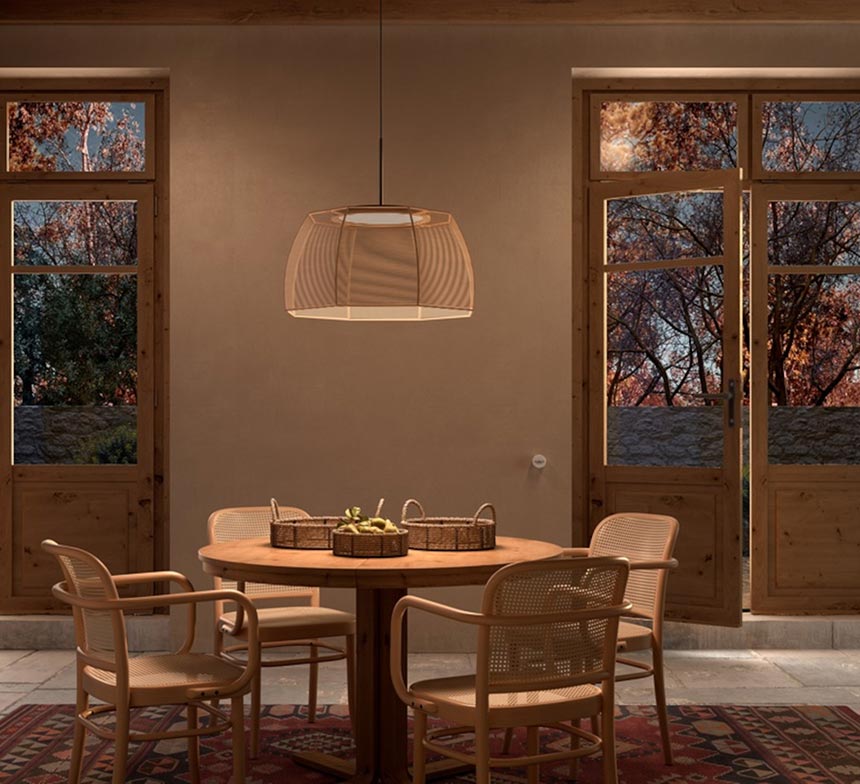
Your room’s orientation and amount of light are certainly two of the largest factors to consider in making the right choice of beige, or any color for that matter. Moreover, the size and position of the windows affects how a color is experienced. Likewise, any surfaces that bounce the inward coming light end up having a say in it, too. And as if things weren’t difficult enough, the materials and any decor pieces you have within your space have a direct impact on the wall paint hues you choose as well. Having said that though, there are some “safe” choices when it comes to white and beige hues. (Here you’ll find My Top 5 BM’s White Colors).
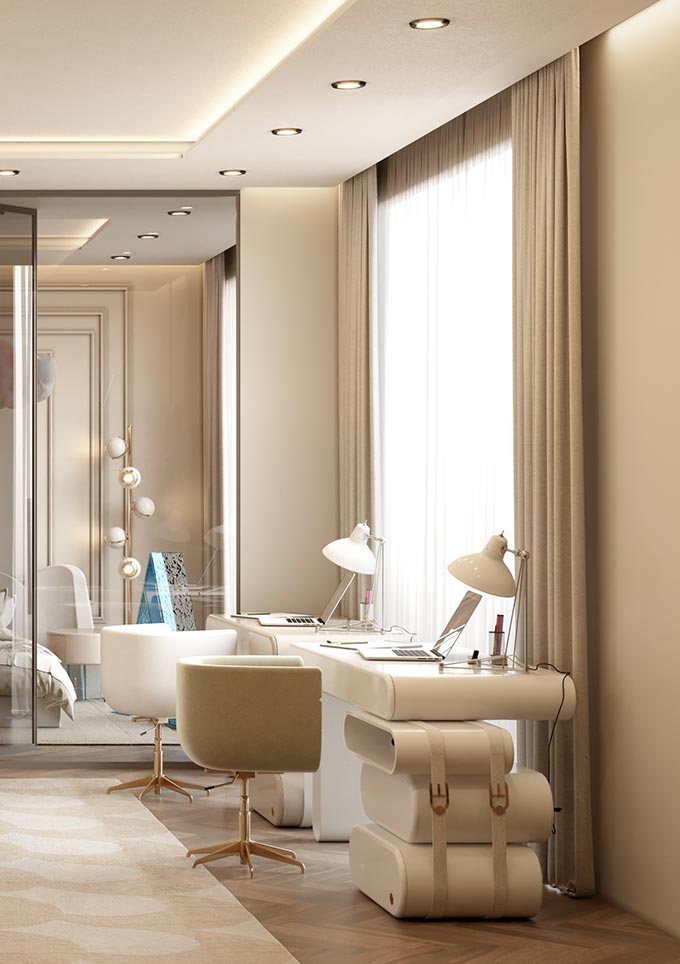
In fact, a color’s LRV (light reflectance value) is a good starting point when you begin considering your options. What is LRV? LRV put simply, is the percentage of light a paint color reflects when illuminated by a light source. Thus, the higher a color’s LRV, the brighter a color appears, for it reflects more light. To give you an idea: many off-white hues have an LRV that ranges from 73 to 92. And to put this into a perspective, the average magic LRV for almost any room is 62. So anything higher than that means that you have a color that reflects more light. Hence, for a dark room, it is safer to opt for a hue with a high LRV to compensate for its lack of natural light.
So what about beige colors?
Beiges, including tans that tend to be more muted, are generally warm hues with a somewhat golden appearance. Their LRV ranges from roughly from 49 to 76. Therefore, there is a wide spectrum of beige territory to cover. However, over the years, I have narrowed it down to the most soothing, calming and natural of their kind, that will not go too orange-y or worse make your space look dated and flat.
My Top 5 BM Beige Paint Colors
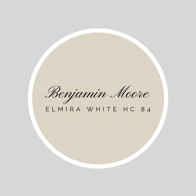
Surely, BM Manchester Tan HC 81 is one of the most popular beige hues, but not mine! Yes, it is a warm, deep hue, with a slight green undertone that works great with yellow-ish toned woods too. Its LRV is 64.41 (close to the magic mark of 62). However, I prefer BM Elmira White HC 84 (LRV=65.37), which belongs to the Historic Color collection. It is a warm creamy beige with grey taupe undertones and as such, I find it more poised and up-to-date. Therefore, BM Elmira White is on top of my recommended beige hues.
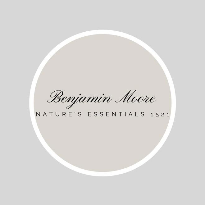
Another absolute favorite and for good reason, but perhaps not as popular, is BM Nature’s Essentials 1521. It is a fantastic neutral beige from the Classic Color Collection with an LRV 66.26. Although, it is quite pale, it will not go flat on you – I swear. It’s not too gray, or too pink. It is probably the most versatile beige hue you will ever come across, that will sing under any light, especially in an open space plan. So, if you are considering a beige wall paint for the first time then, then this is the best one by far!
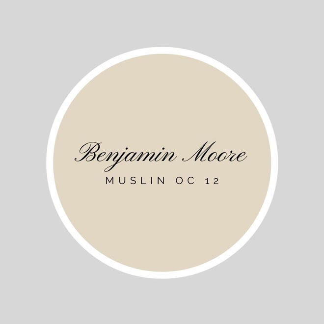
BM Muslin OC12 (LRV 67.85) on the other hand, is a warm beige with a more golden appearance than BM Nature’s Essentials 1521. Muslin OC12 is a classic warm neutral beige; it has an orange undertone with a slight nod to pink, making it more flexible than most traditional beige colors. However, avoid pairing it with colors that have yellow undertones to avoid the unfavorable contrast between pink and yellow.
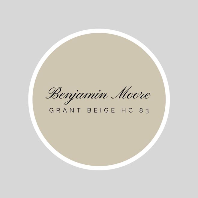
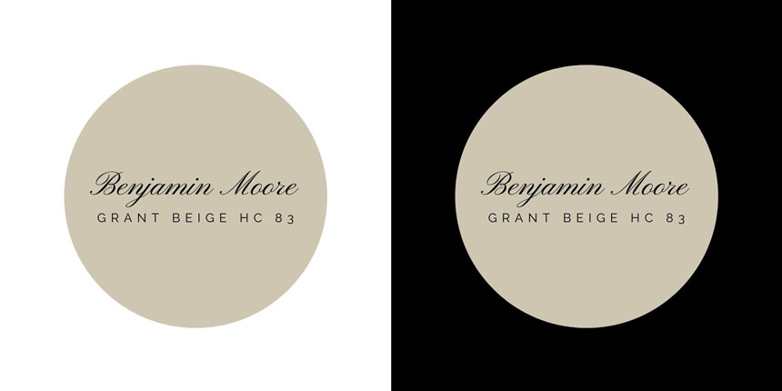
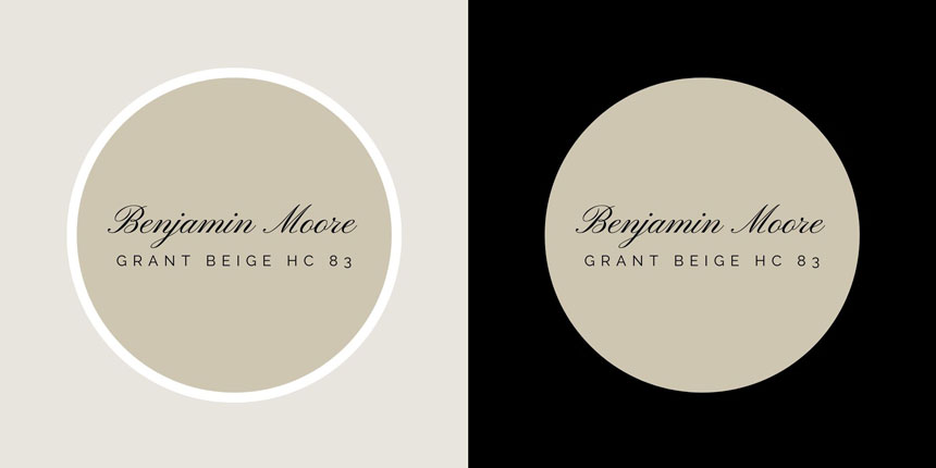
Diving deeper into the pool of beiges and my next favorite is BM Grant Beige HC 83 with an LRV 56.65. Some may mistake it for greige (perhaps because of its minor green undertone), but it’s not. It is a beige with depth and poise. It is a fabulous paint color for living and dining rooms. Moreover, it makes the perfect deep, warm backdrop for artwork displays, in case you have/or considering an art gallery wall.
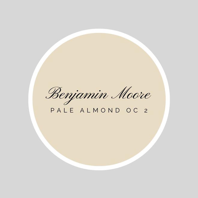
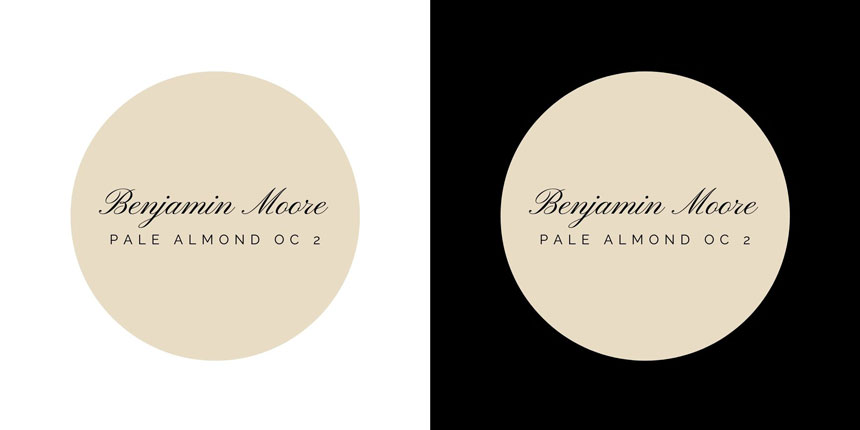
The fifth beige wall paint color is BM Pale Almond OC 2. It has an LRV of 71.17 and it is a warm, neutral beige that will bring any north facing room to life with its glow. Personally, I have recently used it as an accent backdrop in a corridor of my own home, but I wouldn’t hesitate using all it over too. It is the kind of beige that looks good with both light toned and dark toned woods. That’s how good it is.
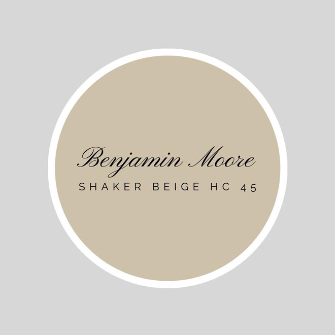
Lastly, I’d like to mention that I’m also a fan of BM Shaker Beige HC 45 (LRV 54.61). So, I’m adding it on this list as a bonus. It is righteously one of the most popular BM beige colors, for it is a warm mid-toned tan that won’t fail you, with a slight orange undertone.
Each and every one of these colors may be paired with other off-white (or off-black for that matter) colors for any trims that you may want to differentiate. BM’s Simply White, Dove Wing and Sea-pearl are just three amazing off white colors in your arsenal to consider.
Building a Beige Color Palette
Having said all that, I want to make a point about how a color “reads.” You see our perception of a color’s intensity and/or depth relies heavily on how it is integrated within a color scheme or palette. Is it the primary color or simply a complimentary one? Is it used as an accent or a backdrop? Is your furniture’s color palette or wood tones compatible with it, or not?
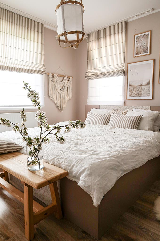
For instance, let’s take an arbitrary closer look at Pale Almond OC 2. As I mentioned earlier, it is the kind of beige that can look good with light toned woods as well as dark. Grant Beige HC 83 on the other hand, looks better with dark toned woods and the reason being for that is that it is a much deeper beige with a significantly lower LRV.
Thus, the takeaway advice from this simplified analysis is that, the more saturated a color is (deeper with a lower LRV), the better it will match with other dark tones, moody and saturated colors. Hence, beige colors will look their best in a color palette made of other earthy tones, nature-inspired, organic colors and when paired with colors of the same color family their undertones belong to.
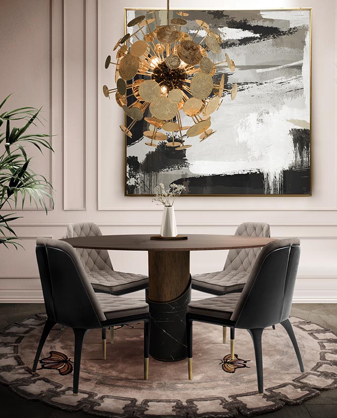
Along these lines, when building your color palette select a beige that means something to you, i.e. the sandy beige of your favorite beach. If for example, your beige has a red undertone to it, then you can surely add a red accent color on to your palette too. And along with that red accent you can surely add on a range from the red family like rusty and terracotta hues.
Thus, let’s recap this: All neutral colors are a no brainer add on colors to your palette (including white, greys and black). Moreover, almost all jewel tones like greens, reds, mauve, navy blue, mint, teal and mocha colors are some of my favorite go-to color additions/accents. And in order to keep it all edgy and up to date, remember to add texture, pattern and inky stains for definition!
Sincerely,




2 comments