One of the biggest ever questions I get from clients is about ‘which color should they choose.’ It is clearly a matter of great concern that comes with a load bearing stress. Indeed, choosing the right paint color shade for a space may prove to be a challenge, but let me assure you that it doesn’t have to be so. There are some basic principles that you need to bear in mind that will guide you in making this decision a lot simpler. Therefore, today I will share with you those principles along with some tips, that will surely fill you with confidence in choosing the right paint color(s) for your space.
Orientation and Natural Light for Finding the Right Paint Color
Natural light is the one thing that everyone appreciates. It has profound effects on our wellness, our productivity and of course of our perception about our surroundings. But not all light is the same. Our actual perception of natural light depends upon orientation and the variable of time. So to begin with, it depends on which hemisphere you live in. Since I live on the Northern hemisphere, I will be discussing sun exposures based on this orientation. However, the opposite will apply to those who live on the Southern hemisphere.
Generally though, when living in countries like the UK, Sweden, and Canada to name but a few, the daylight is more dull and gentler compared to countries in the Mediterranean where is light is very intense at times even in winter. Long-term exposure to this intense light has detrimental effects, which leads people to take compensating measures in an effort to prevent those effects.
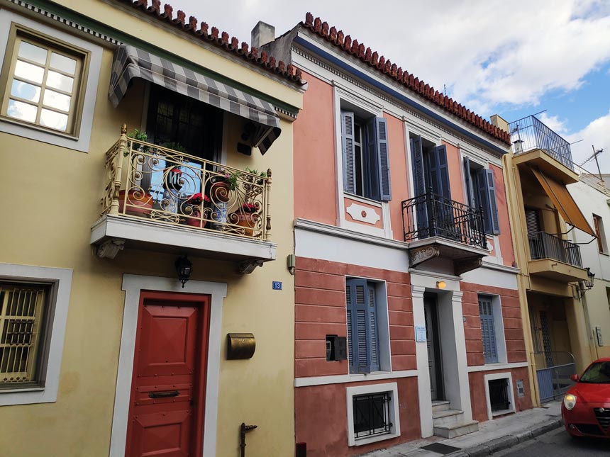
Having shutters and window treatments in any Mediterranean house is compulsory. Moreover, many homeowners resolve to awnings and canopy installations to reduce further those effects. As a matter of fact, drapery on windows that are exposed to such intense light over a length of time may become thinner and eventually get torn to shreds. Literally! Discolorations and color fading are also a very common side effect that may extend on anything from hardwood flooring, area rugs, cabinetry and furniture that are exposed to direct sunlight and even on to external facades.
This is one of the reasons why Greek homeowners for example prefer light color shades over dark ones. Especially in the olden days, paints in dark hues performed very poorly under this intense light that tends to also amplify any imperfections.
So, knowing your orientation on the globe is your starting point. But knowing the compass orientation of a home is next and it is also of vital importance. As such, I will explain the different sun exposures, for each exposure has its own distinct traits and personality.
Sun Exposures
Northern Exposure
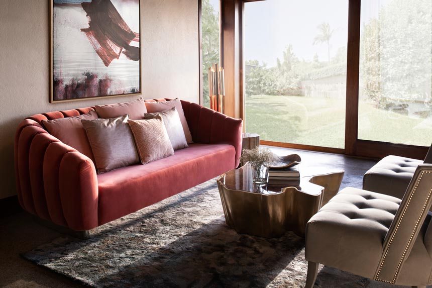
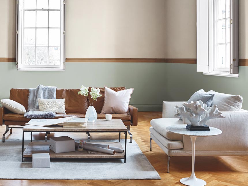
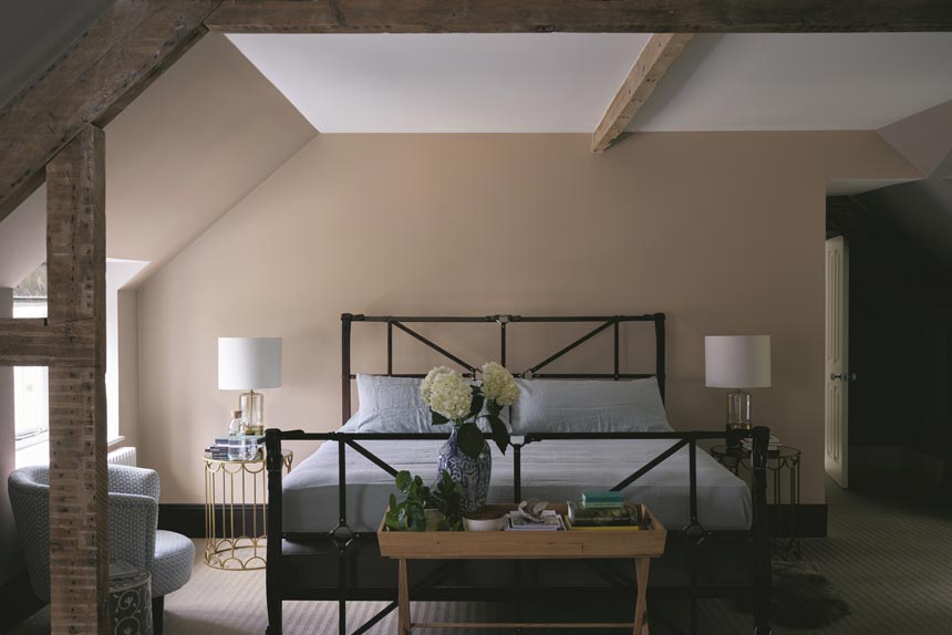
North-facing rooms are the darkest. The light is softer, uniform throughout the day and neutral for most of the year, never too harsh or too dull. The effects of glare are minimal and the shadows less harder. Colors in these rooms appear much cooler on the color spectrum. Hence, a room with a northern view can handle equally well dark, saturated colors as well as warm, organic hues.
Southern Exposure
South-facing rooms are the sunniest and brightest from late morning to mid-afternoon. They get the most sun exposure and are hence, the warmest. The light is also uniform and solid, but the shadows are significantly more crisp and hard. The closer you are at the Equator, glare tends to become an issue and awnings may be the most viable solution. The light in these rooms intensifies hues.
To be honest, I have seen a clash of opinions from designers about which color palette works best for southern views. From personal experience though, I recommend to stay clear from dark and deep saturated hues for the result is overwhelming. I think pops of color accents work best when combined with a softer palette, creating a more balanced effect. Earthly, warm tones also compliment in a great way a south-facing space or facade for that matter.
Eastern Exposure
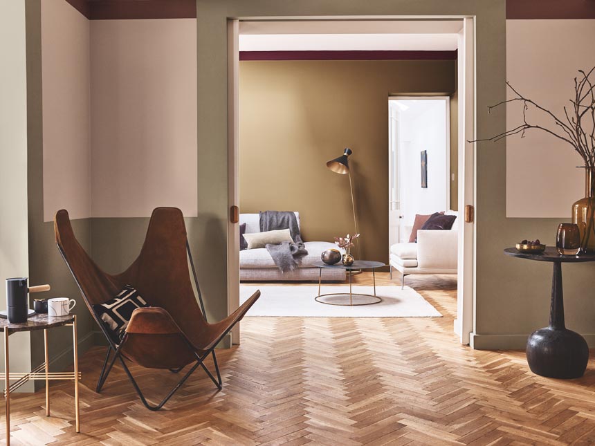
East-facing rooms are obviously brightest in the morning. The casting light has a low altitude, with a gradually varying intensity, casting long softer shadows. It works fine with a saturated palette and therefore, I would personally consider introducing an accent wall or feature. It is also the room that goes dark at a much quicker rate than others. Hence, a warm color palette can make wonders.
Western Exposure
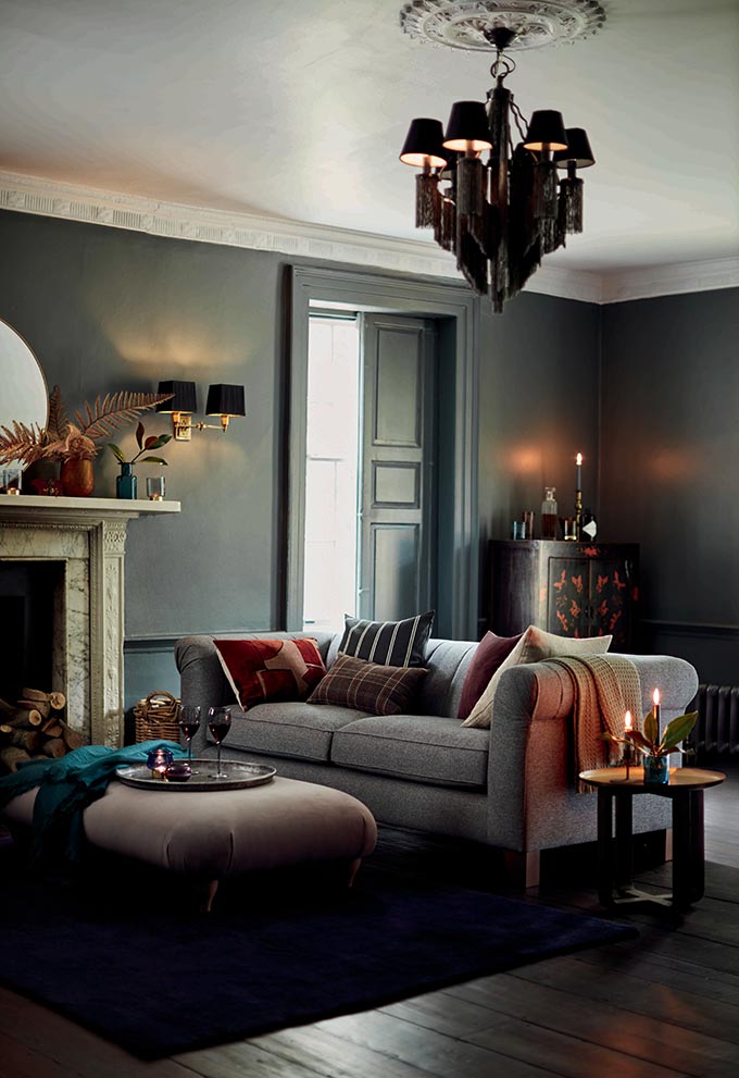
West-facing rooms are flooded with rich golden orange hues from the late afternoon and early evening sun. Just like the light in east-facing rooms, it has a gradual varying intensity casting long, but hard shadows. It can be quite overwhelming, especially during the summer.
As such, during those sunset hours, cool tones look best restoring a sense of balance. If however this room has a morning use then you could always risk going for warmer tones.
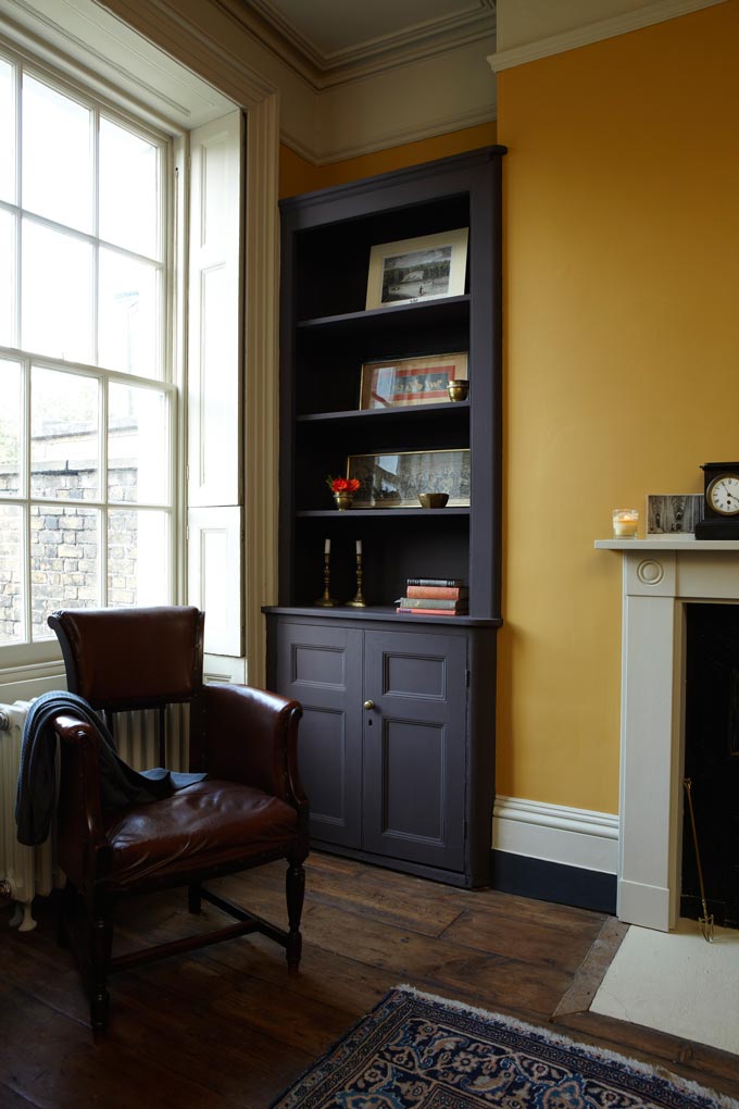
Cupboard: Mahogany, No, 36, Dead Flat. Ceiling and coving: Hardwick white No, 5, Dead Flat and Old White, No 4, Dead Flat.
Tips to Remember on Finding the Right Paint Color That Will Balance Out Natural Lighting
Color is the perfect way to highlight any design scheme. Therefore:
- Work with what you got.
- Pin point the orientation of each room and how many hours you spent in it based on its primary function.
- Define which colors you feel most inclined to and most comfortable with and assign a basic color for each room. Then, decide depending on the orientation of the room if you should go for a lighter shade of your color choice or a darker one. After all, colors come in many shades (gradients) as a variant of their undertones.
- About choosing the right paint color: When looking at a color book, make sure that you view colors on a bright day with natural light. Check to see how the color appears both outdoors and indoors (under direct sunlight and under the shade, but make sure you let your eyes adjust for a minute or two first). That will give you an indication of how the color will render with respect to different seasons (i.e. winter/summer). A color placed on a wall opposite a source of natural light, i.e. window, tends to render its true hue as opposed to its render if placed on the same wall of your window. Similarly, color appears a lot brighter when near the light source as opposed to a far away corner.
- Colors on walls appear different than colors on a ceiling. Usually, when painting a ceiling a color it will render a shade or two darker than the color book.
- Also, some surfaces reflect more than others. Therefore, a reflecting surface like a white marble floor may render some wall colors differently giving them a wash-out kind of effect, so do expect ever so slight variations with the color book.
- A great way to manipulate color and light is color blocking. When your color of choice tends to create a feeling of being over-the-top because the light is too overwhelming, then you could lessen that effect by introducing more blocks of solid colors at strategic places to restore balance, while creating focal accents at the same time.
- Last, but not least opt for quality paint colors. They perform best and hence, save you lots of money in the long-run.
There’s no doubt that the abundance of natural light is one of the biggest attributes to a home. But then again, so is good use of color. Fear not to go bold and stray away from the typical off-whites, as long as you follow the guideline and tips above for finding the right paint color. Should you need any assistance, feel free to send me a message. Finally, I recommend that you take a look at this Psychology of Colors pin portraying colors and their attributes.
I hope you have a great weekend. It’s going to be a long one for us here in Greece, yay…!
XO,