Hello there! Are we all back, looking forward for a dynamic 2018? How was your holiday break? Mine felt too short, but I tried to make the most of it, because every day is a gift. So let’s hit it! My first post for this year is all about Pantone’s Ultra Violet that seems to be causing a ruckus. I guess it startled a lot of people, but then again Pantone almost always causes a stir in the design industry; at least ever since 2000 when they first began announcing their chosen “it” color.

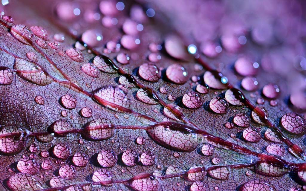
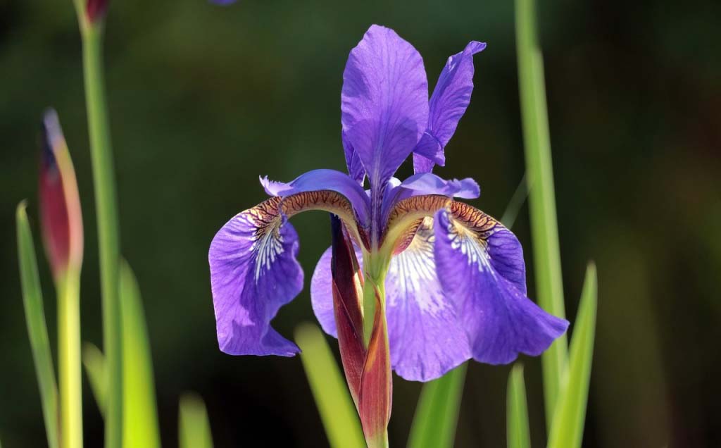
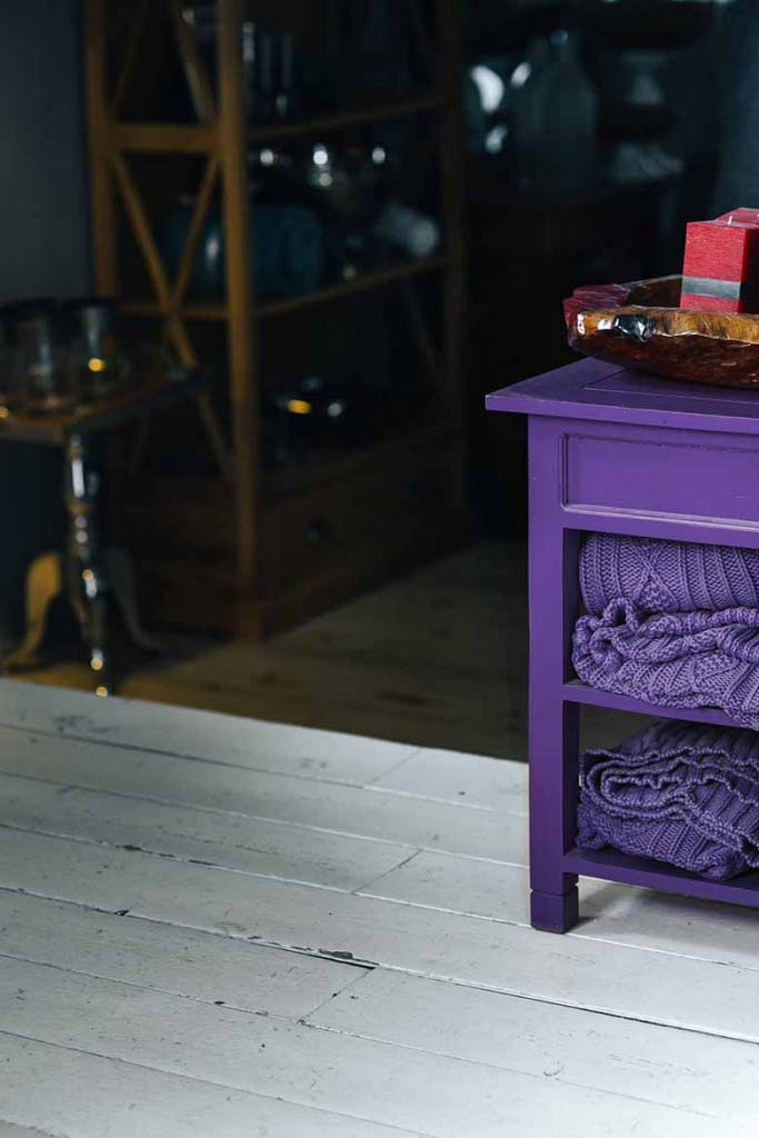
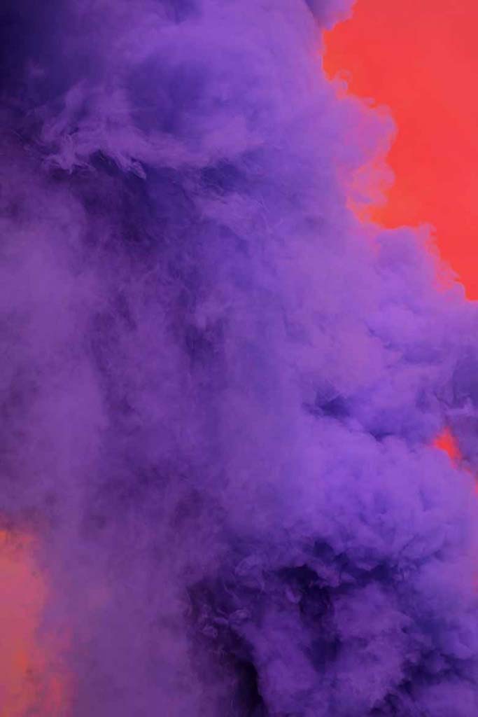
1/2/3 Photo by Camille Couvez on Unsplash/4

The truth of the matter is that last year’s Pantone’s color choice, Greenery, had just began to grow on us. Although, green is such a familiar color for it can be found so abundantly in nature, it wasn’t the easiest of colors to exploit in a room’s interior walls. At first I was thinking that it is a color that would work great in a kid’s bedroom or for a statement kitchen. But it was so much more than that. It embodied our need for a greener urban reality. Naturally, over time we embraced it a whole lot because of its fresh quality. It worked wonders as a pop of color in textiles, or a wallpaper and even as part of a color blocking scheme in every possible interior. We grew fond of it, despite the initial hesitations. So how will people react to this year’s color? My hunch is that we’ll love it, too. So it shouldn’t come as a surprise if it takes over everything both in the fashion and design industry.

Dreams are made of this beautiful blue based purple. It has an ethereal, out-of-the-world quality to it just like a starry night, so when combined with metallics it will shimmer. Moreover, it’s moody, mysterious and signifies non-conformity with an inviting boldness. As such, it can be a great inspiration source and combining it with other colors is a lot easier that expected.
For starters, it works beautifully with green (last year’s color) especially on a white or black background. Yellow, it’s exact counterpart including its various shades, can really give an upbeat punch making it a very attractive combination with a modern edge to it. For a polished, tone-on-tone room interior add more blue elements. If you’re feeling bold but you love a classy design scheme then blend it with a warm red. And, finally for a moody yet, elegant room interior, simply combine it with teal and dusty pink hues (just like in the top image).
Did you notice anything about these color combinations? Of course, you did! All these colors have all been on the scene one way or another, earning their share of loyal fans. So the way I see it, correct me if I’m wrong – ha, ha, purple just filled in a void.

Now Pantone, being the global force in color strategy that she is, got all her bases covered with an inspirational marketing move by creating first a deep purple hue called “Love Symbol #2” in honor of an international icon, Prince just a few months ago. (Remember Purple Rain performed by Prince?) That definitely set the mood for this year’s dedicated color announcement while it paves the establishment of their new color! Ingenious or what?! 😉 That means that even if the ultra violet color is not your shade then you can opt for the deeper shade, love symbol #2 or any of the ones in between and still be trendy!


Purple happens to be one of my favorite colors (as a matter of fact second best to blue). I currently own several purple tees, shirts, sweaters and scarves and much too often I use a dark purple nail polish. I have also introduced purple in my home decor via candles, bath towels and linen bedding long since.
But what’s your take on purple? Are you considering introducing it in your life, too? If so, then the great news are that purple works beautifully with most colors both as a super accent color or as a canvas. Should you need more inspiration from home decor, then do check 5 cool ways to decorate with Pantone’s ultra violet. And don’t forget to share your thoughts about it. Do you love it, hate it or are you somewhere in between?
Love,




Great article! My 2 favorite colors are yellow (a lemon yellow, not a mustard one) and violet (a blue-purple, blurple, indigo!)! I am so happy that it is this year’s Pantone color of the year. I agree that both go together (yellow and violet) really well. I find it bold and uplifting!