Beware of tempting fads, such as a kitchen with double islands, that gives out a chemistry lab vibe. It’s easy to fall in a decorating trend pitfall of this sort. But, our homes matter; and happy, beautiful homes matter even more, they are our soul’s sanctuary. Here, I identify the worst trends, the worse interior design and home decorating debacles – from faux distressed decor to overly done tray ceilings – and offer tasteful alternatives.
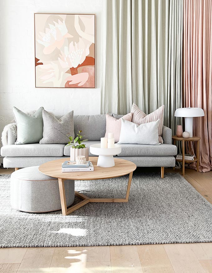
Resorting to bad and tasteless decor is evidence to a desperate effort in gaining the world’s esteem. Only, this path couldn’t be further away from an authentic, aesthetically pleasing truth. In fact, establishing a sound decorating status is achieved primarily via a mindful decorating with intent approach, and a richness in sensible, livable, and meaningful choices that we can adhere to.
…and happy, beautiful homes matter even more, they are our soul’s sanctuary.
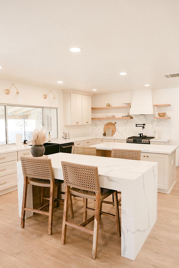
Double kitchen islands
Cooking skills have little to do with square footage or having freight-like kitchen cabinetry, elaborate pantries, cellars and/or double kitchen islands. Actually, a wooden dining table is a far more stylish alternative that gives out a far more homely feel to a kitchen. If you have spare square footage, then I’m sure there are many more creative options to explore and consider.
Open shelving
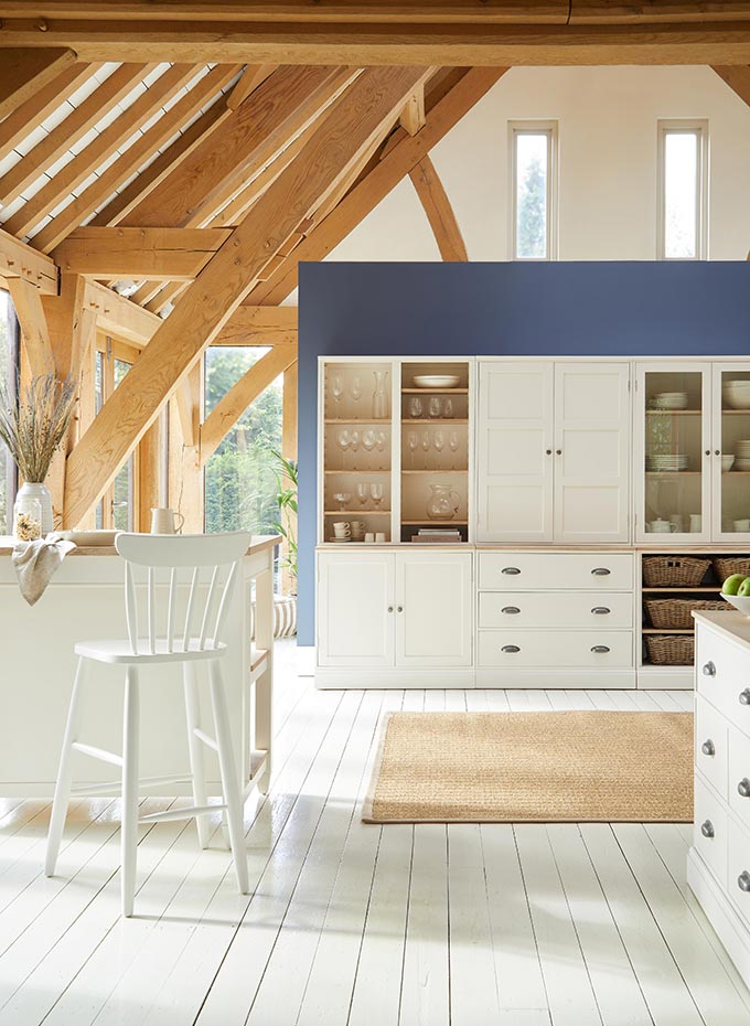
Airy open shelves present you with a superb opportunity to showcase some of your best decor pieces. Open kitchen shelving is no less. Yet, it is not a fits-all-one-size kind of design solution. Shelves are potential dust traps that pose a higher degree of styling difficulty, making them high maintenance. Consequently, this is not a very sustainable trend for most. Instead, opt for glass-door cabinetry as an almost equally airy choice to open shelving.
…establishing a sound decorating status is achieved primarily via a mindful decorating with intent approach, and a richness in sensible, livable, and meaningful choices that we can adhere to.
Barn doors
If you don’t actually live in a farmhouse, or converted barn, then the farmhouse style aesthetic is probably not your best decorating option. (Sorry, no ‘but’ here). A decorating theme being “out-of-context” is one of the worst design pitfalls: imagine how “off” a coastal decorating theme would look in a traditional wooden cabin somewhere in the Alps… Likewise, it follows that it doesn’t make sense to have a barn door in a NYC condo!
With that said, the barn doors trend is one of the worse trends out there, with an extinct functional performance, as they do not contain smells and noise. It was once very Instagram-able fad, but thankfully, all the more people are realizing that it’s not a sensible threshold boundary, aka door. Pocket doors, French doors or hidden doors are just a few of options to consider depending on your real needs.
Cheesy ceiling trays
Ceiling trays is a designer loathed trend with little to none aesthetic value (in many cases). Remember, our living rooms are not part of an airport lounge, in need of running LED strip lines for that extra glow. Good lighting is a bare necessity for any home; shadows too – the right kind that add interest and depth. As such, aim for warm pools of light from various sources, including rechargeable LED lamps and pendant lights that are both decorative and functional.
Shower crowded craze
A bathroom anathema that sends me to the roof, as a designer, is the so called “shower acne.” How is anyone supposed to shower and unwind with a crowded shower fixture – the hand held, the body spray, the main showerhead, the waterfall head, etc. Simple does it easy. Life is complicated as it is, why should we complicate things even more with a senseless shower fixture? Just asking.
Matching furniture
Long gone are the days that matching furniture worked in a space. It is one of the most boring, unimaginative, decorating trends – the kind that broadcasts a sense of lack of identity. Matching furniture may work in a bedroom, sometimes if done properly. Chances are that it will never work in a living/dining/sitting room though. To avoid this design pitfall, mix up your resource stores. Never buy everything in one go, from a single source.
Remember our homes are part of who we are as individuals. They sustain our well-being. If our homes fail to project our individuality, then we have failed to decorate them in a manner that reflects our best shelves. Also, continuing on this thought train, you should avoid that showroom effect that mass produced flat-packing furniture project. A good way to do that is to take it slow and edit your shopping wish-list by looking for other alternatives too. Flea markets have many hidden treasures. Believe me, there are always options.
Faux distressed decor
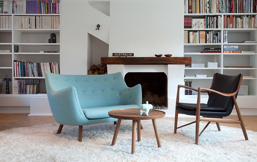
Faux distressed decor and furnishings are more often than not, tacky. Paradoxically, they shout out the exact opposite of effortlessness, with a very shabby vibe. The worst part is that if you put too many such pieces in a single space, it will simply make everything else look cheap, real fast. Obviously, owning a piece or two of faux distressed pieces may be quite alright. Anything beyond that, is potentially wasted fund(s) that could have been splurged elsewhere. In lieu, consider adding second hand pieces with a story to them, or pass down heirlooms that have acquired a natural patina aesthetic.
Decor props – (probably one of the top 3 worse design pitfalls)
This broad category of a trend is a huge chapter in design history. I’m talking about decor pieces that “help” style negative spaces in our rooms, that were most likely bought on an impulse shopping spree. However, such pieces became potential eyesores as time went by. (And yes, I have also been guilty of this trend pitfall).
Many Instagram/TikTok home decor influencers, resort to adopt such decor props, building themselves a following and creating a fad over a particular prop, only to change it three months later down the road for another – all in the name of content creation. Disco balls or chandeliers that resemble disco balls, for instance, certainly fall under this category. They are decor props with no real function, purpose or value in a home. They can’t possibly mean much to someone with some common sense and a descent aesthetic.
Too many times, some of these decor props are pieces of lesser quality and aesthetic value, that eventually hurt our eyes. As a result, a lot resort to a continuous, ever-growing decorating domino craze; that’s the kind where you buy this “badly-wanted-latest-trendy-decor” that hardly fits with the rest. In order to fix the resulting feel of ‘something is off,’ you end up changing the one thing after another.
The deeper underlying issue behind the trend pitfall of decor props, is that it does not constitute an environmentally conscious and sustainable home decorating approach. Good homes don’t need a revamp every three months or so. Adding new decor props in such a fast pace, is only draining; worse than sinking in quicksand. We simply can’t afford to be on this train.
If our homes fail to project our individuality, then we have failed to decorate them in a manner that reflects our best shelves.
Rather to giving in this craze, it’s best to resort to slow design. Slow design calls for conscious decision making, based on prioritizing and resorting to buys after identifying a genuine intent followed by a thorough, before-hand market research.
The Uptake?
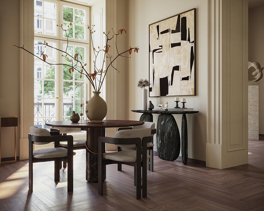
Architectural finishes and flourishes make a great backbone for any decorating journey. Take note and use them for a cohesive decorating approach. Invest then, in adding things that are logical and aesthetically pleasing, the kind you want around you for years to come. Fill your home with things that tell the world who you really are. Avoid the design trend pitfalls listed above. And at the end of the day, remember, the best recipe for decorating success is: ‘make it personal.’


