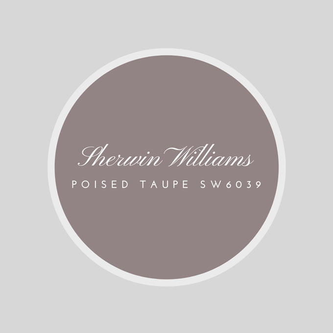
It is this time of the year again where companies announce their choice color for the coming year! Benjamin Moore: Shadow 2117-30; and for Sherwin Williams it is a beautiful neutral: Poised Taupe SW6039. After five years of a gray reign, they decided at Sherwin Williams, that it is time to warm things up a little by adding a touch of red. Poised Taupe, is described by the company’s spokesperson as “warm and cool tones together to create one irresistibly versatile color.”

The result is a brownish gray. Personally, I think it is a subtle yet, moody color that desperately needs pops of color here and there to bring it to life. It matches great with warm yellows, coral reds and greens. It is a pretty awesome neutral come to think of it with you work it properly.
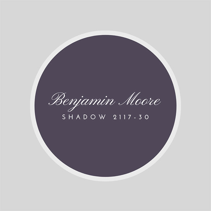
Benjamin Moore on the other hand picked a vibrant moody hue that makes a bold statement; Shadow 2117-30. An alluring amethyst that smacks you in the face! It is a big turnover considering that last year’s color was Simply White.


It ebbs and flows with its surroundings, and light brings it to life
as the BM official website quotes. It is a deep, alluring color that has a unique ambiance feel to it. It is enigmatic and cozy. It also matches greatly with deep yellows and reds, but also moody blues and browns. But it is a big turnover considering that last year’s color was Simply White! I like this year’s color Shadow because it is challenging my imagination. It is dark like the night.
Dark colors do not make spaces seem smaller like most people believe. They make them more intimate and intriguing! In any case, please bear in mind that these colors are just this year’s trends! Next year, new colors will become the next best thing. So if you do not like to paint your home year after year, choose a color that you feel comfortable with – that reflects your personality.
If you choose Navajo White, please reconsider it. It is a neutral color (I give you that), but I’m sure that you can pick something a little more exciting and a little less common! Also bear in mind that it is crucial before you pick your color scheme to consider carefully the flow of natural light in your spaces. (You may want to check this: How to choose the right color based on light orientation).
Lastly, a little note to bear in mind. If you live i.e. along the coastline of the Mediterranean Sea, then colors such as BM Shadow 2117-30 generally do not work that well. Too much sunshine distorts the desired outcome (it may even fade to an extent). As a result, they tend to look more “weary” over time. On the other hand, bold hues give a refined, crisp, and contemporary feel to things. So weigh out your options carefully and make a change that matters!
Take care now,