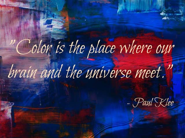
This week I’d like to talk about colors! There is a fundamental and universal truth that is found everywhere and makes an imprint on us every moment of our lives yet, we take it for granted — the existence of colors. Colors make an enormous visual impact on us defining our perception of things. That’s why color is used as a description attribute. But how can you make the most successful color combinations even if you’re not so artistic? Read on to find out how…
I think it’s absolutely fascinating how colors fuse into our lives and inspire us. We even describe our moods in color (i.e. ‘I’m feeling blue’)! Almost everything we love has at least one color. Almost everything we dislike also has a color. However, some colors are more appealing to us than others. Have you ever wondered why?
A little background info on colors
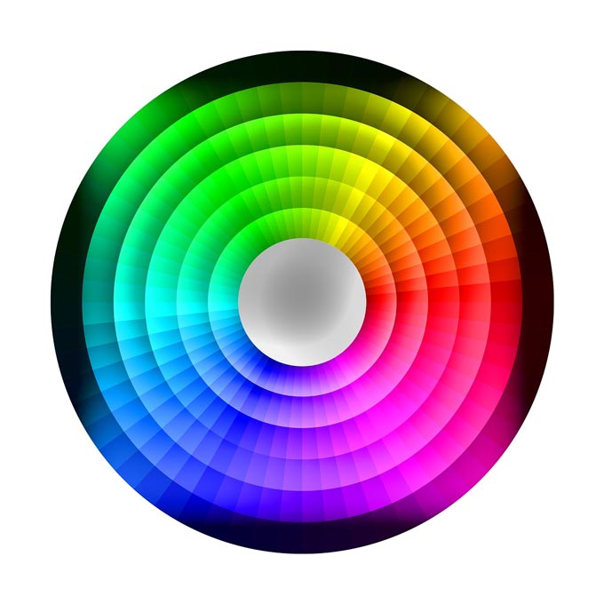
Colors are the one element that can transform anything so it helps to know just a couple of basic things about them in order to coordinate them best. I will not go into much detail about color theory. (I do suggest though, that you read this great article about color and branding). I believe that we all know more or less the primary colors RYB, (although some might argue there are four because of our physiology and they make a pretty solid case for it too; so if you’re interested in some in depth analysis then you should check this article out). Green, orange and violet (purple) are the secondary colors. All the colors in between are known as tertiary ones.
Now if you mix colors in terms of i.e. paints, you get a grey shade that if it is saturated enough it becomes black. This means that grey is the most neutral color and it partly explains the “grey over grey frenzy” that we simply can’t get over yet. Its neutrality makes a great backdrop and its independent of any decorating style.
In any case, colors are defined by three attributes — lightness, saturation and hue. These three attributes give us a wide range of colors i.e. blue hue ranges from light cyan to midnight blue depending on the saturation.
The exact opposite though holds for the primary colors in terms of light where you get a tint of white instead. In general, when we add white we make tints, but when we add black we get shades.
Obviously, primary colors have complimentary colors. These are obtained from mixing the opposing primary colors i.e. blue is a primary color and orange is its complimentary color (yellow+red). Red’s complimentary color is green and yellow’s is violet (purple).
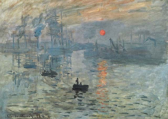
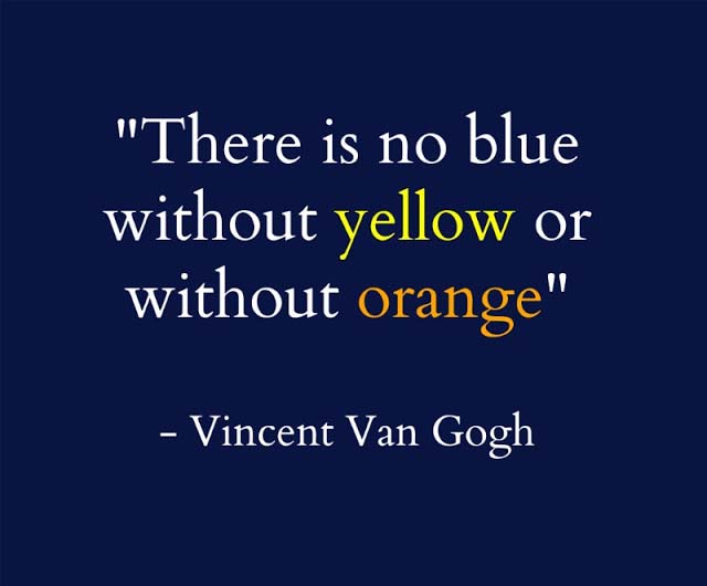
Personally, I am a “blue” person. Anyone who knows me, knows my dislike for orange. However, if I want to make a more intense blue impact, I must add a touch of orange. That is especially true arts, but it most definitely applies in home decorating too. Monet, one of my favorite artists of all times, wrote back in 1888 that “color makes its impact from contrasts rather than from its inherent qualities, the primary colors seem more brilliant when they are in contrast with their complimentary colors.”[1]
[1] Philip Ball, Historie vivante des couleurs, p260
How to Make Successful Color Combinations That Rock
Vincent Van Gogh believed the exact same thing. And it’s absolutely SO true! This is exactly what you should be doing in your home as well. You need to focus on creating the right contrasts in order to create a powerful and stunning coordination. That’s the key to making a successful color combination! That is achieved by selecting complimentary hues found on opposite ends of the color wheel.
The 101 Color Matching Guide
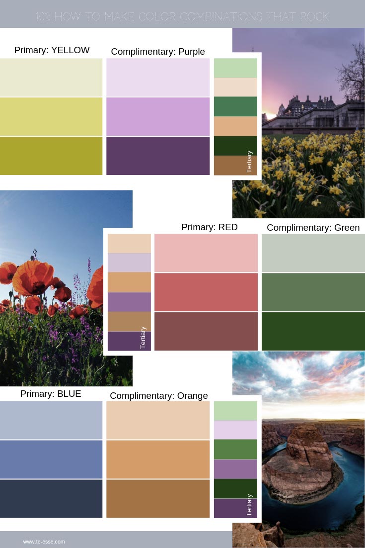
As I mentioned earlier red, yellow and blue are the primary colors. These are our starting point. It does not matter whether you use a tint or shade of these colors or they are simply an undertone from an off-white or gray wall paint that you are contemplating. The principle is always the same. Thus, I have created a cheat note with a few images from nature that illustrate best how these colors combine with others for you to use as reference. (Remember: I’m illustrating the principle)!
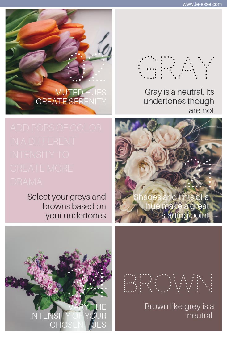
So, if you want to create a color palette then try a muted version of your favorite primary or complimentary hues and then play up the intensity level of your favorite one. Let that be your dominant color. Add in grays and browns as long as you make sure their undertones will compliment that dominant color of your choice. Layer in some pops of colors (complimentary and tertiary) to create juxtapositions and definition. And remember that all grays and browns may be neutral, but they are nonetheless governed by their undertones. So do match those undertones for an effective outcome!
Color combinations in home decorating
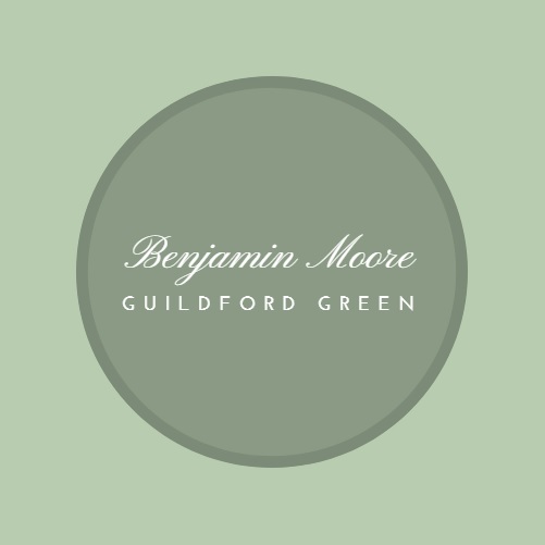
Now, in a home improvement project of an apartment a few years back, I painted one of the bedrooms BM Guilford Green — a mute “yellowish” green (color of the year 2015). Green, just like blue, is considered a color that works well in a bedroom, because it’s soothing to the eye.
My theory behind this is that our brain registers colors from the moment we’re born. As we grow older we develop stronger and in other cases weaker bonds with particular color combinations based on our exposure to imagery from different surroundings. The stronger the bonds, the more favorable the respective colors are to us.
For example, green and blue are two colors with a wide range of shades yet, so abundant in nature that almost everyone feels relaxed when surrounded by them. We have grown accustomed to them even before we learned to talk. We have a super strong familiarity bond with them. Hence, our psychology takes in blues and greens really well, especially when it comes to a space assigned for relaxation.
So, let’s get back to that home improvement project I started telling you about. What was so special about this green? Not much! Seriously, it’s just a beautiful serene green, but I wanted to create that WOW factor using color to make up for the lack of any other design features.
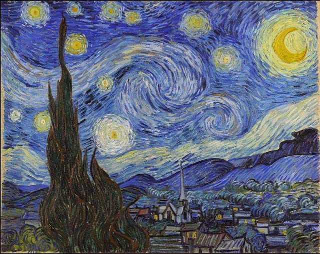
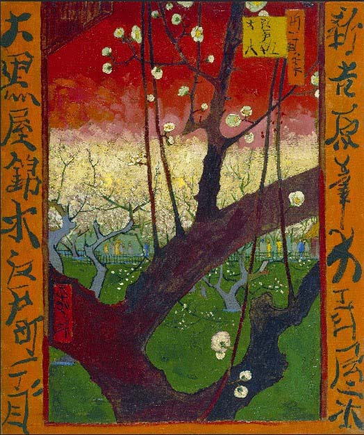
So, I accomplished that by hanging the Flourishing Plum Tree by Vincent van Gogh (see image below). Needless to say, that the painting really stood out against the green walls. The effect was awesome, but that came as no surprise to me since green is the complimentary and opposite color of red and the right contrast certifies a great aesthetic result. It was that contrast between red and green that created that WOW factor! Simple, yet very effective. And it works every time!
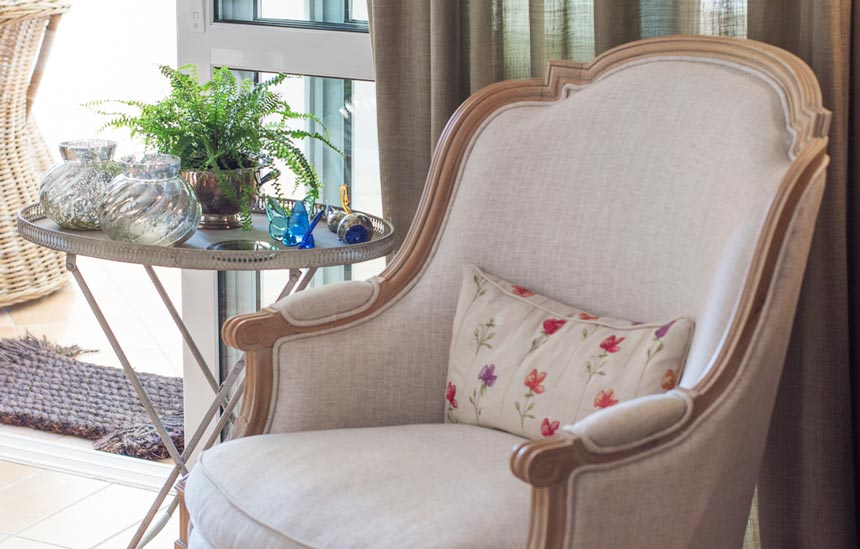
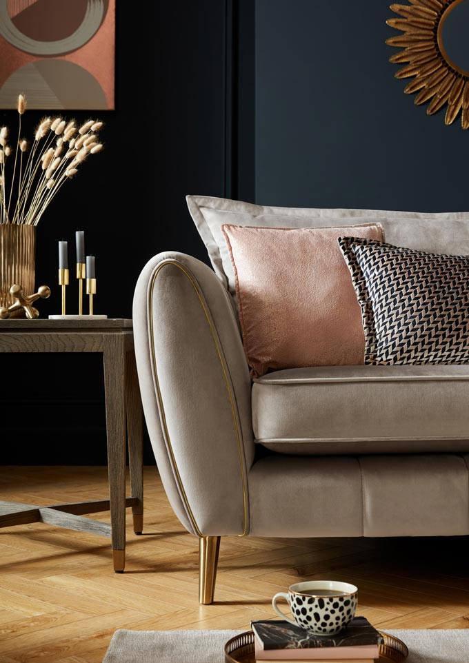
Hence, the point for you to keep is that even if you have the ultimate neutral off-white color palette running throughout your home, you could add in some home decor (think art imagery, vases, throws or rugs etc.) that will create juxtapositions with any design elements you choose to accentuate. This will create a highly sophisticated interior where the resulting depth and definition will totally upgrade your decorating style.
I’m a true believer in the power of colors. Without colors I would probably be in a state of depression. As a matter of fact, everyone would go a little mental without them. Colors make everything so much more interesting. Therefore, I try to mix and fuse them everywhere just like nature has already done so for us. And when I need to step up the design scheme with color, then I love using color blocking.
With the use of several key colors, anyone can create contrasts that project space volumes, textures, add intensity or serenity to any surrounding. My ultimate goal is to create a synthesis and not simply a harmony of grey shades or white tints (I reserve such color palette schemes for very specific theme-projects like doing an all white interior design).
Having said that, it always amazes me how hard I have to convince people to open their minds and broaden their comfort zones when it comes to colors. (This might be a good time to read a post about comfort zones). But do you want to know something that I find even more amazing? Children — who have no reservations whatsoever in mixing any and every color in every possible way. Don’t you love that about them?
Their psychology is so easy going, transparent and clear of prejudice – true free spirits – with a fearless attitude. Thus, they embrace colors with no reservations and I think we should be too!
Recap
Next time you want to paint a room of your house — do not exclude any colors until you complete your composition. Think of your project as if you were a child in front of a canvas while you let go of your reservations. Trust your instinct and build a color palette with the primary colors you like most and their complimentary colors and make them work for you by layering them in as tints and shades.
Now a successful color layering means that there is a repetition of the same colors at different heights through-out the room, that ultimately creates a theme. Also, it is best to opt for a similar intensity between your colors of choice for a well collected look.
So, don’t think only in terms of walls. When it comes to painting a room, you should always consider other than its wall, your ceiling color, the color of the doors, the trims, the flooring and in other design elements. Fuse those colors with the existing or new features (i.e. upholstery, curtain fabrics, the furniture, the decor, and the flooring). You’ll be surprised with the outcome. First decide what the basic color will be, the one that will “dominate.” Next, decide whether you want an accent wall or feature. Then, determine the colors that will complement the dominant color you chose.
Remember, if you observe carefully, the best composition is the one that has a blend of numerous colors at different dosages (intensities). Nature does that all the time and it works beautifully! Rooms with a dominant color and various shades of it may easily feel “dull” and “undone” in the long-run, resulting in further design and/or color additions in the future.
That’s why as an designer, I resort to pops of complimentary colors and hence, build a color palette that will highlight what I sought after. So, I urge you to be bold and try out different combinations using primary, secondary AND tertiary colors together and fuse them.
A touch of a contrasting color here and there can make all the difference in the world. I guarantee you that it will rock your style and rattle your psychology (in a good sense). After all we live in a world of colors!
Till next week,