Just when you thought you might have seen the last of pink interiors, Benjamin Moore announces the Color of the Year 2020: First Light 2101-70. It is a soft, rosy pink, part of the Benjamin Moore Color Trends 2020 palette that includes mostly pastel colors.
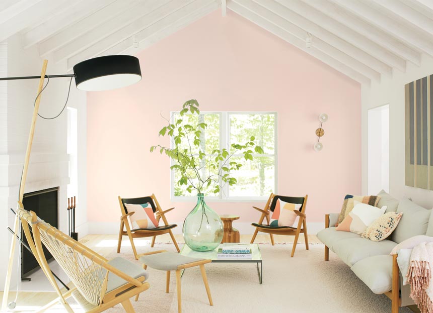
First Light 2102-70 was selected as “our Color of the Year 2020 to represent a new dawn of idealism, design and living,” said Andrea Magno, Benjamin Moore Director of Color Marketing and Development. “First Light 2102-70 reflects a new definition of the home –a shift in mindset from the material to satisfying the core needs in life: community, comfort, security, self-expression, authenticity and ultimately, optimism.”
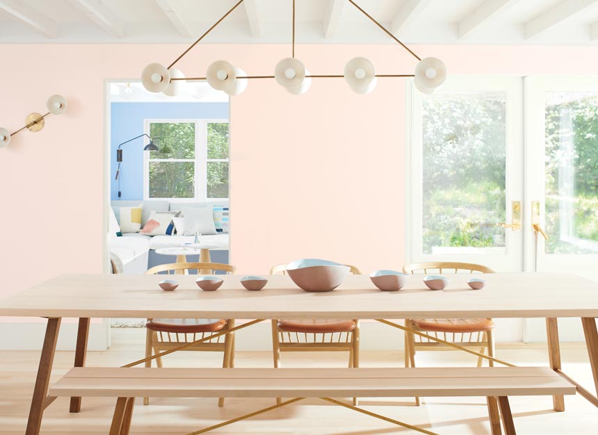
Last year’s color was a soft grey, Metropolitan. So there’s definitely a shift, for this year’s choice stands out for its flattering and easy to love vibe. Does it capture the mood of people? I certainly believe so, as this not too sweet blush hue has all the potential to sweep us off our feet.
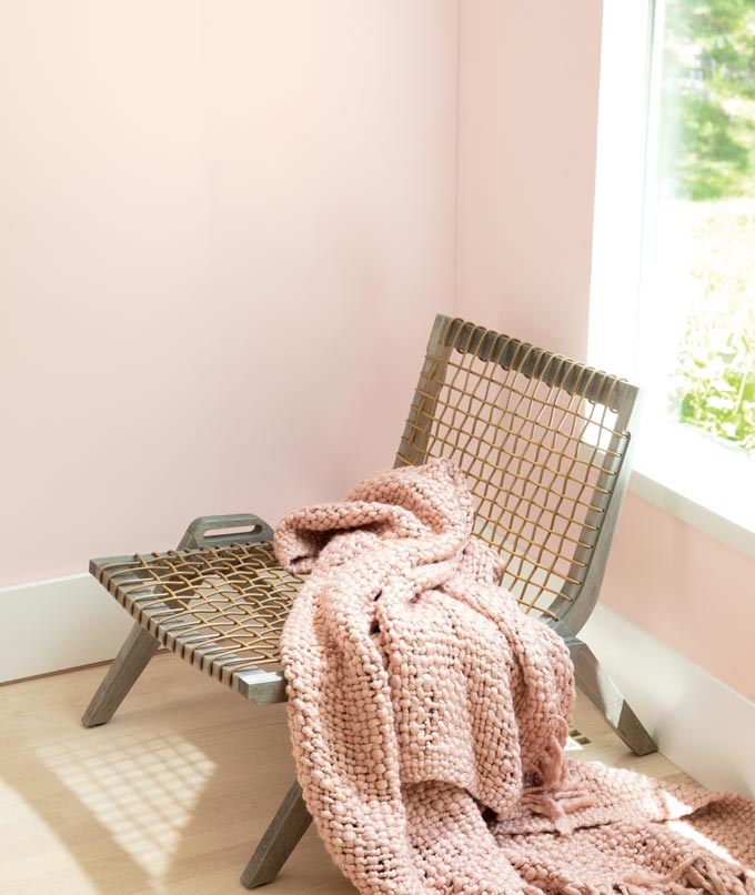
Let’s face it, pink is not just another pastel color. It is a new neutral that designers love to toy with. That’s why it has been popping everywhere. Naturally, pink is evolving and so are its interpretations. In any case though, if you are looking for a striking pink color that is flexible yet livable, then this one is the perfect hue. It almost glows. It is not dull and yes, it’s fun, especially when paired with some or all of its complimentary palette colors!
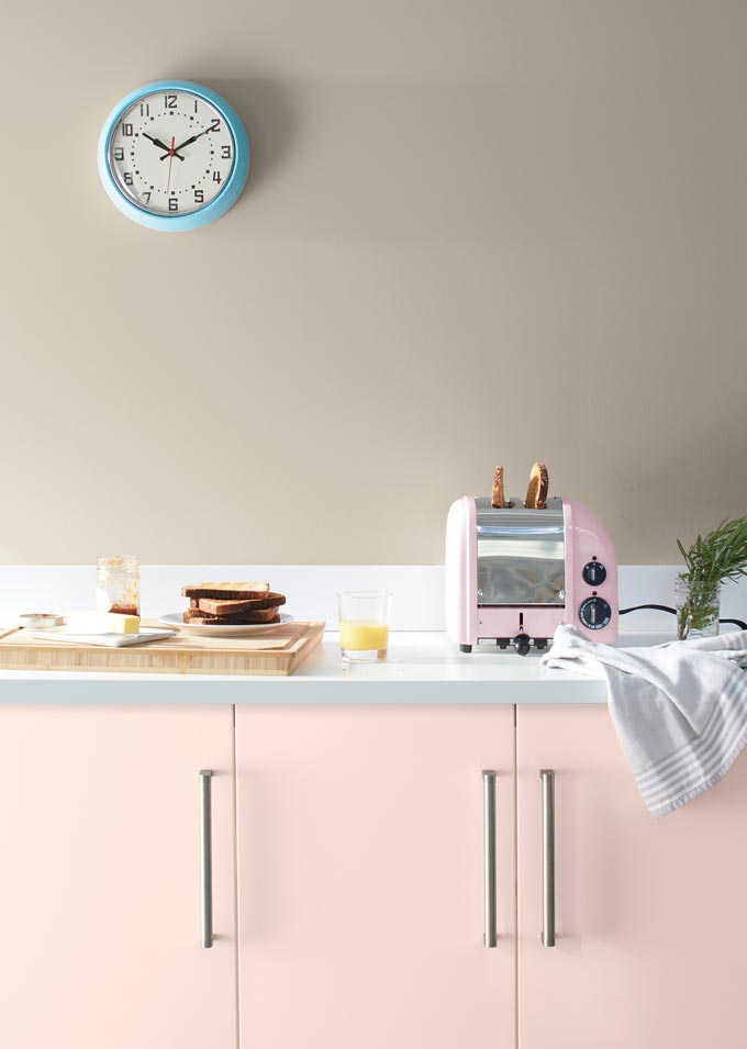
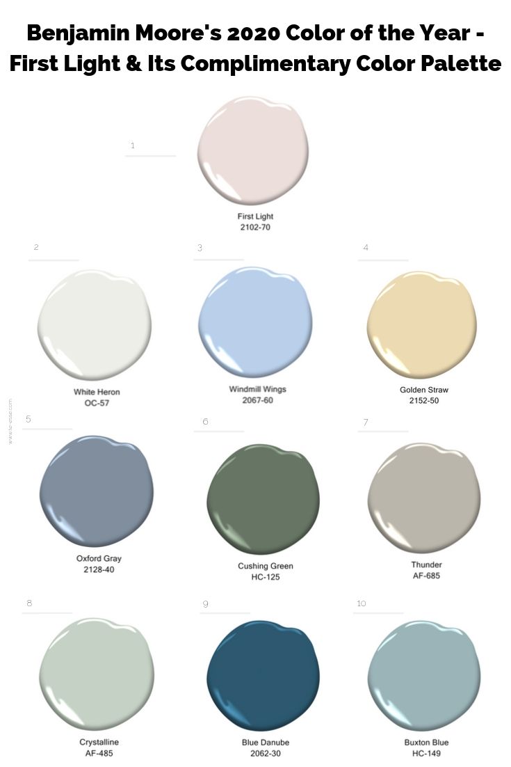
Finally, I would like to mention that its complimentary palette includes some delightful and well poised colors. It includes White Heron OC-57 (that makes one of my go-to off whites); Crystalline AF-485; Windmill Wings 2067-60; Buxton Blue HC-149; Golden Straw 2152-50; Thunder AF-685; Cushing Green HC-125 (one of my bold green go-to colors); Oxford Gray 2128-40 & Blue Danube 2062-30.
Stay inspired,


First Light is stunning!
Mariya