Admittedly, 2020 has proved to be a year of many unexpected challenges. Therefore, when the Dutch paint brand, Dulux, named yesterday Brave Ground as Color the Year 2021 it made perfect sense. An earthy based hue with a “reassuring” feel to it, seems to reflect best the need for a down-to-earth trigger mindset.
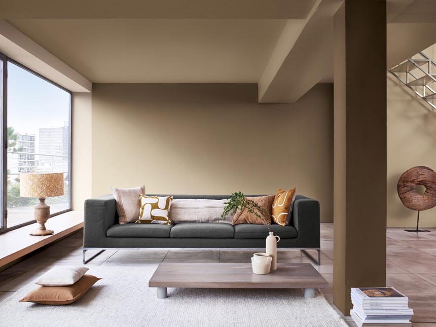
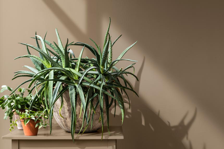
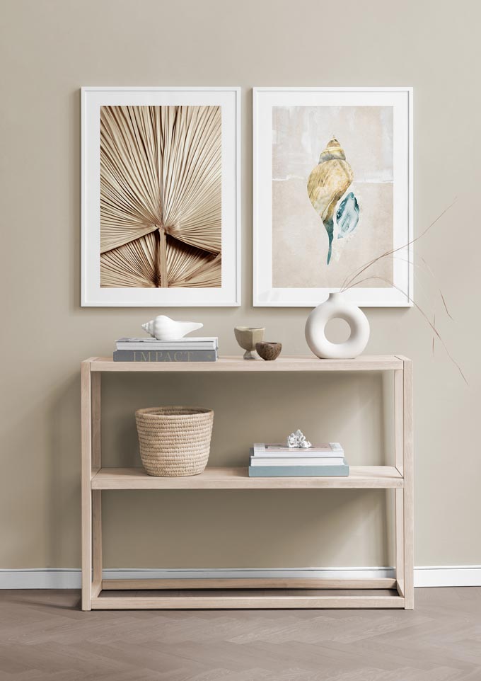
Brave Ground is a warm toned beige, but neutral enough like a shade of sand. It can easily act as the perfect balanced backdrop. Add some warm red pops to it and you can easily make it stand out for that wow factor, like in a dining space. As a matter of fact, it works exceptionally well with artisanal crafts and natural materials.
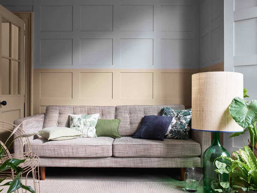
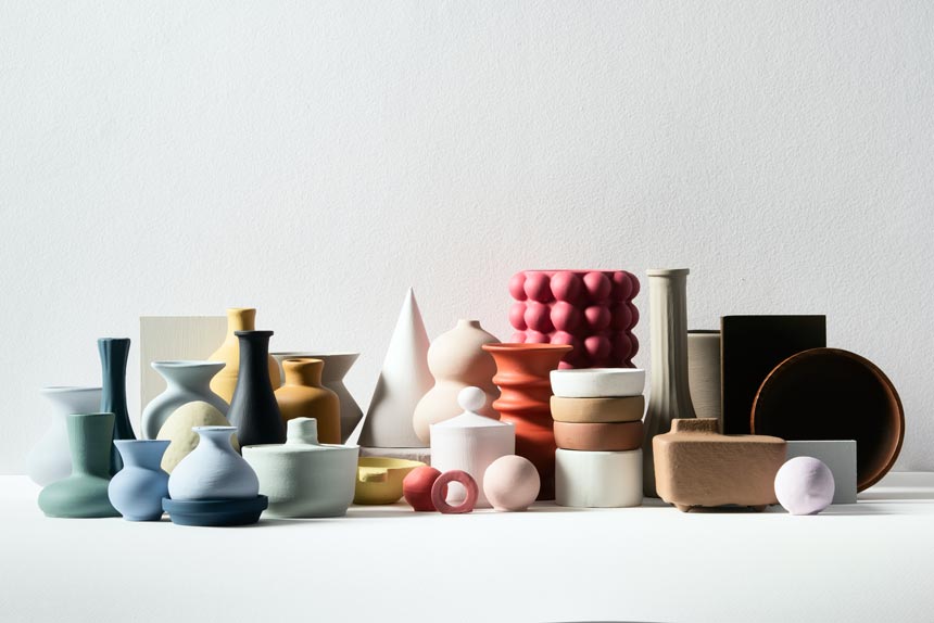
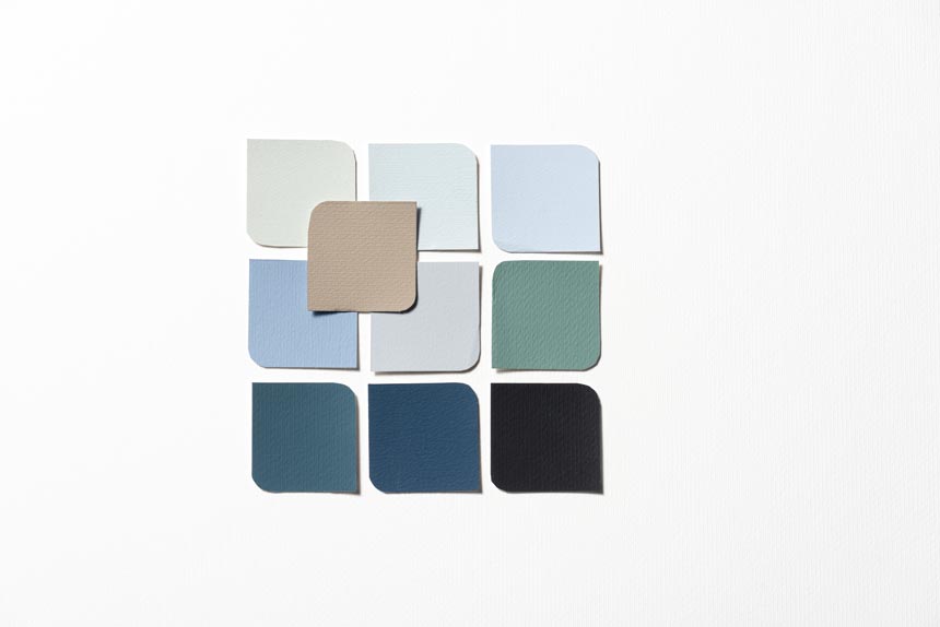
On the other hand, you can combine it with some blues and/or greens like Tranquil Dawn. The concept is to bring the outdoors in for that soothing and calming factor. This type of combination could be perfect for a bedroom or a living room filled with natural wood, indoor plants and shapely ceramic finds. Similarly, if you opt for soft and natural shades, then you will create a relaxing vibe; the ideal paint color for a home office if you ask me. Whatever the case though, this is a color for creating spaces where you can “reflect, recharge and recalibrate” as the creative director of Dulux UK Marianne Shillingford put it.
She continues: “We continue to live through uncertain times. In 2021, the warm and grounding tones of Brave GroundTM will allow us to find certainty in the strength from the very ground beneath our feet, emboldening us to go forward and begin to live again and giving us the flex to adapt to the ever changing circumstances we face.”
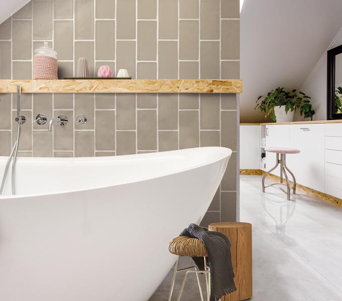
In all honesty though, I had a bit of a hard time picturing Brave Ground as my first go-to paint color for a kitchen. Yet, tiles in this hue simply look amazing as you see for yourself pictured in the bathroom below. So don’t haste to rule this color out. Instead, let it grow on you and feel its timeless strength in delivering.
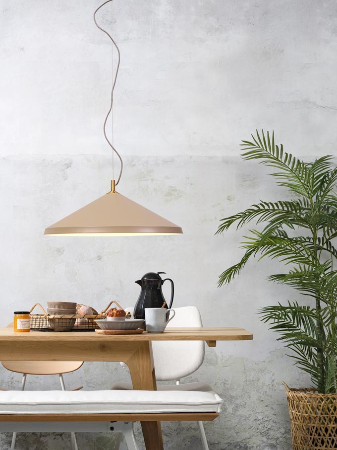
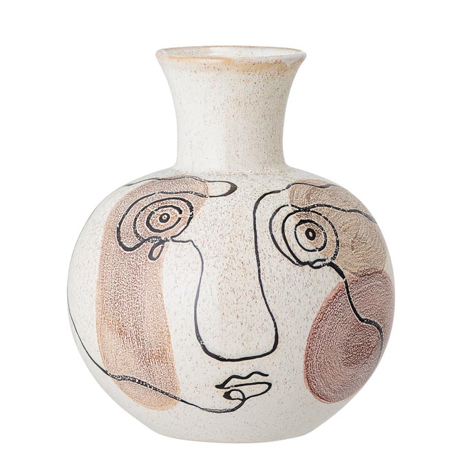
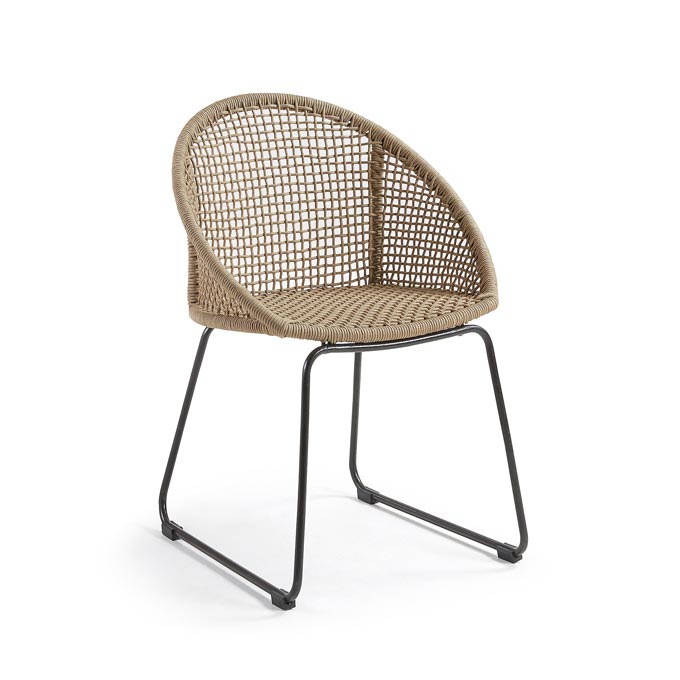
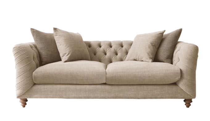
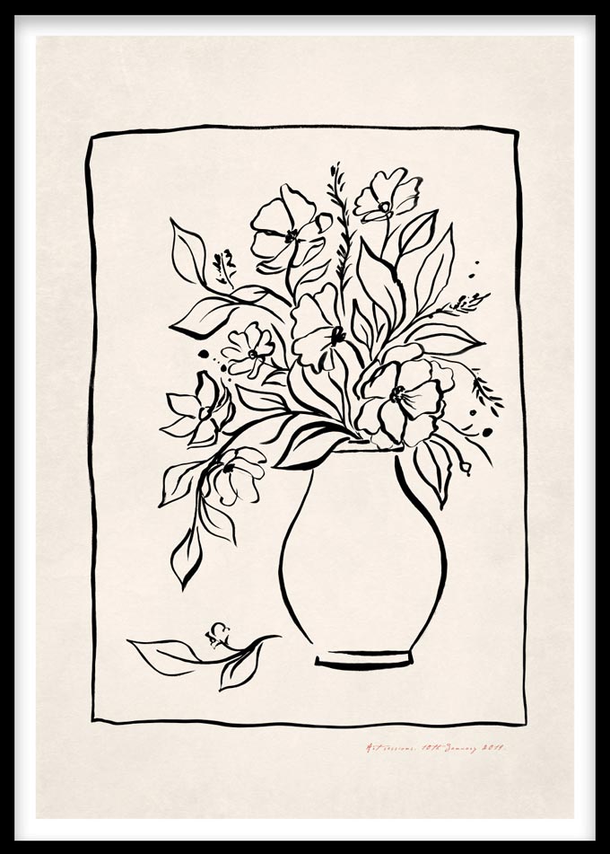
In every case, I believe it is a versatile color and not just in terms of walls. Thus, I’ve found many pieces to make a moodboard to showcase its potential across the board. It conveys best, the feel you get from this rich statement neutral hue.
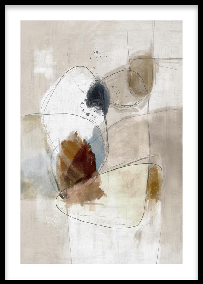
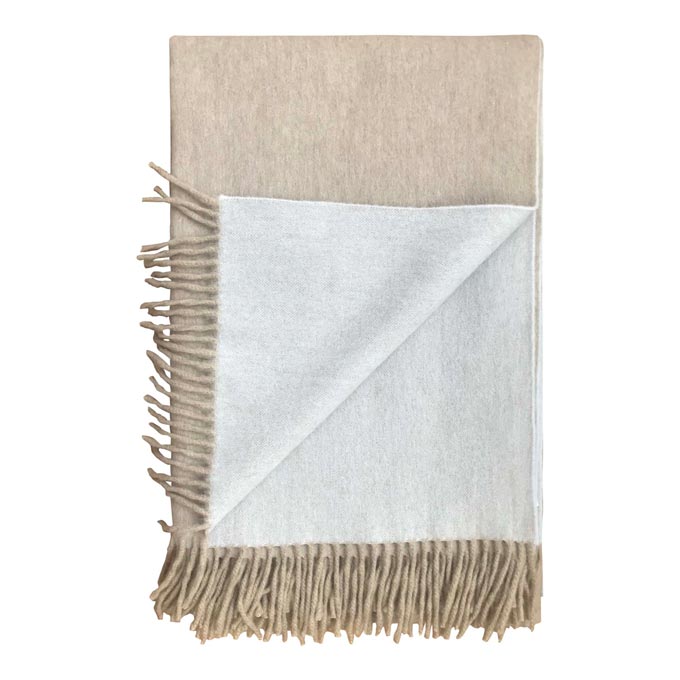
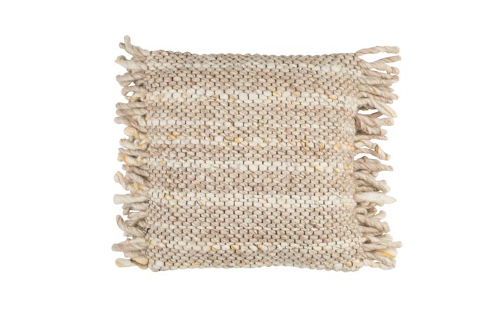
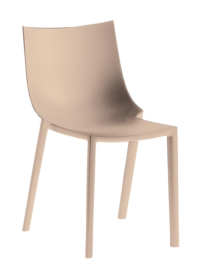
Lastly, Brave Ground is one of those colors that promote well-being. Moreover, it aligns perfectly with a shift seen after the pandemic for “in-home wellness.” Hence, in these uncertain times, it’s always great to know where to rely on, even if it’s only about your wall paint color.
Cheers,




Great palette of colors. I feel through these colors a connection with the earth and nature. Simple and beautiful.