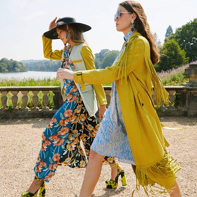
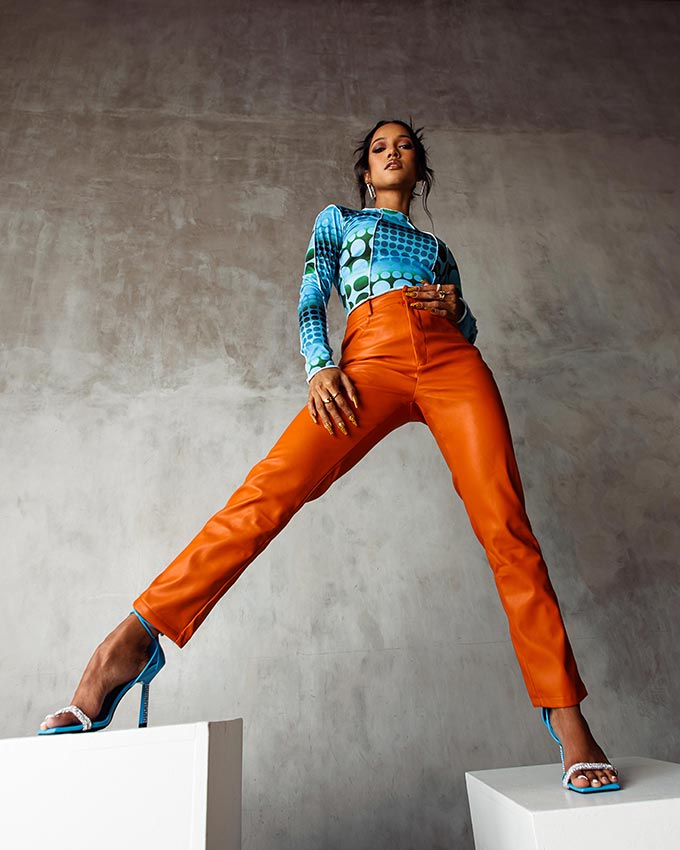
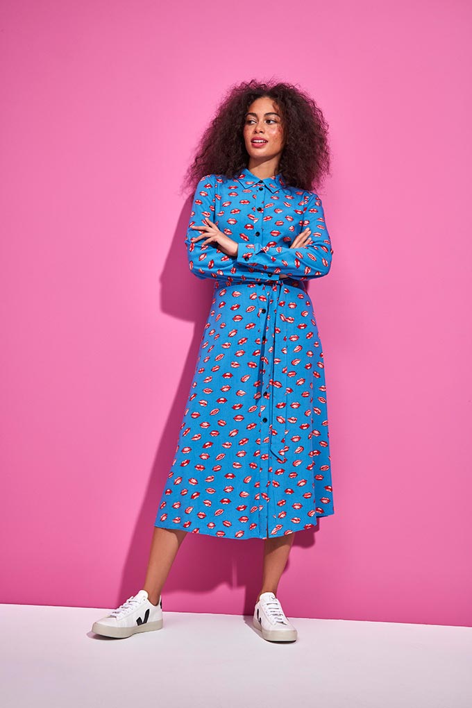
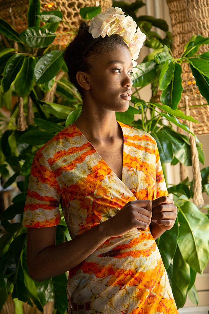
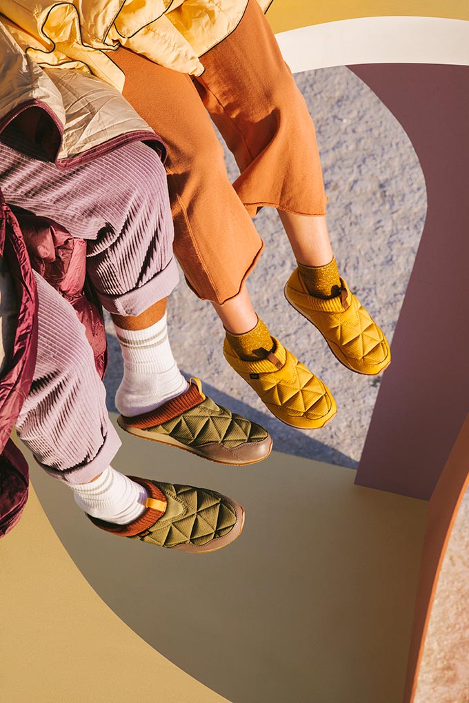
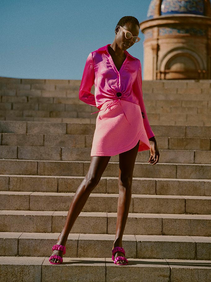
‘Dress for the life you want, be happy and feel excited about the future to come’ makes up the mindset behind dopamine dressing. From catwalks to the streets, bold, bright, zingy colors and clothes with mood-boosting qualities are beginning to crop up everywhere. Funky patterns and lots of texture too, help make them far more interesting than ever before. Color saturation is gradually and steadily gaining ground, picking up its momentum. This trend is literally calling us to snap out of our state of hibernation. And not just in fashion, but in interior design too.
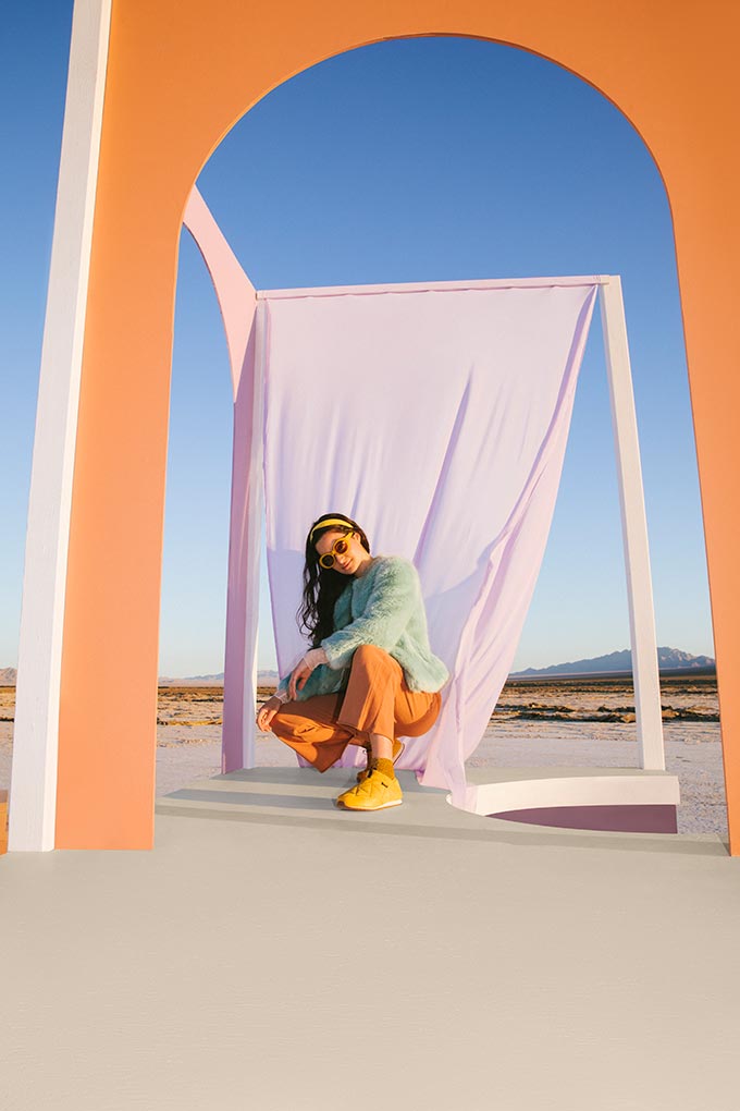
To dress with intention for that feel good factor, is key. Dopamine dressing is not really about this color or that. It’s not color blocking either. It’s more about the associations and memories a color triggers for the release of dopamine, that ultimately, boosts your mood. That’s why, it can be totally subjective. Still, there are some generally accepted associations that most of us relate to.
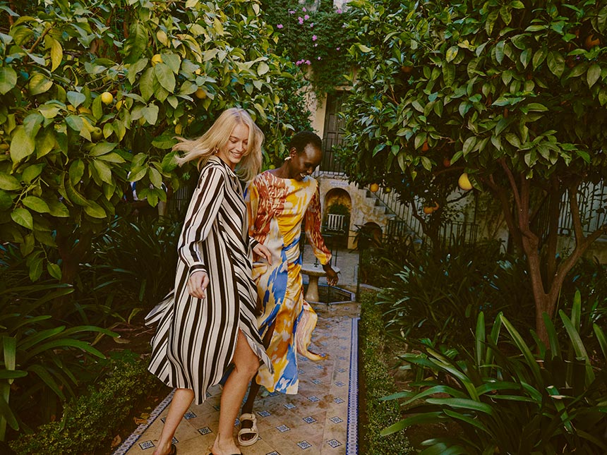
Yellow is a great energy booster. Orange promotes impulsiveness. Red, on the other hand, means different things to different cultures; generally speaking though, it calls for attention. Yet, blue is generally accepted as a calming hue. But, once you combine all these colors in various ways, textures and unexpected patterns, then it’s a whole new ball game.
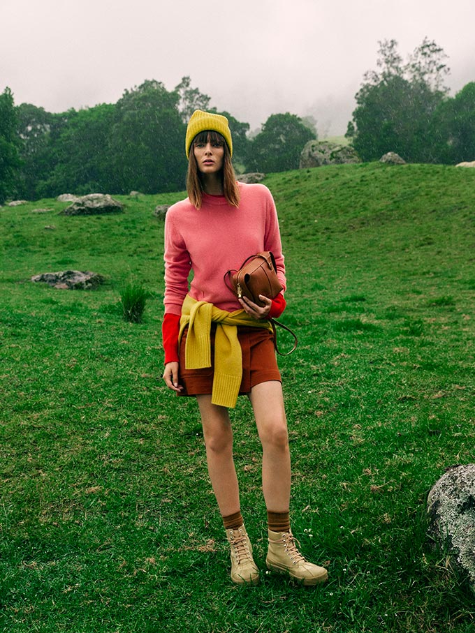
Our times may be unsteady and even uncertain, but our mood doesn’t have to be so. Therefore, making fashion statements via dopamine dressing is a way to stay motivated in a positive way, be open to opportunities and to seek pleasure.
Fashion dopamine dressing
Victoria Beckham, Hailey Bieber, and Kendall Jenner are only three of many celebrities embracing this fashion trend.
Interior design dopamine effect
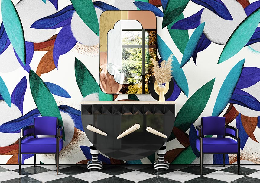
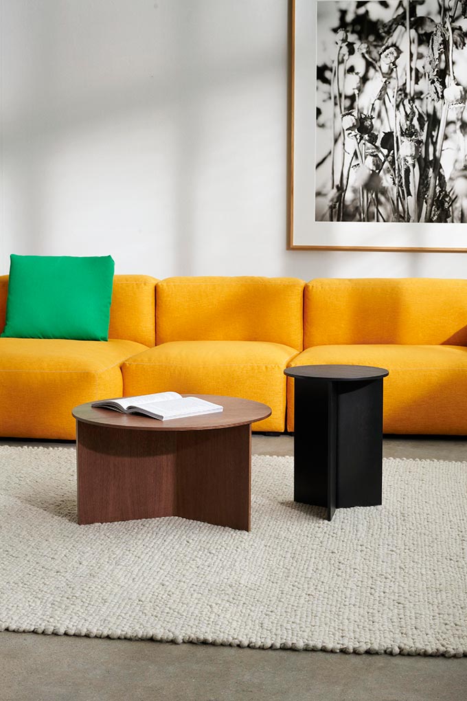
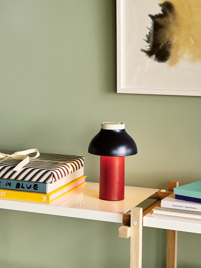
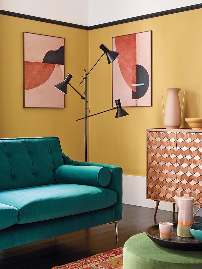
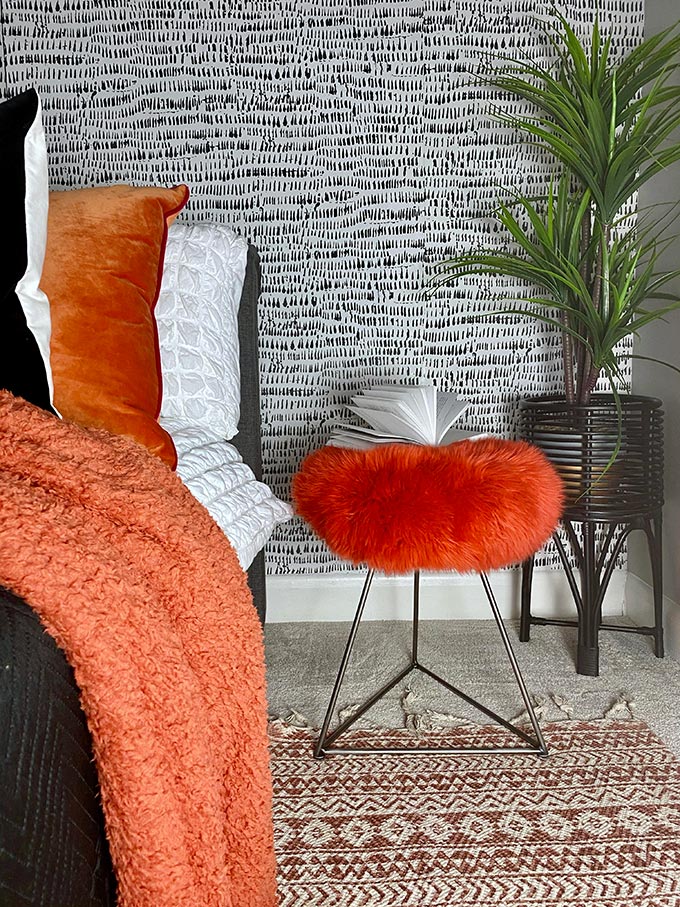
As I mentioned earlier, dopamine dressing is more than a fashion statement. It has infiltrated and is now surging in the interior design world too. Color has always been one of the most important factors in any design industry. And one of the things we can thank the pandemic for, is the embrace of color again, with a new take in various degrees. Some of you prefer neutral or earth tones. But many others are embracing a more color saturated approach, dressing up spaces in color engaging ways. Sometimes, it’s good thing to go maximal: Think ‘More is MORE.’



1 comment