Reading is always a good idea. Books are priceless possessions that accumulate over the years. Even at this digital era where cell-phones, tablets and all those gadgets that help us read on the go, can’t replace a good hardbound book. If you’re like me, proud owner of many books, then you probably already own a bookcase. As a matter of fact I have three, so far. Although, styling book shelves is a big challenge, my bookcase styling tips will turn your “book-show-case” into a functional and aesthetically pleasing home decor addition on a budget.
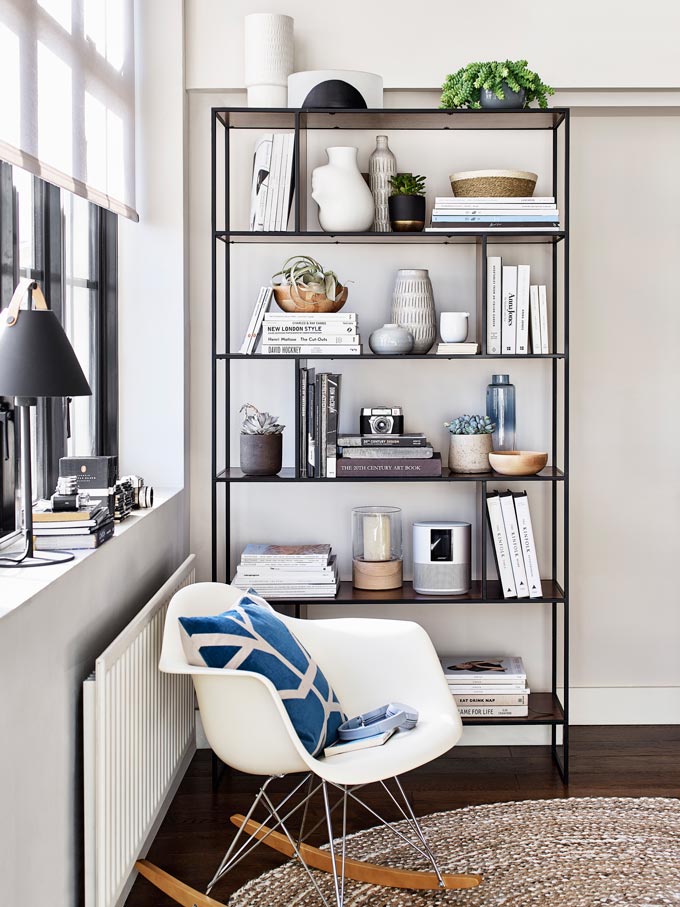
I love old vintage looking books. They make a great display. Having said that though, all books add splashes of color and texture in a bookcase, not just the old ones, but even the old ones with their dust jackets. The way I see it, the books you own tell your own interesting story, while the way you display them defines an overall mood (uptight or relaxed) and more importantly – attitude! They can tell people how important they are to you and/or how often you read them! Ah huh, that’s right!
If you add on some of your favorite decor objects then you can have a seriously stylish gallery at hardly any cost! For any bookcase gallery makes the most wonderful backdrop. Combine that with an art gallery wall and then you’ll have a serious design scheme going on for you.

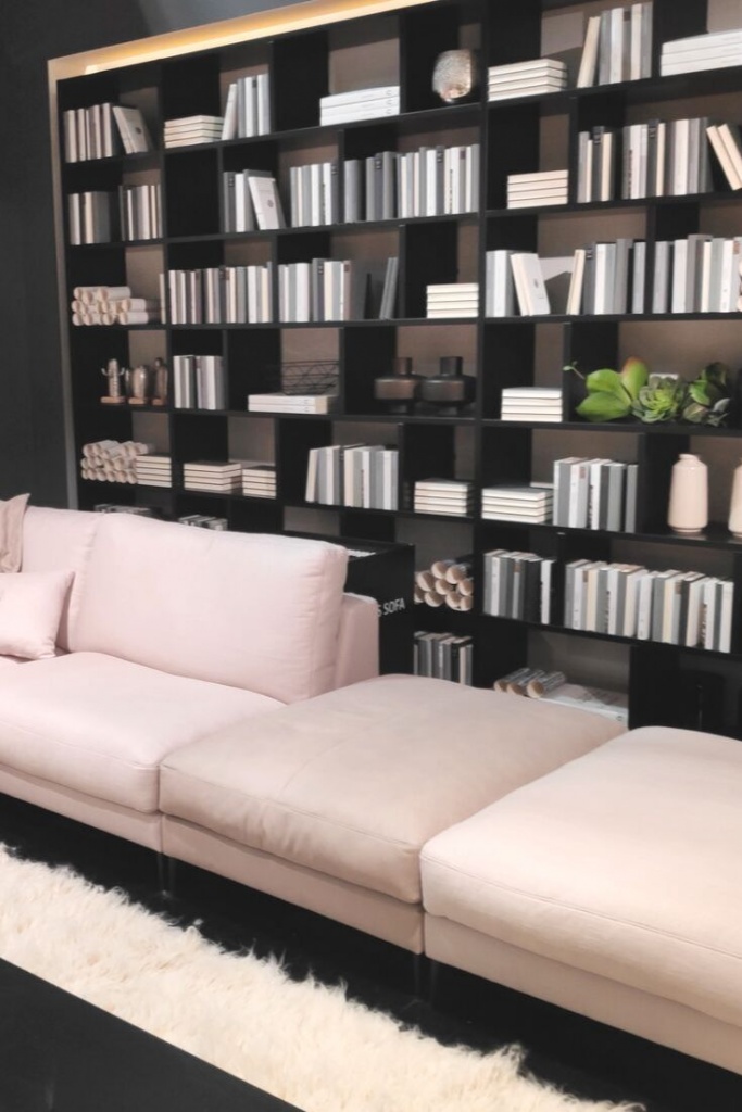
Now, some people employ various styling techniques to create an overall uniform, cohesive look. For example they cover their books with paper. Or they place them in such a way that the spines are hidden. I’m all for that if you’re not into reading as much and you’re OK with handling your books as decor items, especially if you don’t own too many.
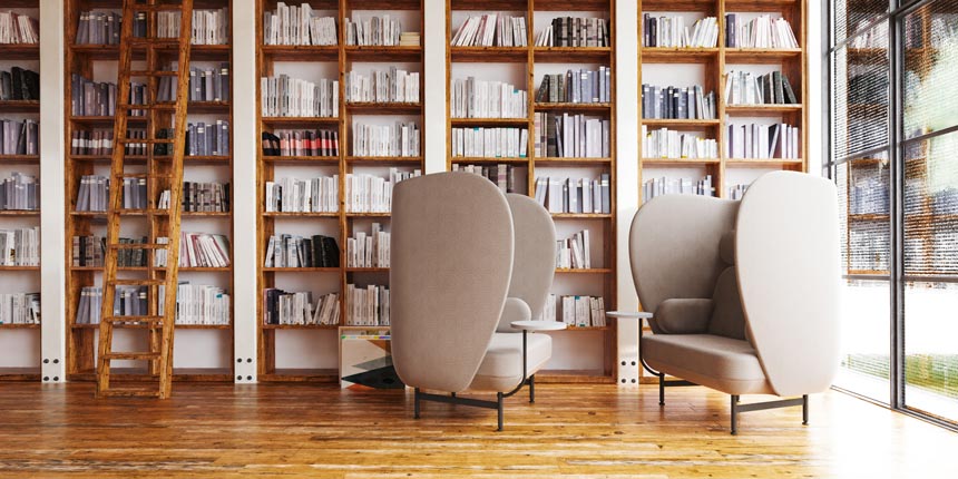
Unfortunately, such an approach has no functional practicality. They might make a great looking display, but does it really work for a reader? Can you really remember where you placed every single book of yours if you can’t read its spine? Awesome, if you can! But can anyone else find a book to read without actually reading its spine from that stylish bookcase of yours? This approach, however neat it looks, doesn’t work for me. So I collected some photos to show you how amazing bookcases can look, even if they’re not uniform in color. Furthermore, I made a little guideline with bookcase styling tips that work for me and can surely work for you too.
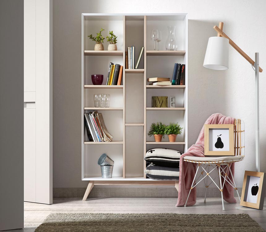
Bookcase Styling Tips : Guide
Almost everyone will tell you that there are three basic steps involved: group, place and decorate. However, I have included one more step in this process that makes the difference between looking good and awesome! This is HUGE! I call it SORTING! Oh, yes, you got me: it’s all about sorting.
Bookcase Styling Tips 1 and 2: Grouping and Sorting
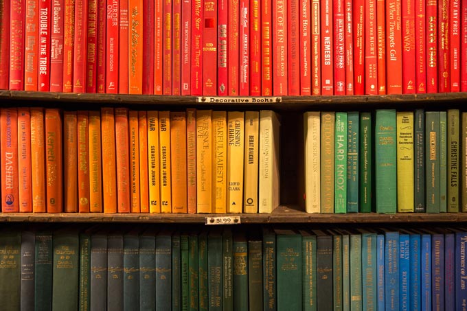
First decide which books you keep. Over the years surely you have collected books that don’t mean as much to you anymore. Give away anything you don’t really want anymore. Next, it helps to group them in genre categories like: hobbies, arts, fiction novels, etc. Then you elaborate on this grouping by creating smaller sub-groups based on spine color. The aim is to color coordinate those sub-groups i.e. fiction books with blue spines, fiction books with red spines, fishing books with green spines and so on. That way you’ll create a color and genre coordinated setup, two birds with a stone kind of thing! I promise you it works.
Bookcase Styling Tip 3: Placing
Now that you got the hard part out of the way, it’s time to have some fun. It is time to put up your story. Place your grouped books in the shelves: horizontally or vertically. It helps to create “dips”. That means books of various heights lined up in ascending height or descending height (dipping down) as shown just below. Or you can combine both ways. Vary the size of your horizontally laid books to create more “negative space.” Negative space refers to the empty space that allows a visual “rest” area for the eyes. It basically creates a zone for contrast and interplay.
Horizontal stacks create a laid back approach. Everything about horizontal layering is relaxed. Furthermore, a horizontal pile can act as a bookend, while it can also act as a “pacifying zone” when placed between two vertical stacks that project edginess. Undoubtedly, placing books vertically means that you are probably reading them more often.
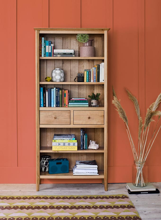
Think about it. It’s a lot easier to pull out a book placed vertically rather than pulling a booking from the bottom of a horizontal pile. Hide any unnecessary clutter in boxes that you can place at the bottom of your bookcase. Big volumes don’t leave much negative space and that’s why they work well at the bottom. A big box at the top would look awkward. Similarly, place all the large and heavy objects at the bottom.

Tip 4: Decorating
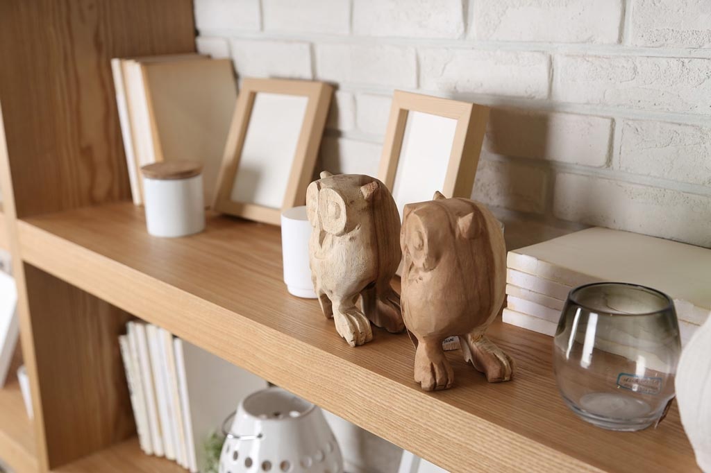
This is the part were you know that this styling project is nearly over. Your story is up! So, breathe in and let your creativity take over. Mix any artwork, photo frames, knick knacks you love and perhaps some greenery. Laying a bowl for example on a horizontal pile of books simply enhances the laid back, relaxed approach while you’re showcasing one of your favorite decor objects, perhaps a favorite trip memorabilia.
Use objects that you really love, because you’ll be seeing a lot of them. Don’t be afraid to mix portrait with landscape orientated frames. It creates visual “dips” as discussed above, which is a really good thing. Variation enhances a more easy going attitude.
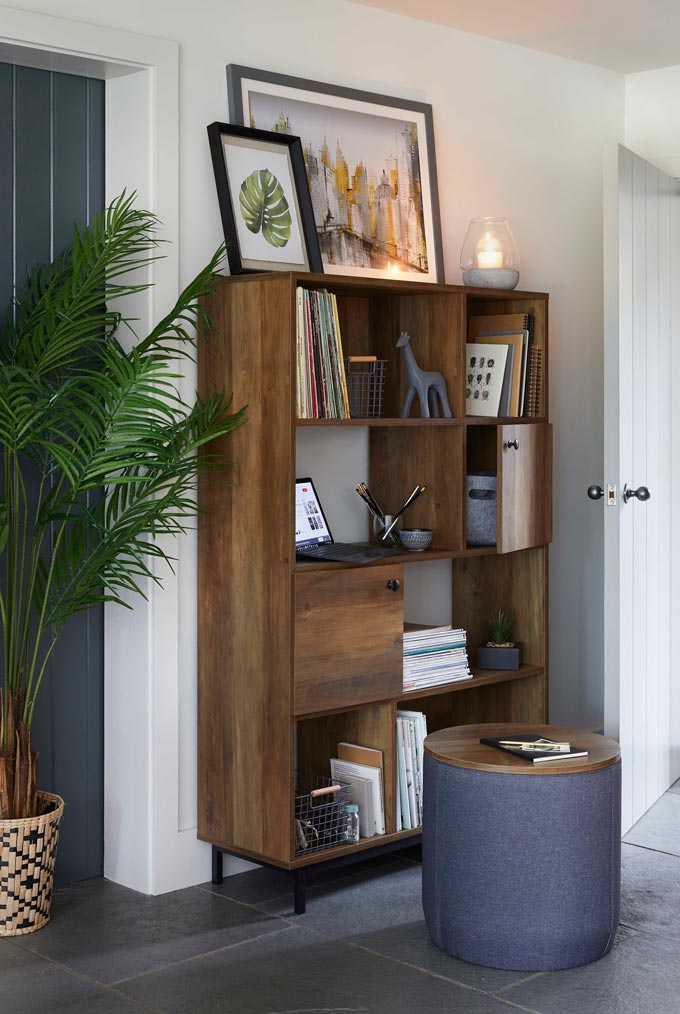
Also, it’s very important to think in odd numbers like a group of three frames, three vases, or one sculpture/figurine somewhere diagonally. (This is one of the six fail proof interior decorating tips that I discuss in more detail in another post). Working diagonally also helps to make things look even more interesting.
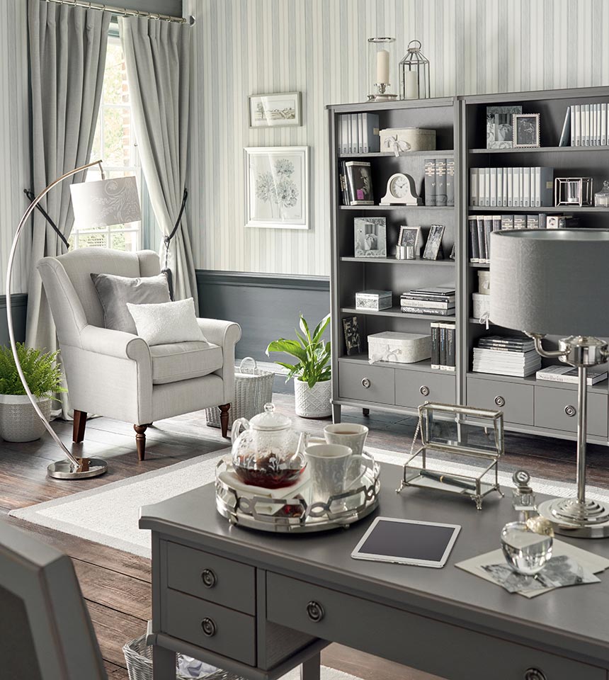
Keep balance in mind and you can’t go wrong. Small boxes, old cameras, eccentric bookends, an odd teapot are just a few examples of beautiful decor additions of your style.
Greenery
Allow me at this point I’d like to make a parenthesis about greenery. Greenery is a trend that has made a strong comeback. There’s no doubt that plants add life in a space. However, if your bookcase is anything like mine (with many books where…”maximalism lives here” kind of speaking) then you might not have enough space for a plant.
The good news are that there’s no need to feel bad about it. Greenery works awfully well in open shelf type of bookcases, because it fills up all that negative space. For robust bookcases though, you ought to consider small plants (including faux ones) if any at all. Think of a library – do they have plants? Nope, and no one really minds that.
My advice is to adopt the trends that work for you, not the ones that you have to work for!
Takeaway thoughts
The best part about styling a bookcase is that it probably won’t cost you a dime. Use decor objects that you already own. Just try placing them at different spots and see what looks right to you. It’s a trial and error process, but it can make you feel like you rule the world once you get it right and that’s a great feeling!
Have fun,

Post last update: 09/27/2019




Very helpful to read! Will have to do some rearranging of my bookcase after reading this post! But thanks for the inspiration. Helped me a lot!