After this long holiday break, I hope everyone is feeling refreshed and ready to embark on a new decade, starting with a happy new 2020. Henceforth, it’s back to the grindstone, but hopefully with a more mindful and positive attitude. With that in mind, I’m kicking off this year with an intriguing colorful home interior of an awarded residential project in Russia.
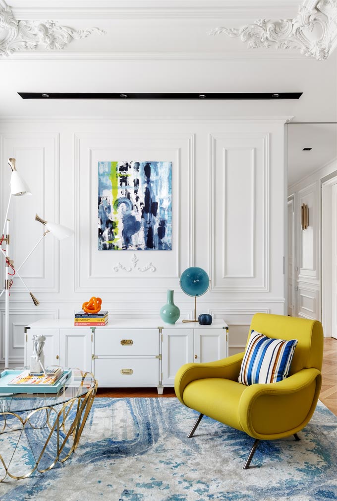
This project was awarded the International Property Award in the Interior Design Apartments category. It is about an apartment in a prestigious residential complex in Moscow, home to a couple and their teenage daughter. It is designed by Oksana Salberg-Vachnadze from the O2 Design Moscow Studio.
A colorful design approach
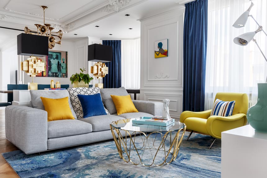
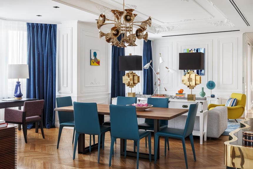
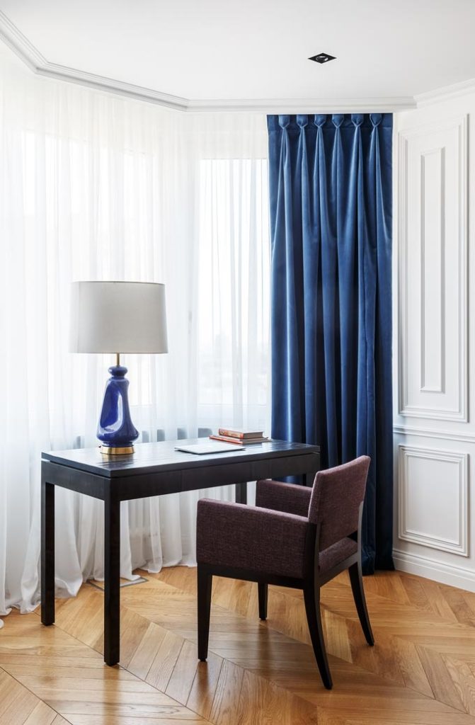
This colorful home interior is a great example of a mix and match approach, where old meets new in an interior to create a unique blend. The color accents are bright and bold – mostly classic blue and yellow. Perhaps you could even call them striking, but they are well layered in against a primarily white background.
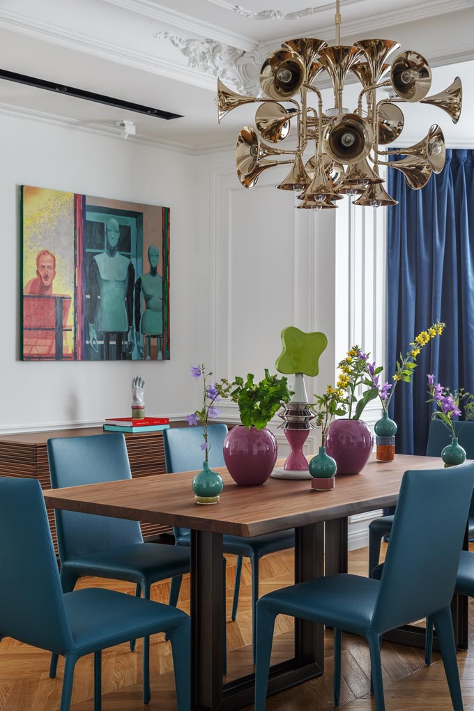
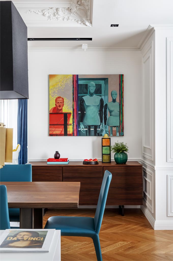
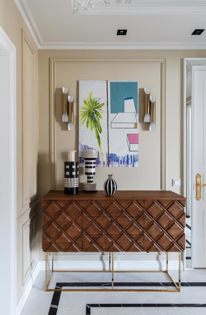
Despite the luxurious and striking furniture and finishes, the house looks and feels well lived in. I think it helps that there is something whimsical about it in a “jazzy” kind of way. For all one knows, it’s partly due to the eye-catching lighting from DelightFull as well as the prominent artwork i.e. over the wooden sideboard.
The French-inspired Interior Style
One step inside this three-bedroom apartment that stretches just over 160 sq.m. and you can tell it is a true color feast for eyes. Similarly, well balanced contrasts between solid colors, interiors-materials like dark wood and marble along with many different patterns spotted everywhere, further enhance the playful and maximalist character of the design scheme.
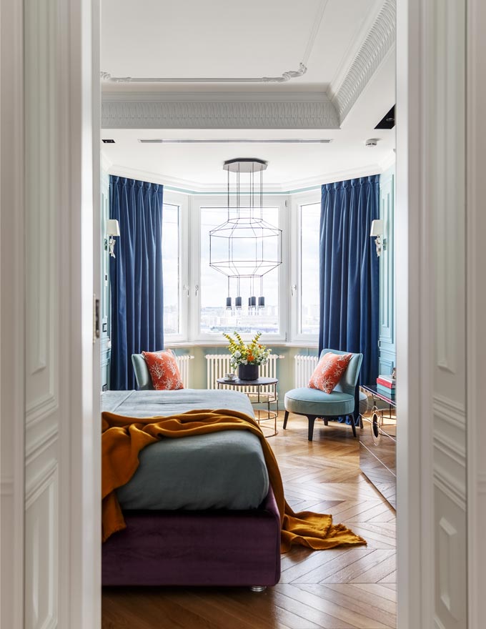
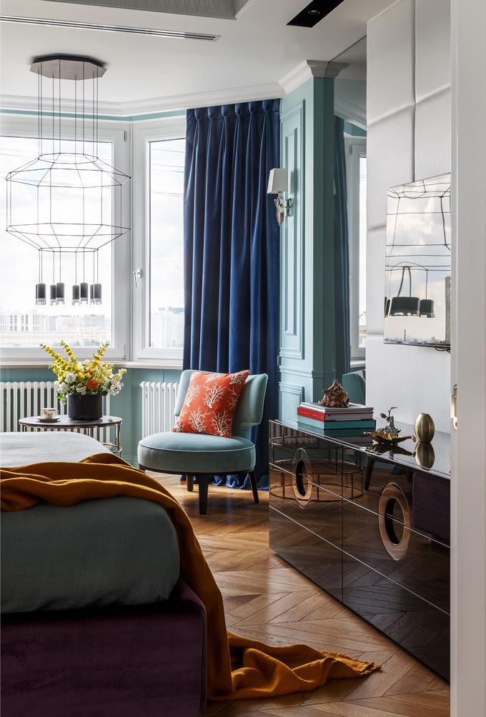
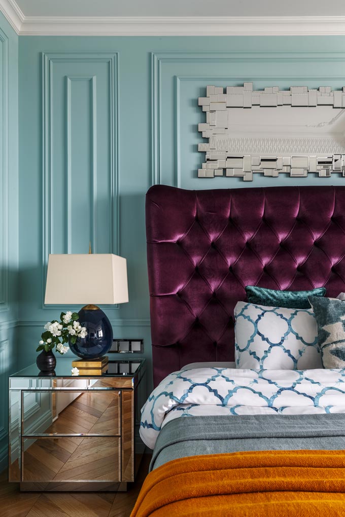
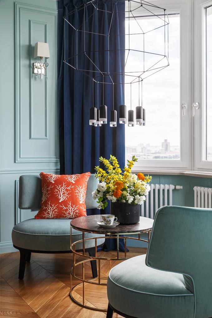
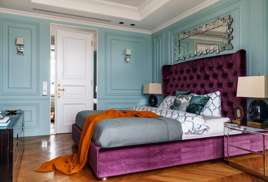
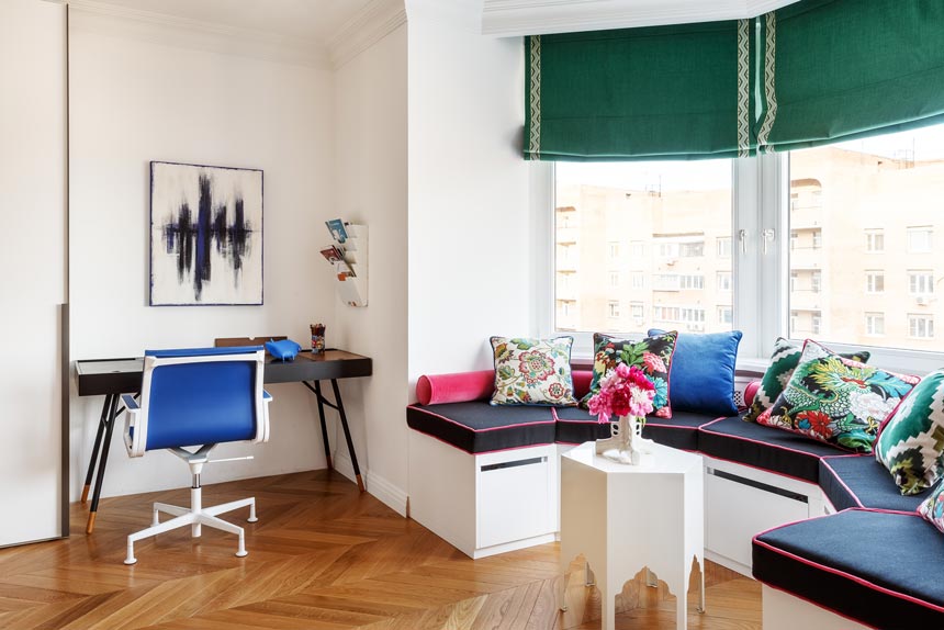
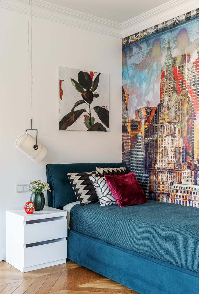
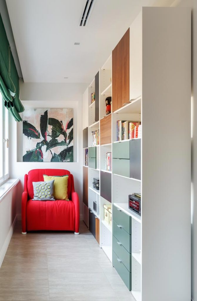
All the while, the neoclassical features of the apartment, combined with the white backdrop, resonate a French-inspired interior style. Blame it on the wall and ceiling decorative mouldings that keep a low profile under a coat or two of white paint. Or blame the chevron pattern parquet flooring. More importantly, blame it to the effortless coexistence of different styled pieces.
The Twist in the Design
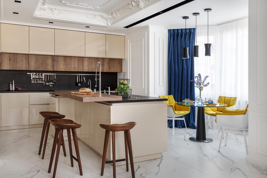
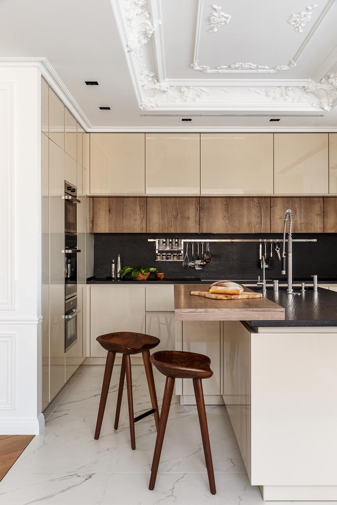
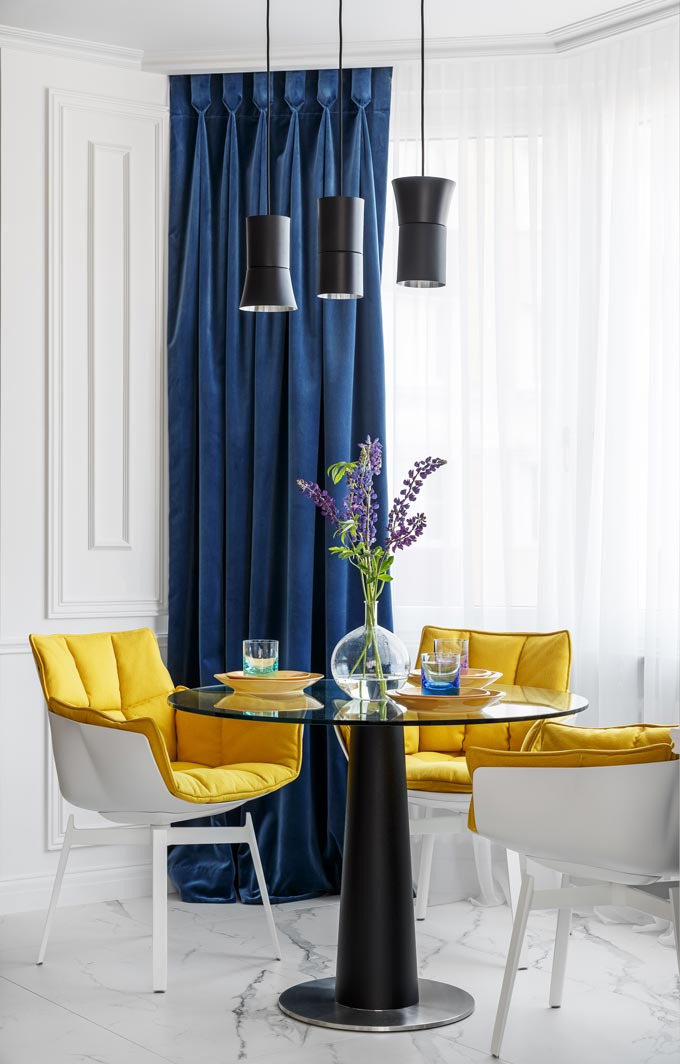
Moreover, I think the beige toned contemporary kitchen clashes with the breakfast area, because of those yellow armchairs, intentionally in a most interesting way. They take you by surprise. Don’t they? Yet, it works.
As for the beige tone, it downplays the ergonomic kitchen, without stripping its sharp looks. It creates a well-played twist in the design and a strong focal point at the breakfast nook, just as intended.
The Luxurious Bathroom
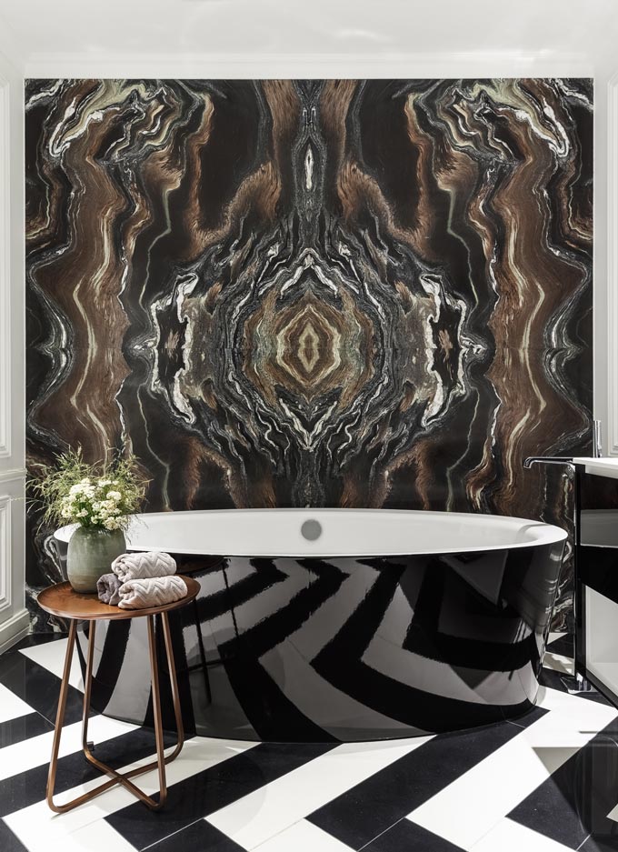
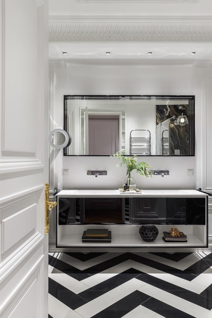
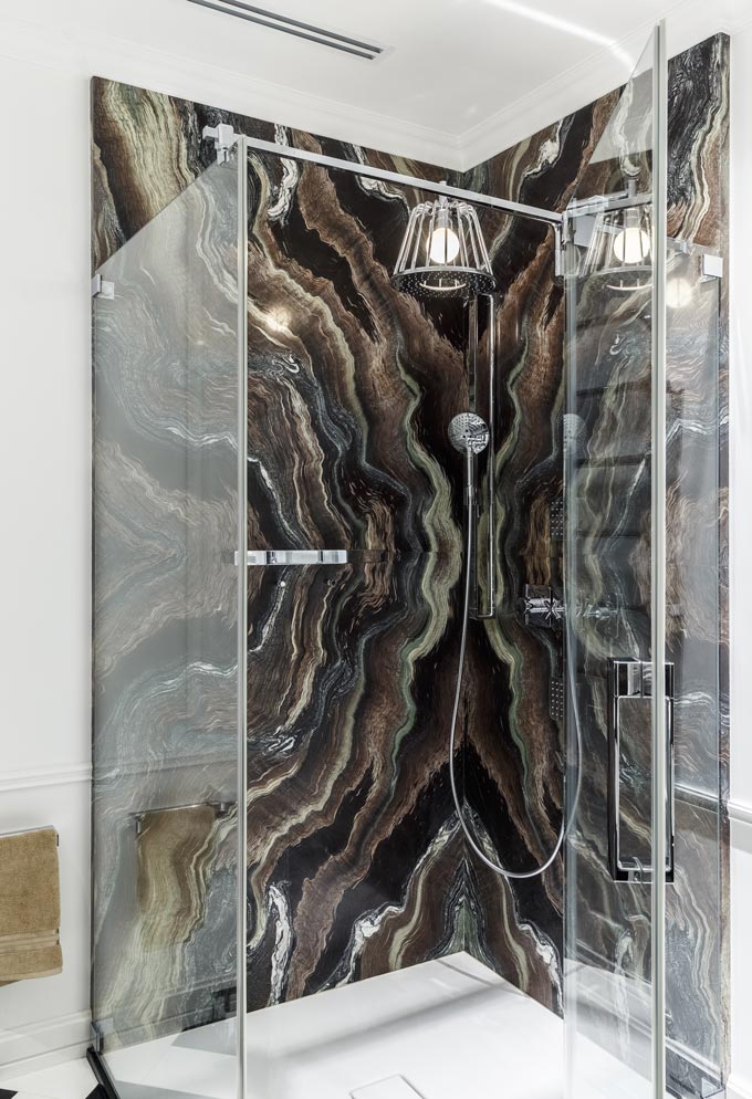
Lastly, let me show you the bathroom. It is a masterpiece in its own right. It is large enough for both a tub and a shower and naturally, carries on the ongoing luxurious theme. Need I say more?
Even if you don’t like the rest of that house, chances are that you will love the herringbone pattern floor juxtaposed to those dark veined marble slab panels… (Note that the key to making it all work so well, is no other than the scale of those patterns on the floor and walls). 😉
Concluding
Now, I believe that this colorful home interior has a bit of a retro appeal, many art deco elements and a unique color palette that give life to its distinct aesthetic. It is not a typical space by any means and that’s exactly the point!
Have an inspirational day, xo


Wow!!! What a house tour!!! Never thought I would love seeing so many colors put together and still love the result! The kitchen in that beige tone is amazing but what really caught my eye is indeed the breakfast area with those yellow armchairs that match absolutely with the blue curtains in the background. As for the bathroom…what can I say! Love the marble panels and the fact that it is in brown tones just as much as the floor and its pattern! For me the result is something luxurious yet very warm and so I could definitely picture myself living in such a space.