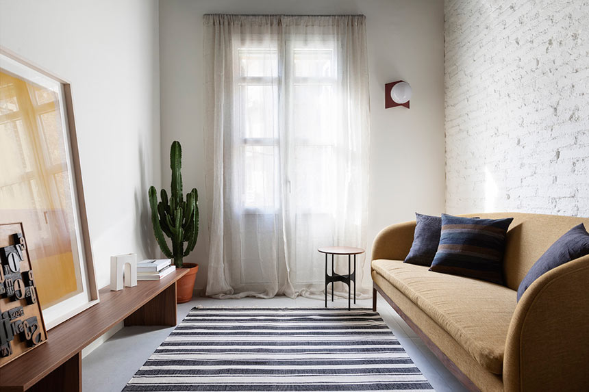
There is something so alluring about living in a small apartment – if it’s done right, like this one. Imagine all of the conveniences and comforts of modern living, in 42 sq.m. harnessing a unique nautical vibe… I’m talking about the Blue Apartment; a project with a witty, “out-of-the-box” interior design sensibility.
About the Blue Apartment
The Blue Apartment, located in Barcelona, was designed by interior designer Daniel Rotmensch. And judging from my own experience, the refurbishment of such a compact and elongated space must have been quite a challenge. Yet, it all appears perfectly formed with the least bit of effort.
The initial design intention was to maximize light for the habitable spaces. As such, the layout was organized in such a manner, as to combine the sitting-dining-kitchen spaces close to the natural light source: a single window door. Although, this may appear as the obvious choice, I’m sure it was not as simple during the design process.
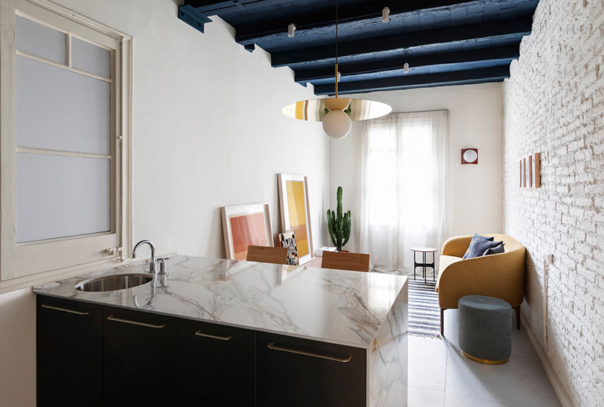
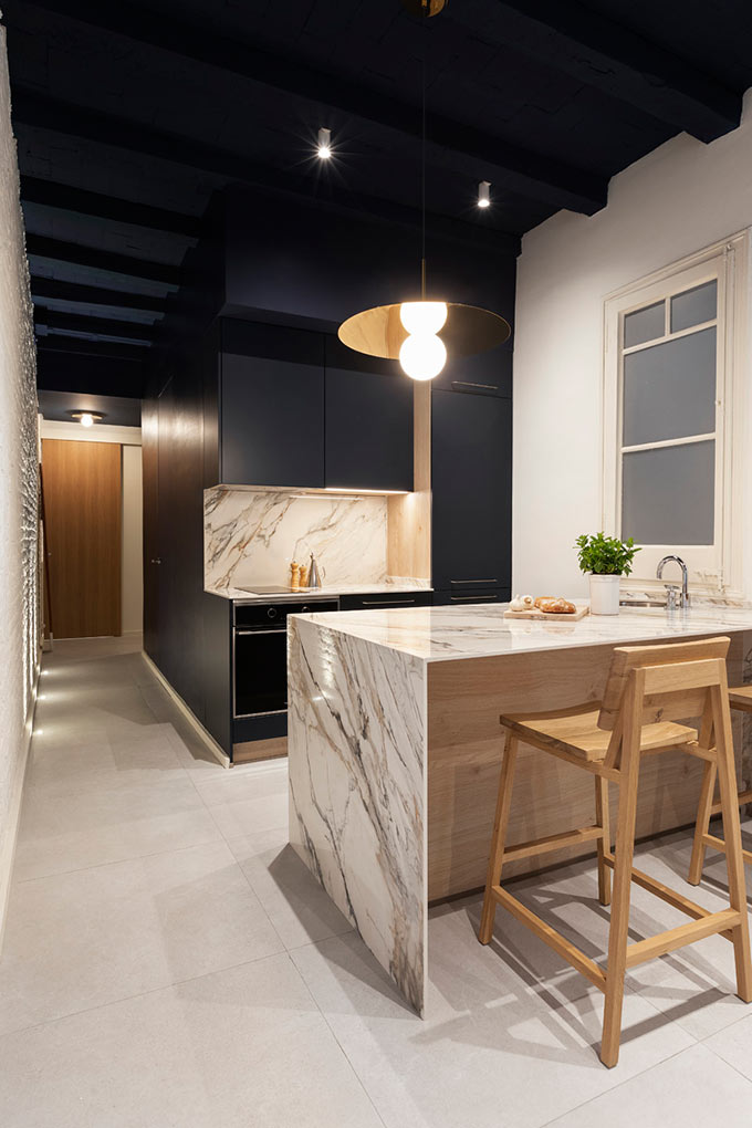
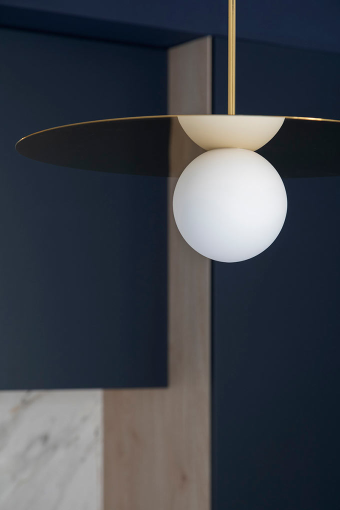
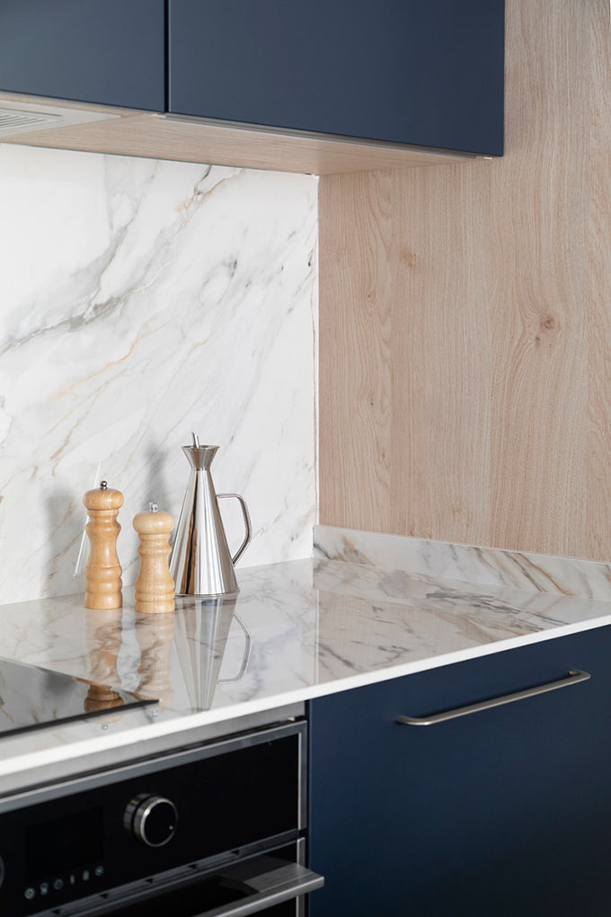
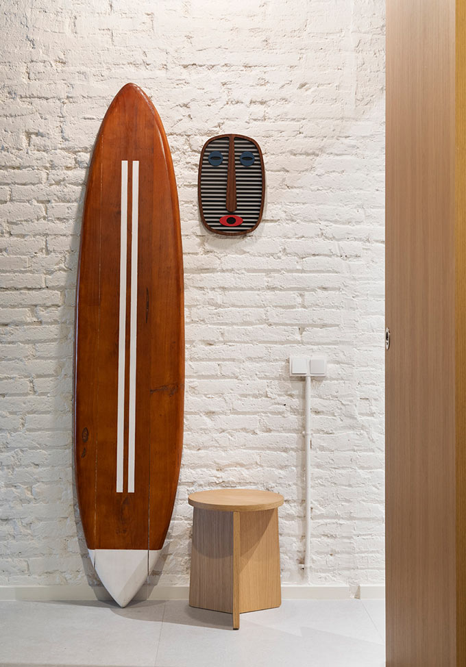
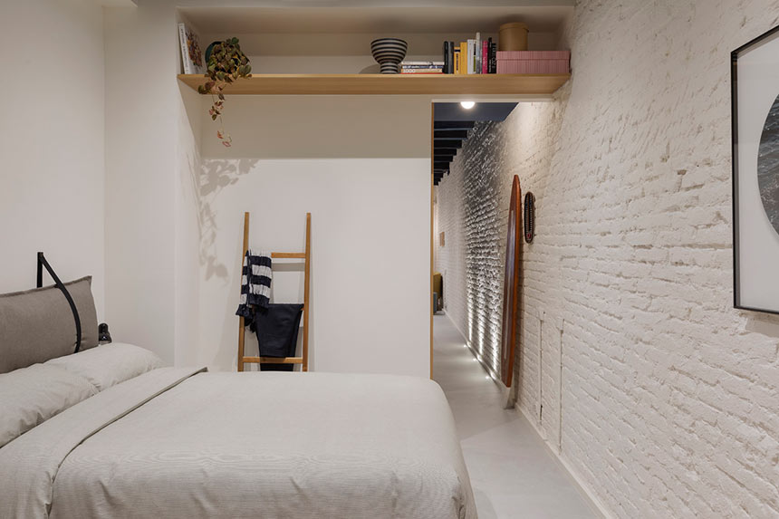
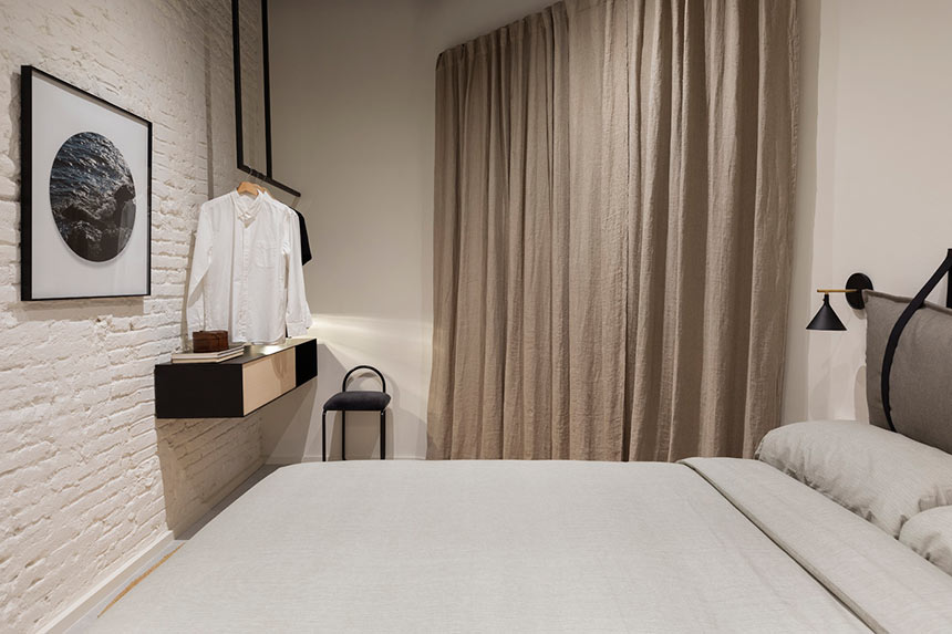
Without a doubt, the off-white exposed brick wall that runs along the entire length of this small apartment acts as the backbone axis. Its rugged finish adds depth and texture to the entire apartment – the perfect backdrop. Instantly, this backdrop is complimented over and above by the structural navy blue ceiling that constitutes that cool factor.
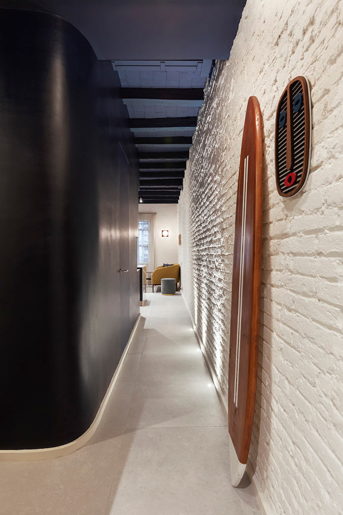
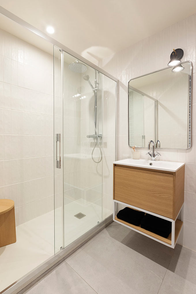
Moreover, I love the fact that a central volume, enclosed by its distinctive and grounding navy blue color, features a focal sculptural insert on the one end, a fitted CULTO kitchen. Its white veined marble look finish is a superb juxtaposition to the volume’s painterly manner. Also, part of this central volume includes a fully equipped bathroom, hidden from plain view thanks to its flush door.
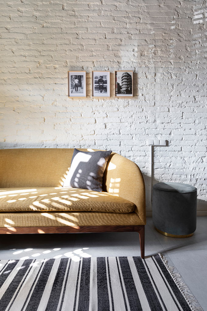
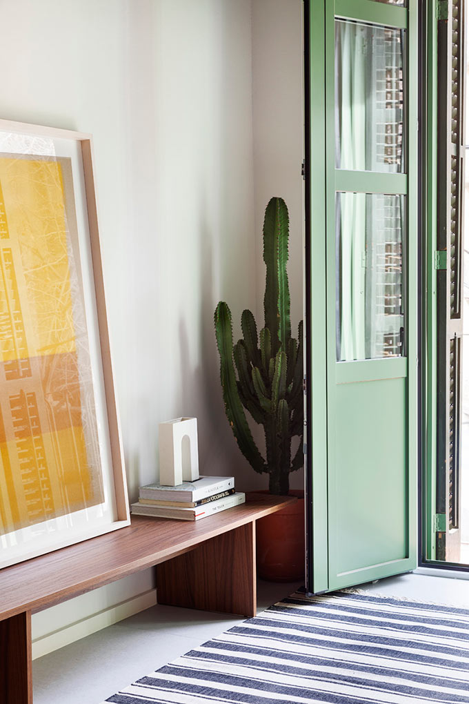
Likewise, the continuous flooring and limited, but bold color palette farther enhance the apartment’s design flow. This allows the eye to travel across the entire space. Clearly, in all small spaces every single piece counts. And this Blue Apartment is no exception. It has a few eclectic furniture pieces, starting with that perfectly scaled curvy mustard sofa; all carefully curated to create a livable space with a strong punch.
Takeaway thoughts
So what makes this home tour special? Well, one of the things I really like about this small apartment’s interior design is that it feels like it has been approached via a restorative lens. It is minimal, not Scandi minimal by any means; yet, with a singular warmth and attitude. It has poise and character. No easy decorating hacks to trick the eye, i.e. use of mirrors as I discussed in a previous article on Living Big in a Small Space. Rotmensch has not followed the almost typical all-white concept either. In fact, it doesn’t feel like it’s been done by the book. As such, it stirs beguiling emotions that appeal to my soft spot for eclectic and/or out-of-the-box interiors. And for all these reasons, I think it would be most definitely worth the stay!
Yours,


Wow! So colourful but elegant. What a great tour 🙂 x