Chances are that you may have heard that the Pantone Color Institute announced their color of the year 2019 as Living Coral (PANTONE 16-1546). Is it a forecast? Hardly! I think it’s definitely a hue that follows the current trends and a mood for an optimistic decade closure. Nonetheless, the impact of this announcement will definitely be felt and seen in both décor and design. Obviously, that includes the fashion industry that has embraced this hue since last spring. So, let’s check out this color in a collage of images and then I hope you tell me what you think of it.
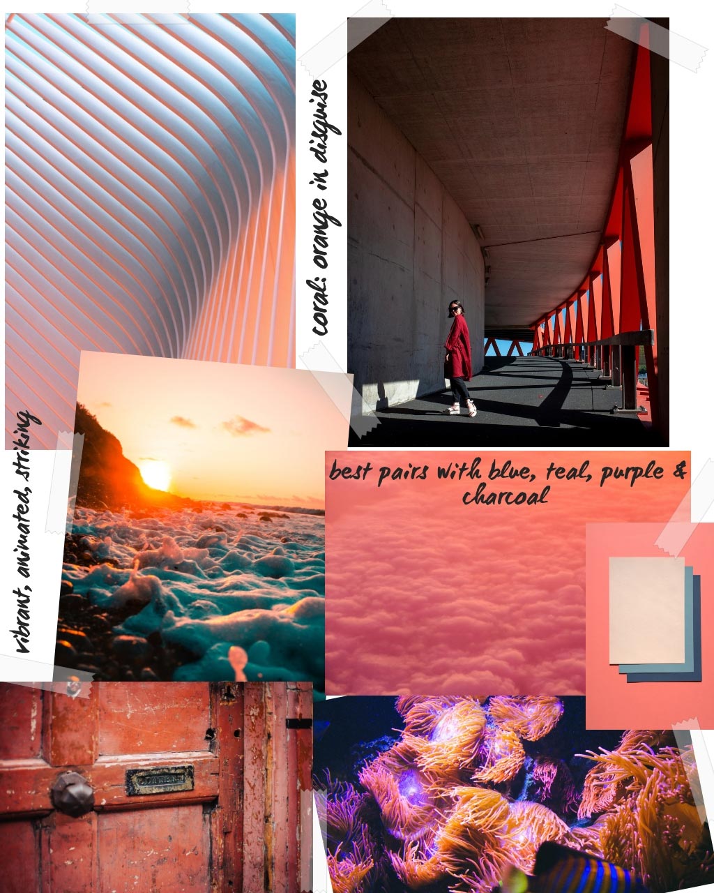
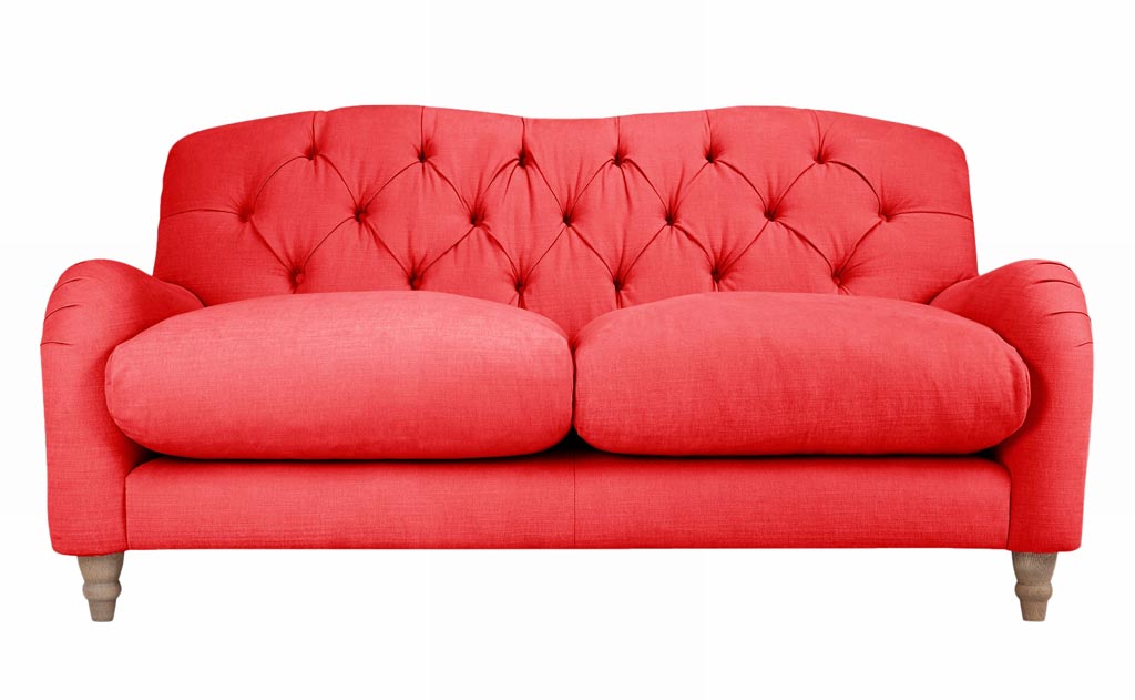
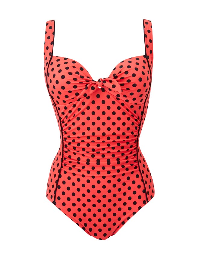
Although this orange hue with golden undertones may appear more pinkish to most of you, make no mistake that it is an orange color. As such, I instinctively have kept a refrained attitude towards it. In other words, I didn’t jump up and down from joy at the sound of the announcement, for orange is not my hue. Why? I’m not entirely sure, but even though orange is part of nature’s color spectrum, I don’t like super dosages of it everywhere. I like to use it as a pop accent instead. And this brings me to my next point. This microtrend will flood over with coral hues just about everywhere and that is a bit too overwhelming for me considering that I’m no fan of orange.
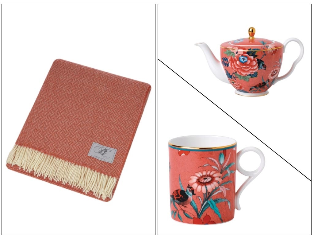
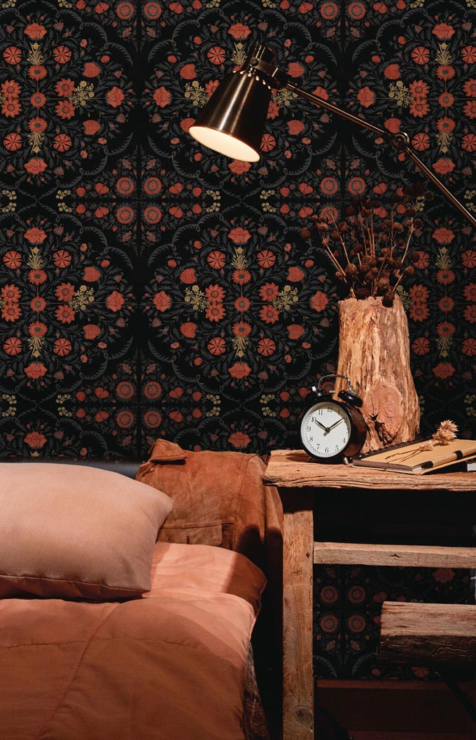
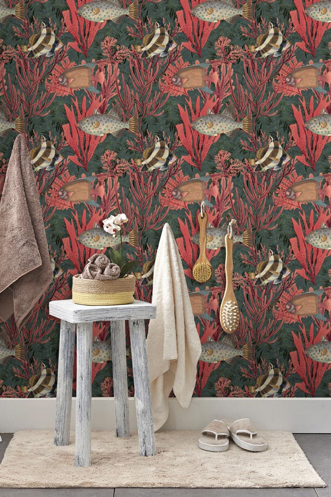
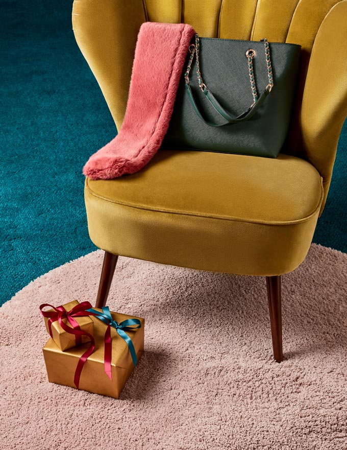
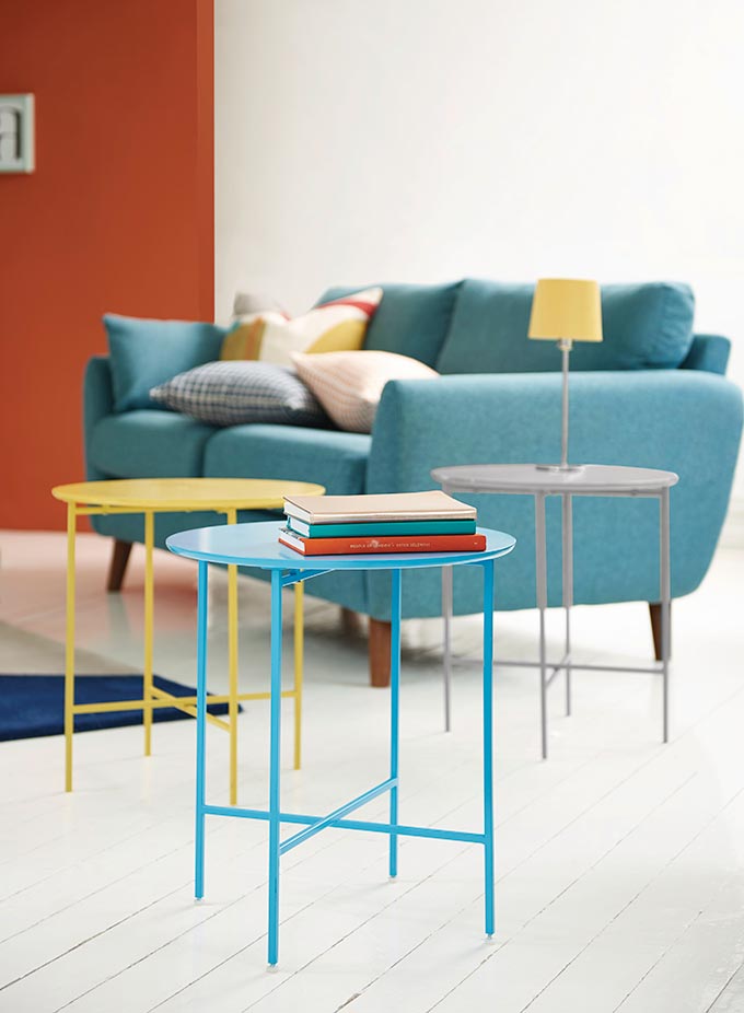
Anyway, even at the risk of sounding like I’m bragging, I have to say that I saw this coming. Just like I see many other pastels brewing in the background before they resurface after their distinct absence of more than two decades. Now, don’t get me wrong, this coral hue is a very energetic color, vibrant and quite striking when used as an accent against a contrasting background (see the wallpapers above). Therefore, it pairs really well with colors like teal, blues, and purples. But it also goes well with forest green, rusty and mustard hues.
A tip to note when it comes to color coordination is that if you pick a saturated version of this hue, then use saturated contrasting hues to keep it balanced. If on the other hand you use a desaturated coral hue, then again use desaturated color pairings.
The tone of the coral hue will dictate the overall tonal scheme. As a vibrant, warm color it has the power to make a scheme more or less engaging depending on its tone. And that’s where the other pastels come in. For if you do decide to go for a color scheme with a desaturated coral as the protagonist, then pastel colors like pistachio and pastel yellows and blues will inevitably join.
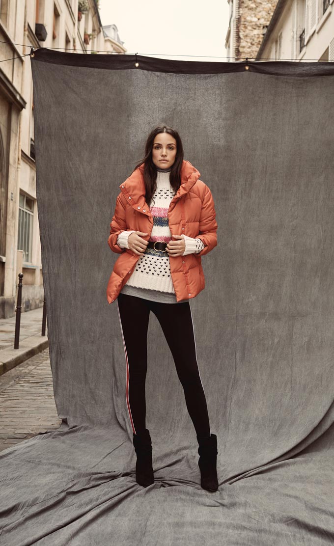
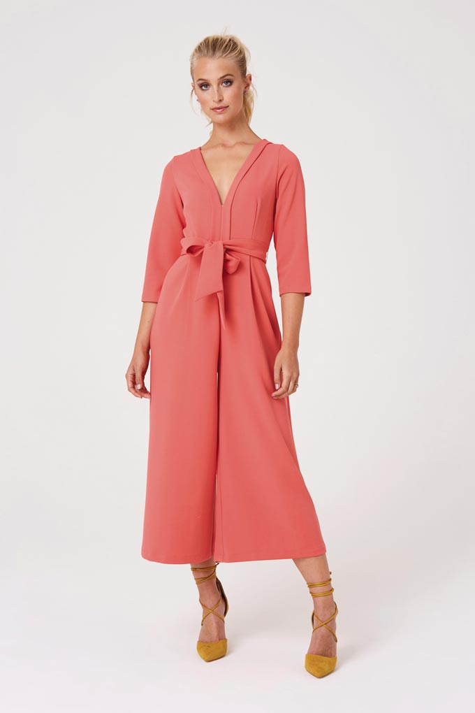
Now when it comes to fashion, introducing a color like coral is a lot easier than in décor. Fashions come and go much faster. So many celebrities have already embraced it and wearing it proudly for this will be one of the “it” colors of the up-coming spring-summer season. Obviously, in this fast-pace changing world we live in, it scores well for them if they wear it first before anyone else (but that’s another story because to me style is not about who wears what first, but how you wear something that resonates the best of you).
I will pause here for today, for I don’t want to get into spring clothing just yet. I promise, there’s more coming up real soon.
I know that this is a very busy season for all of you, but I sincerely hope you make the most out of this holiday season.
Keep smiling, xo