Hello there! It is 20 days to Christmas…! So, today I want to take you for a home tour that I was lucky enough to photograph last week. It is a small rental filled with personality, strong accents and a warm but funky vibe that becomes a lot the younger generation Athenians that live in this vibrant city that is redefining itself. Timos, who studied interior design and his partner put together this living space on a shoestring budget, but its packed with big ideas, some DIY’s, a whole lot of love and hence, it’s no wonder that Christmas lives big there.
The 20 sq.m. Rental
Once upon a time, there was a wall that separated the hallway from the living room, but thankfully that was taken down by the owner during a renovation several years back. This resulted in making the no bigger than 20 sq. m. space look a bit bigger and a whole lot brighter.
Furthermore, it allowed Timos to create a dining space for four that he so clearly defined with color blocking (see black wall paint) with a wabi-sabi attitude. This defining strong black accent isn’t perfectly aligned and so it smooths the starkness of the black wall paint. The DIY lighting, with its industrial flair, over the dining table with a real warm glow makes the dining space all the more cozy and inviting.
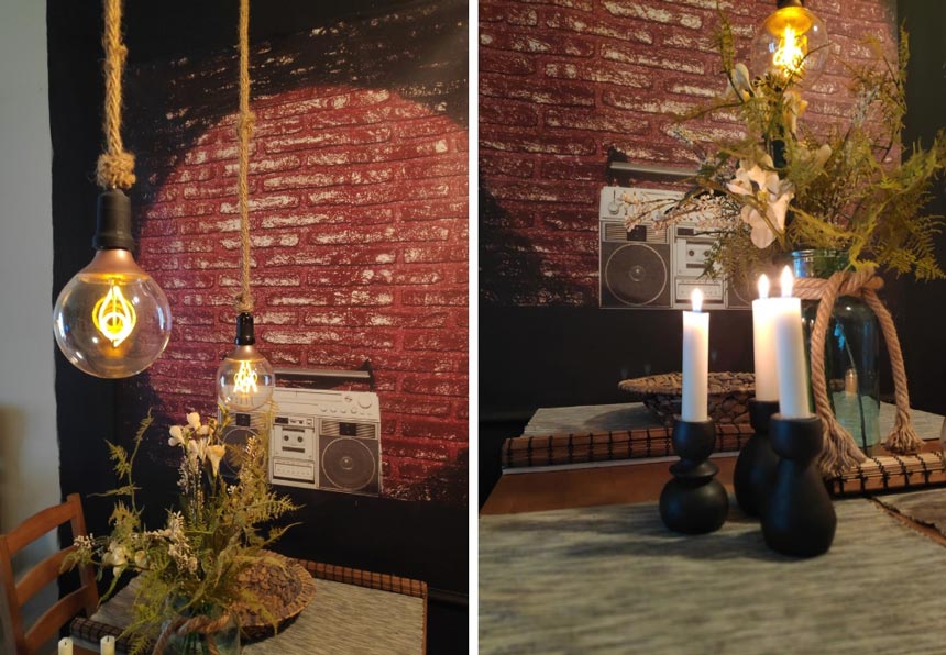
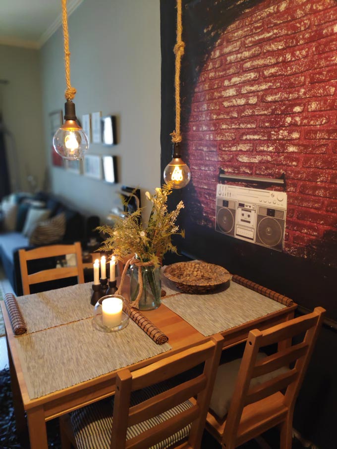
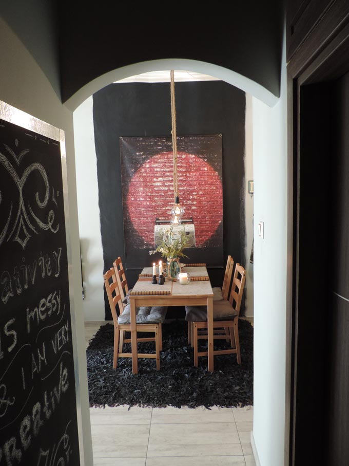
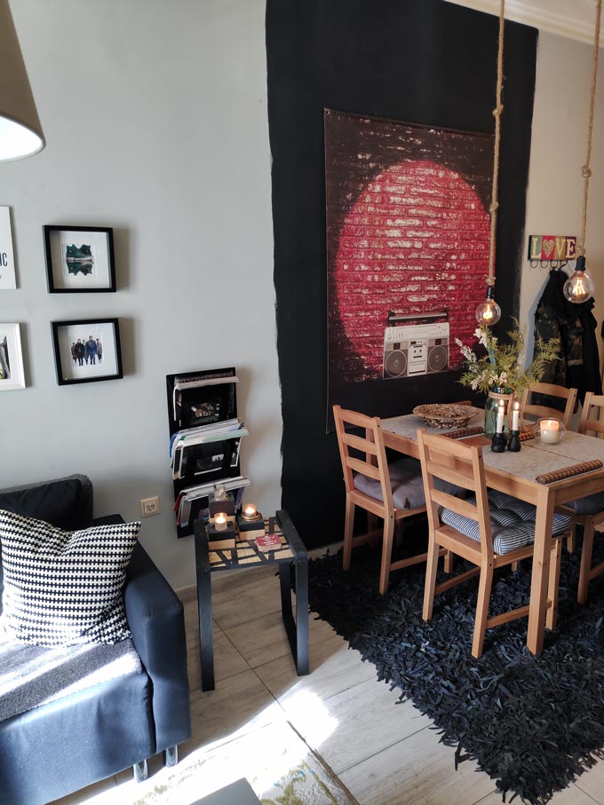
Moreover, it was followed up with just the right size black, textured area rug giving this dining space a personality of its own. Personally, I think the addition of that art image of a brick wall was such a brilliant idea, for it gives a sense of a peephole through the wall – like an opening where light comes through.
It’s the perfect illusion and definitely a lot more interesting than a mirror that would not work at all, for it would reflect the corridor that leads to the rest of this flat. Instead, it magnetizes your gaze and that’s exactly what Timos wanted to accomplish.
Art Gallery Wall
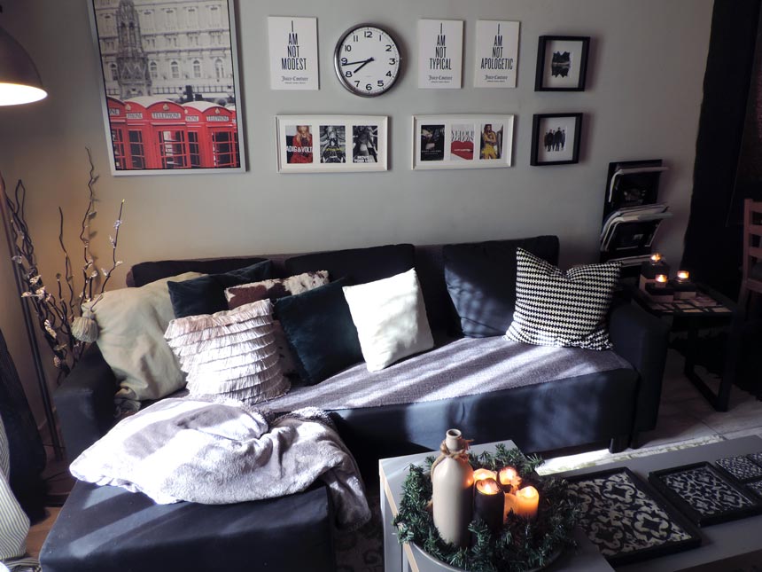
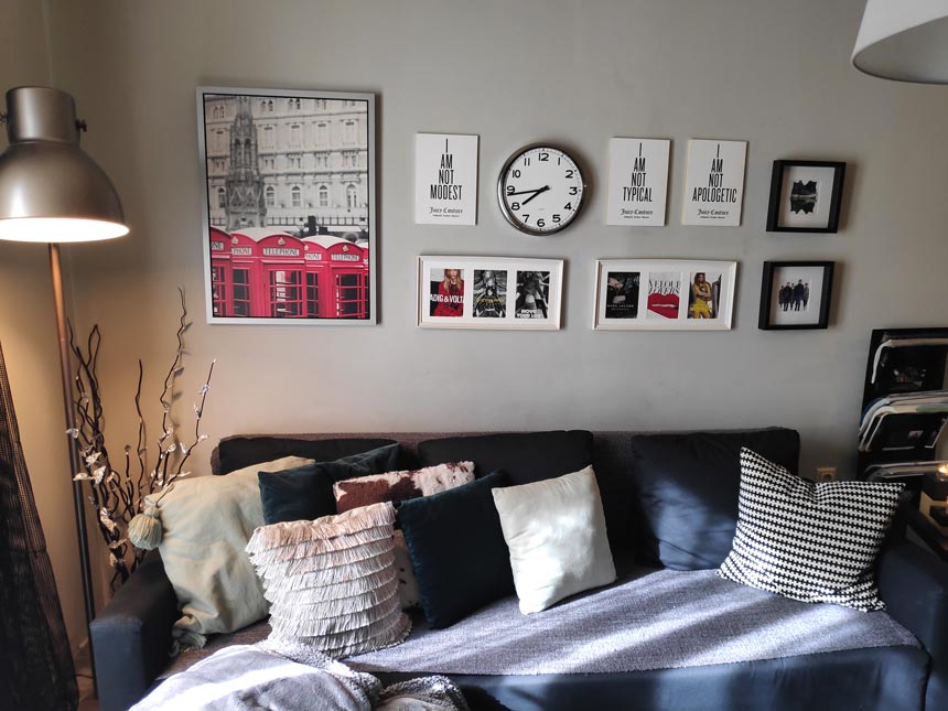
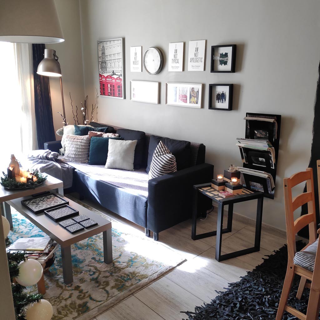
Another interesting feature in this space is the art gallery wall that stretches over the sofa. It is neatly arranged, keeping a strict bottom border with quotes fusing in with fashion art images mostly. This is a good mix of typography with images that resonate a funky and trendy vibe, but for me it’s all about that clock that gives everything a twist. The branches beside the sofa add a bit of an organic touch complimenting the round form of this industrial looking floor lamp.
It’s well worthwhile taking notice of the decorative pillows on the sofa where texture (cowhide, velvet, linen, fringes and tassels come together). They’re not all the same size and their patterns differ. So, this is a great example of how to mix different kinds of decorative cushions.
Accent Wall
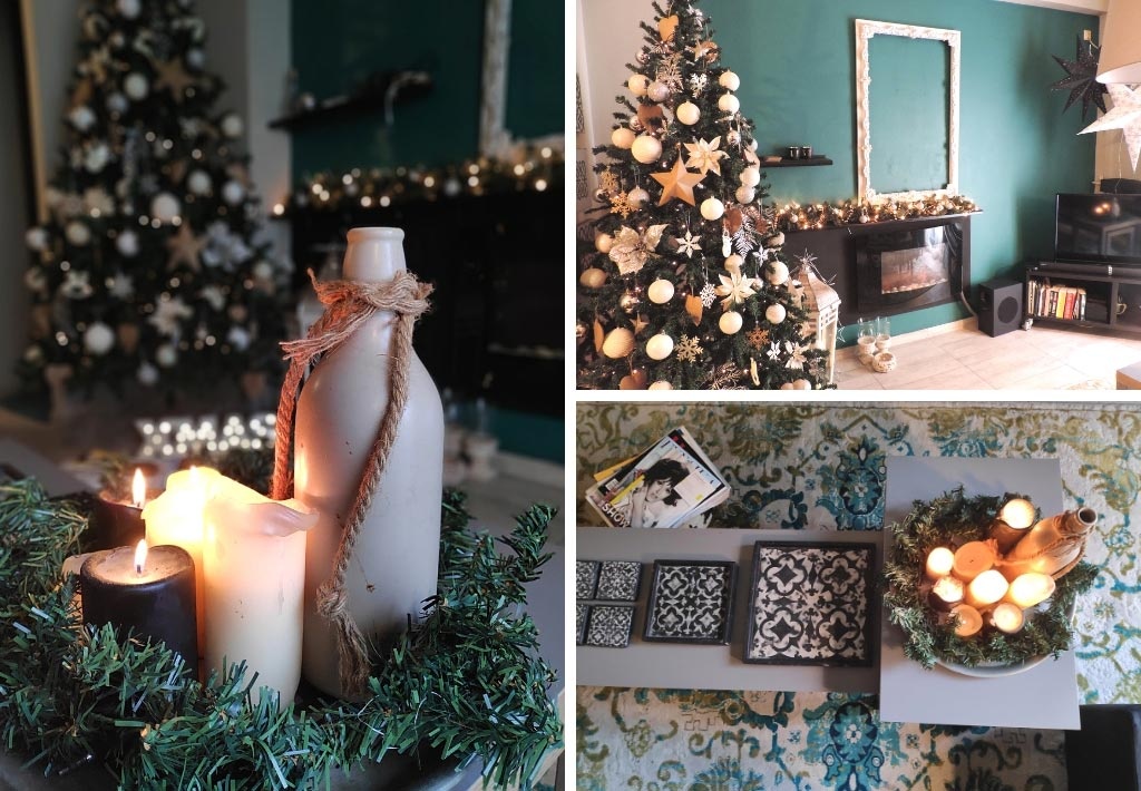
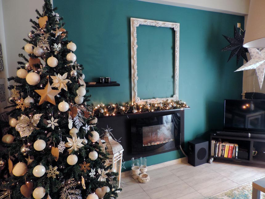
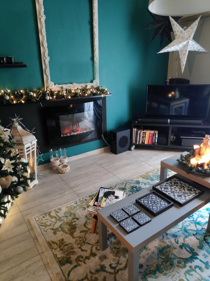
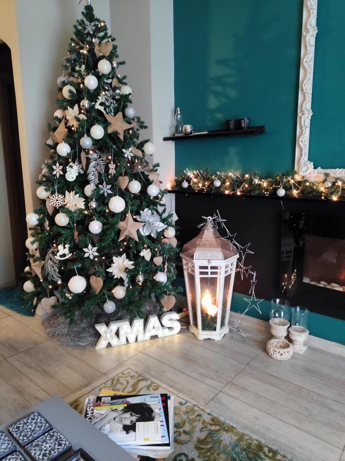
Finally, across the wall with the sofa, there’s an accent wall with a blue green color to it (a bit like Benjamin Moore’s Juniper Green 601, but with a more blueish undertone to it). The fascinating part of about this wall, besides its bold color, is the electric fireplace insert burner in the middle of the wall. Timos again had the ingenious idea of using a white, thin but embellished frame over the insert to create the illusion of a real fireplace. I still can’t get over how clever that was!
Obviously, with the Christmas tree besides the fireplace, the garland over it and the fairy lights it all looked so festive, warm and inviting with a hygge feel to it, even though it was far from a typical Scandi interior and a neutral palette that most people opt. This space was special because I could tell how Timos took pride in it.
A Final Word
Of course, when you take pride in your home then you definitely take pride in yourself and that’s what a good home tells of you. This small home tour is a fascinating example of how implementing big ideas, even in the smallest rental spaces with a tight budget, can go a long way to create a real sense of pride and accomplishment.
And last but not least, a source for further reading: Industrial Design Decorating for a Rental as your 101 guide on how to go about it.
I hope you enjoyed it as much as I did.
Love,


So sweet!!