I know you have a story to tell: your handwriting, your favorite color(s) and the pattern prints you choose are all giving you away. It is like reading a diary, because patterns do not lie! In fact, never doubt patterns for the way you mix them is a testament of your uniqueness. But how do you match patterns and colors in home decor and get it right? This is my approach…
I first wrote about mixing patterns like a pro here. Then I put together a video which includes a couple of examples, while I explain my approach in some detail. And now, I am finally getting down (after a lot of ups, downs and hick-ups) to briefing you here, for many of you still like to read. (But even so you may also want to watch the video).
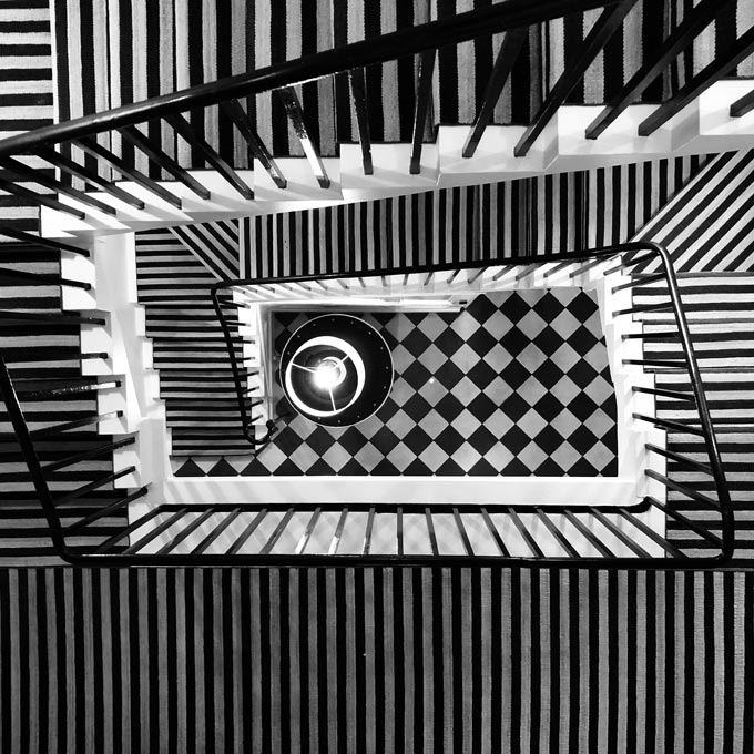
Now, patterns have a distinct theme depending upon their repeating motif. There are several types of patterns. Stripes, dots, damask, ikat, toile, damask, paisley, flower, tropical, plaids and checks being the best known in the design industry. Mixing all these makes decorating a whole lot more fun and interesting.
Of course, patterns have been around forever and embraced by many different cultures over the years, giving them a historical identity among other things (i.e. think of the plaid pattern and Scotland). In every case though, they have always been used in decorating thus, giving rise to a new wave of emotions with every new interpretation.
For instance, about four-five years ago, chevron patterns had taken over. Nowadays, patterns is one of the rising interior decorating trends that is steadily rising again even in minimal interiors. After all, maximalism is here yet again, and in many more ways than just wallpapers and luscious patterned fabrics, as a result of the need for more personalized spaces. Hence, patterns are the easiest way to help anyone do just that.
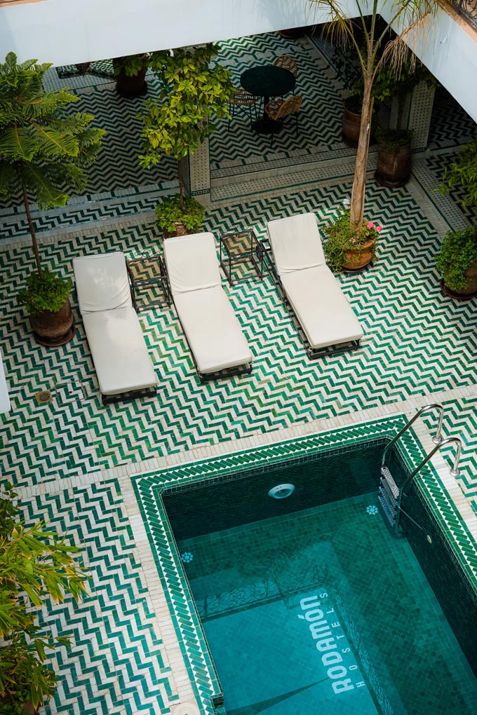
Having said all that, I want you to take notice of how many patterns you already have in your home – the ones your eyes may seem to skip. Perhaps your flooring has a distinct pattern. Good chances are that your bathroom wall tiling has a pattern to it as well. Thus, the point I’m trying to make is that if patterns are used the right way, then no single pattern will shine more than another.
Mixing Patterns
Hence, let go of any doubts you may have about introducing more patterns and follow your instinct. That’s my very first tip. Sounds obvious and easy enough, but too many times people hold back because of their doubts. Now once you let yourself free then, start introducing patterns by layering them in (NOT piling them)! In order to do that right, you should aim to match the colors of the patterns and not the actual pattern.
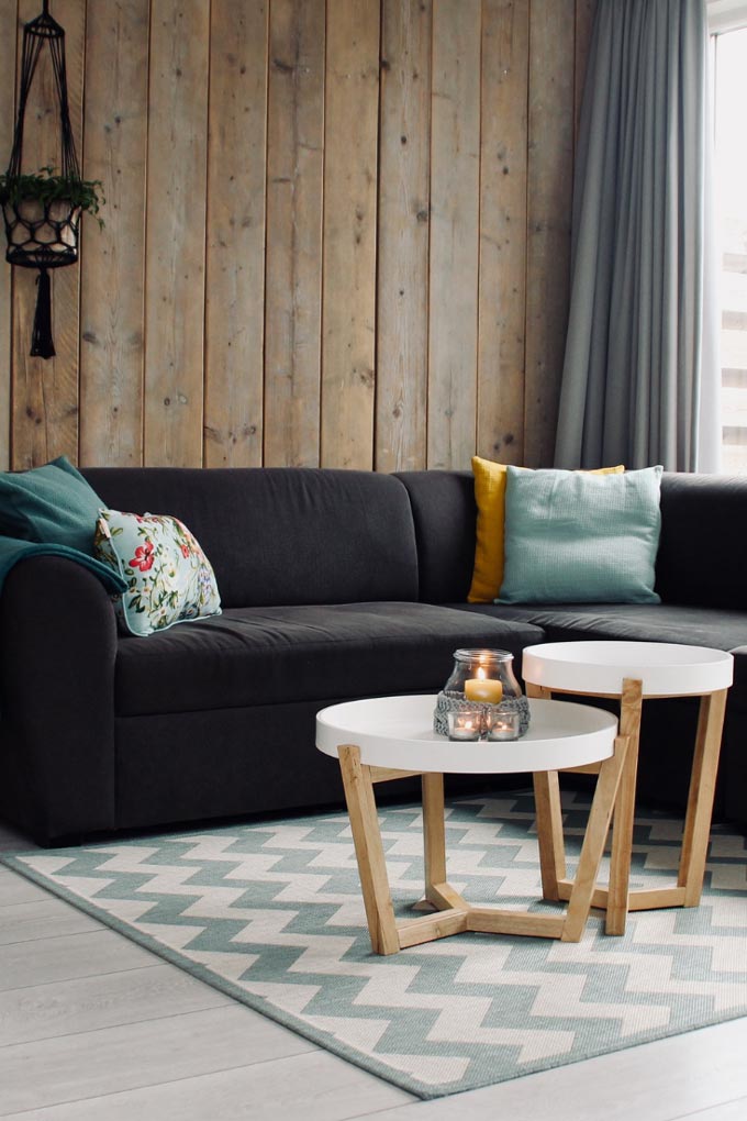
A bonus tip for you to remember is that stripes and dots are neutral. So whenever doubts get the best of you or you need a transitional pattern, then rely on them. They will ease any patterns transitions. Of course that does not mean that they will go un-noticed. (Perhaps you should check for yourselves how to use stripes in an interior).
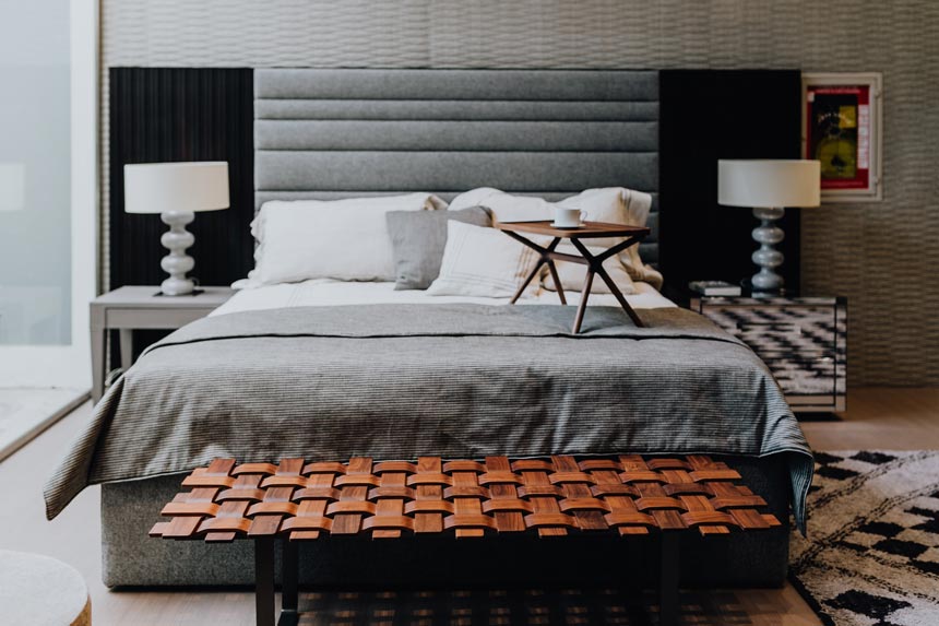
So back to what I was saying, if the colors of the patterns match, then the patterns will come together. Moreover, in order to layer in patterns, you need some solid colors. The more uniform these solid colors are, that break up the patterns and balance things out, the more cohesive the result. Hence, pull the solid colors from the patterns you choose. Or, if you have already established your solid colors, then it’s best to opt for patterns that include your solid colors within the pattern itself. Lastly, add some black decor to give more definition. That is the finishing touch for it usually adds more depth to the design scheme.
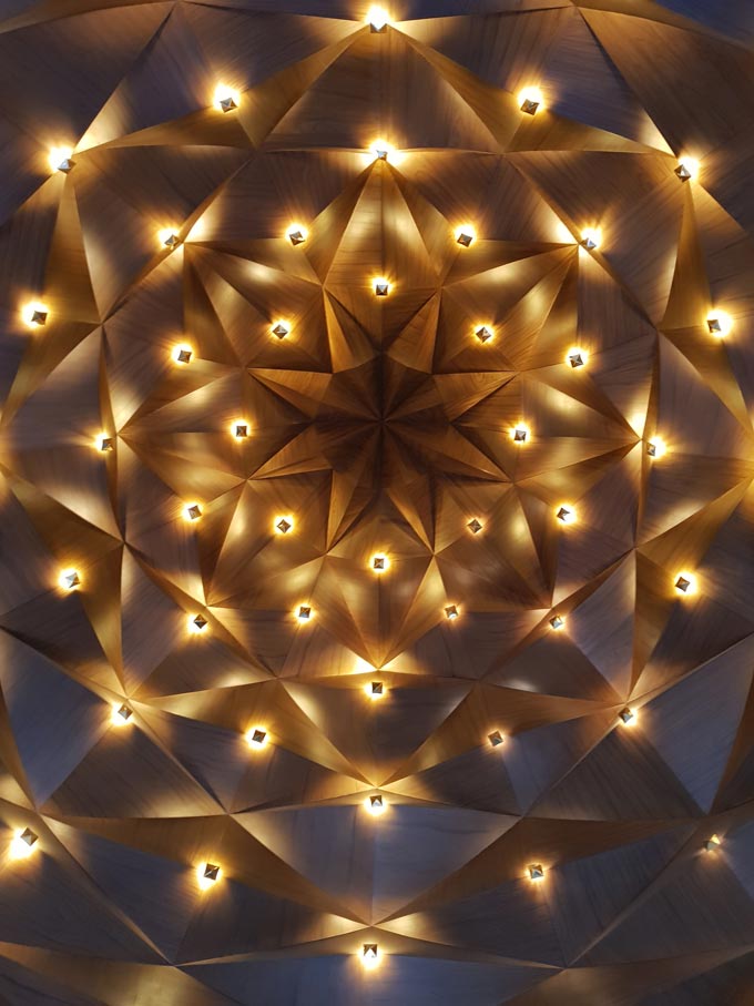
Sculptural and Decorative Patterns
In fact some patterns are based on forms rather than decorative motifs found typically in fabrics and wallpapers. The advantage of this type of patterns is that they are more sculptural and hence, add more depth by default. Therefore, embrace them in your home decorating, for they will work wonders for you.
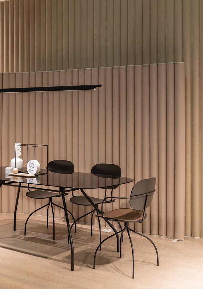
If you are into minimalism, then opt for sculptural patterns i.e. in furniture, room dividers, lighting, wall treatments e.t.c. If on the other hand you are a maximalist, then opt for both sculptural and decorative patterns. (Decorative patterns that are typically found in textiles). So whatever your style is, take the time to edit your space and layer in the patterns of your liking. For a more eclectic design scheme will certainly spark a bigger engagement.
Till next time, xx